This piece is the result of eight months of weekly scratch paper collection from a Blick art store. The typology showcases the wild variety of responses to the simple prompt of “draw something”. Through this typology, trends emerge in the words, icons, and intention of its hundreds of authors, while personal traces remain scattered across its pages as faint signatures of the anonymous hands that authored them.
I have always been fascinated by “text in the wild”. I’ll be the first to take a picture of graffiti or a hand-made poster on a telephone pole. Despite being created by people, I see wild text as a form of generative art. The anonymous authors of wild text are still a process outside of myself, so, just like a game of Exquisite Corpse, or LeWitt’s Wall Drawings, they retain their critical generative uncertainty. This informs my choice of sourcing my wild text from Blick. The generative process is other people, so I wanted the canvas and conditions of those other people to remain as consistent as possible to best showcase that generative process. The sheer diversity of the pieces generated is enriched for the fact that that each and every artist worked with the same paper, options of pen, and surrounding environment.
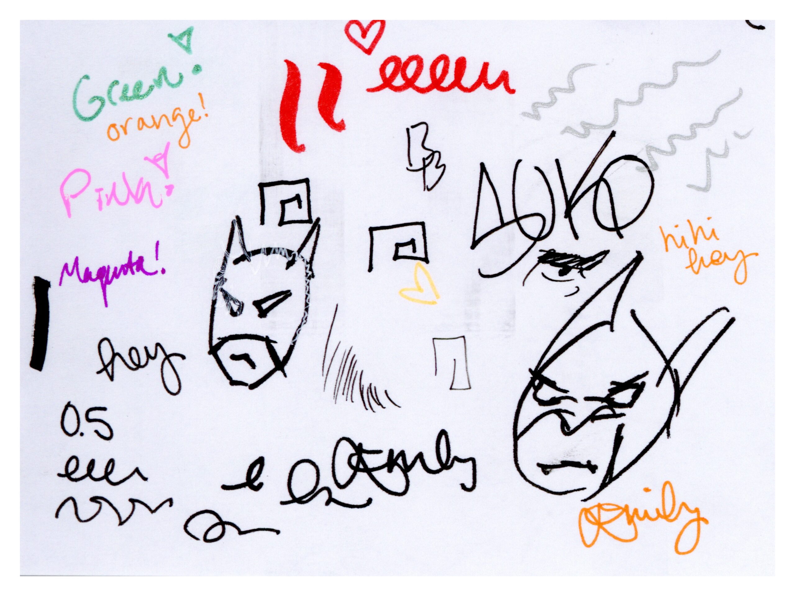
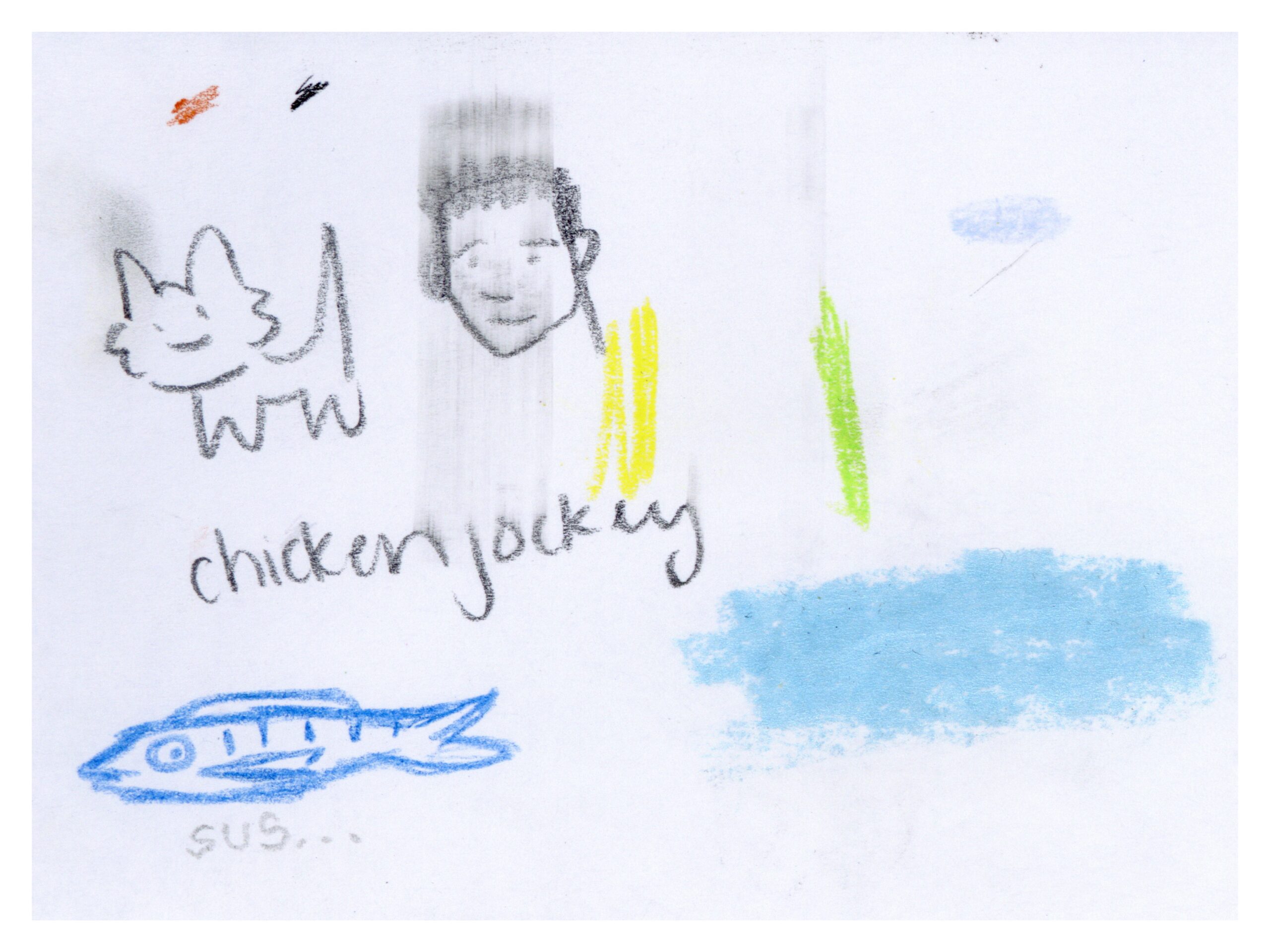
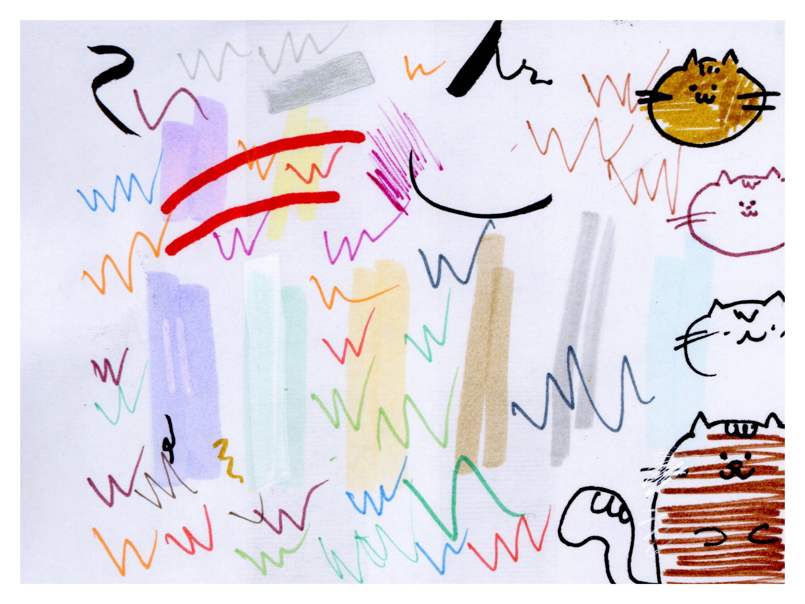
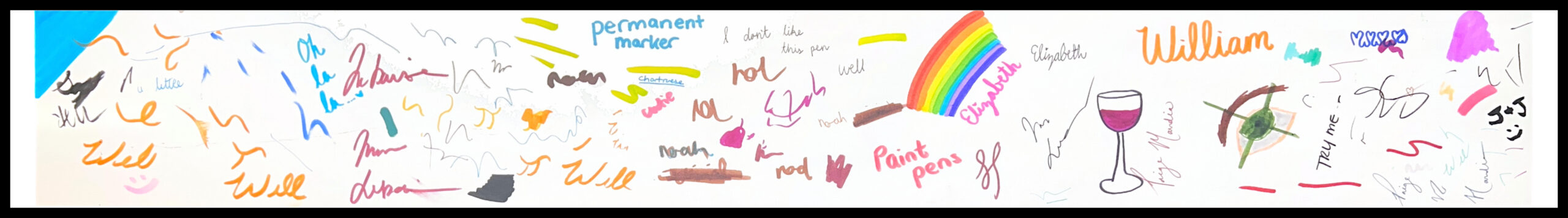
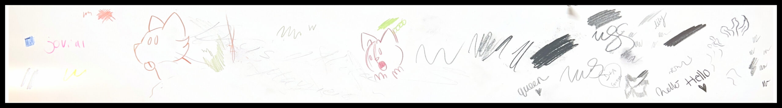
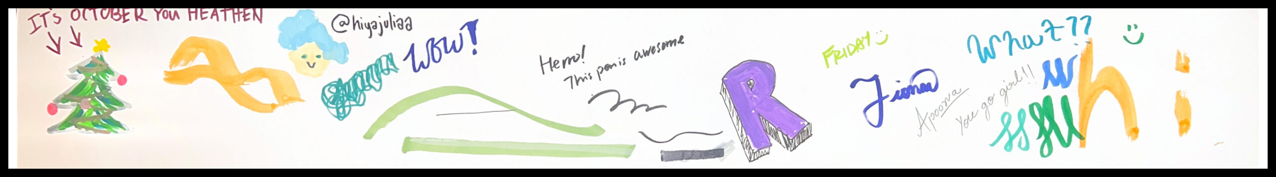
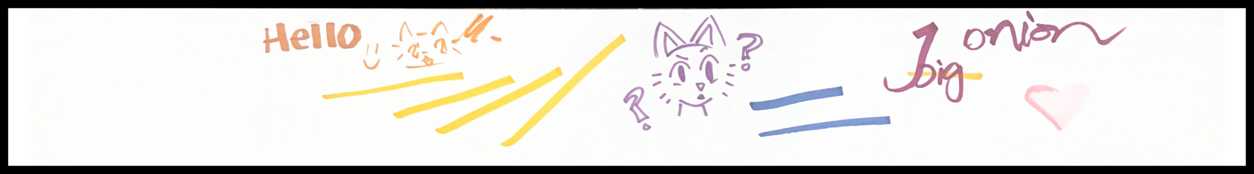
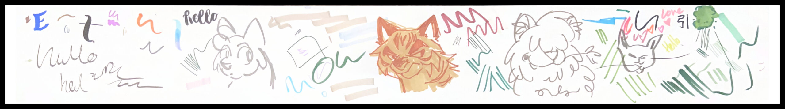
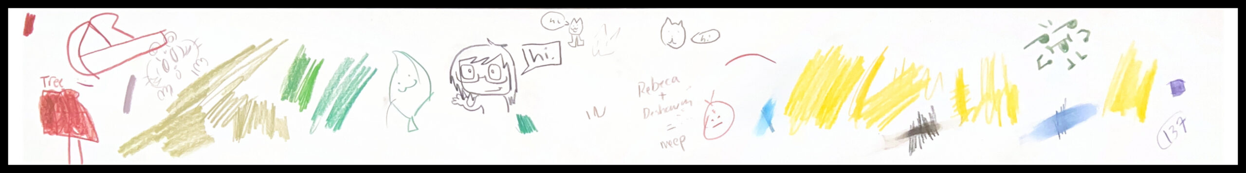
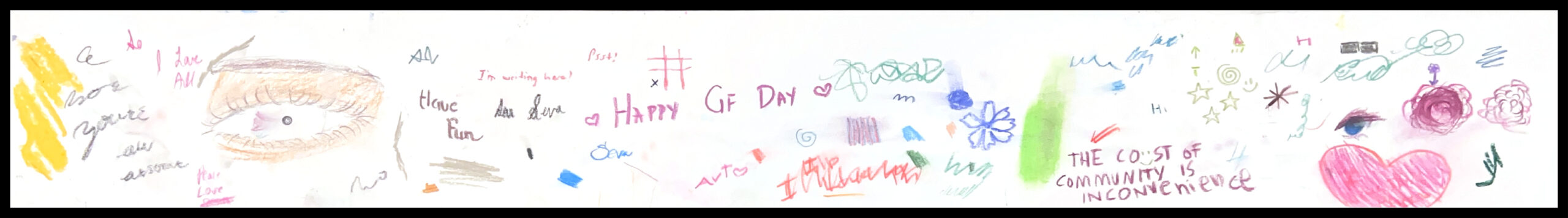
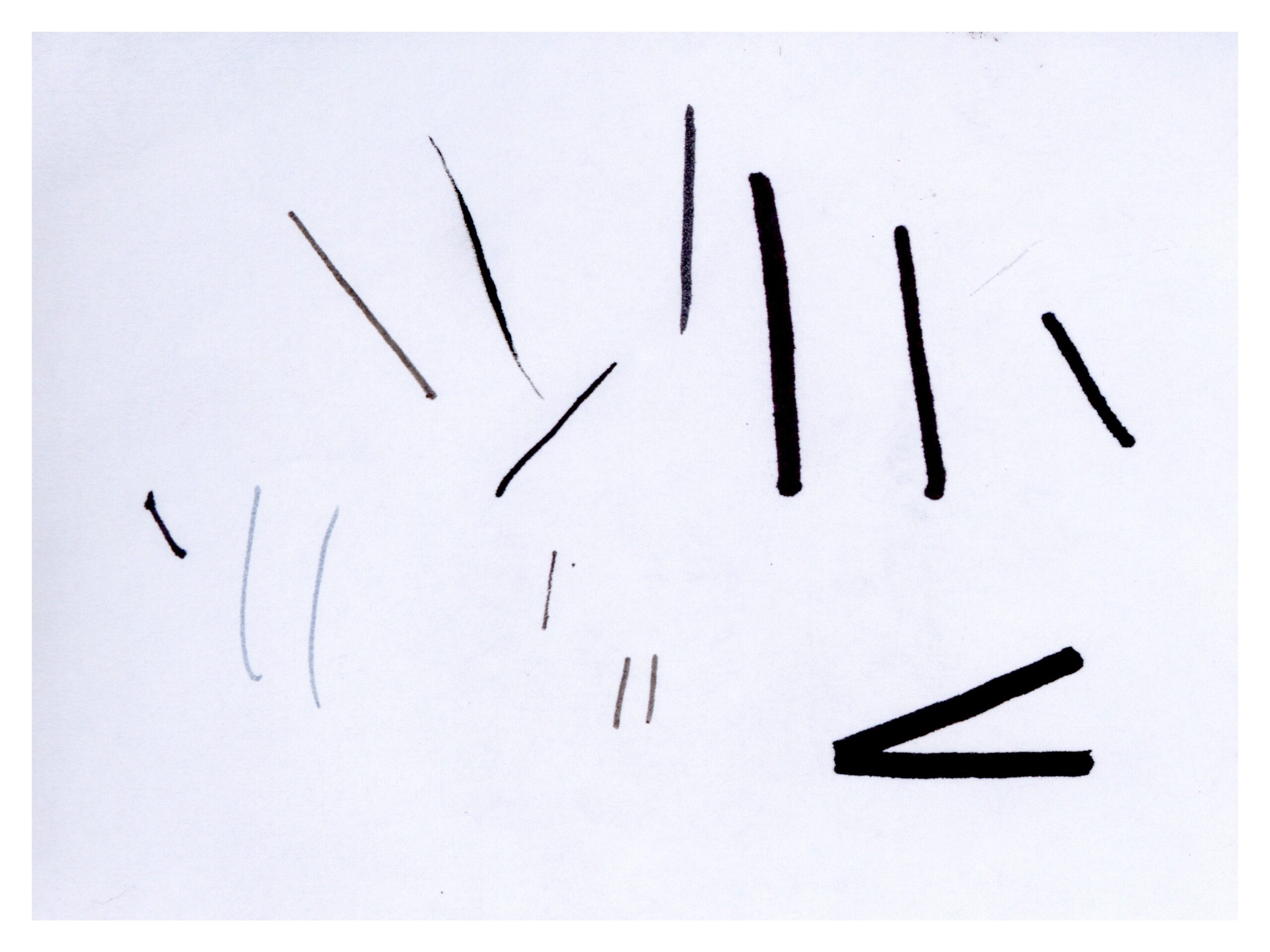
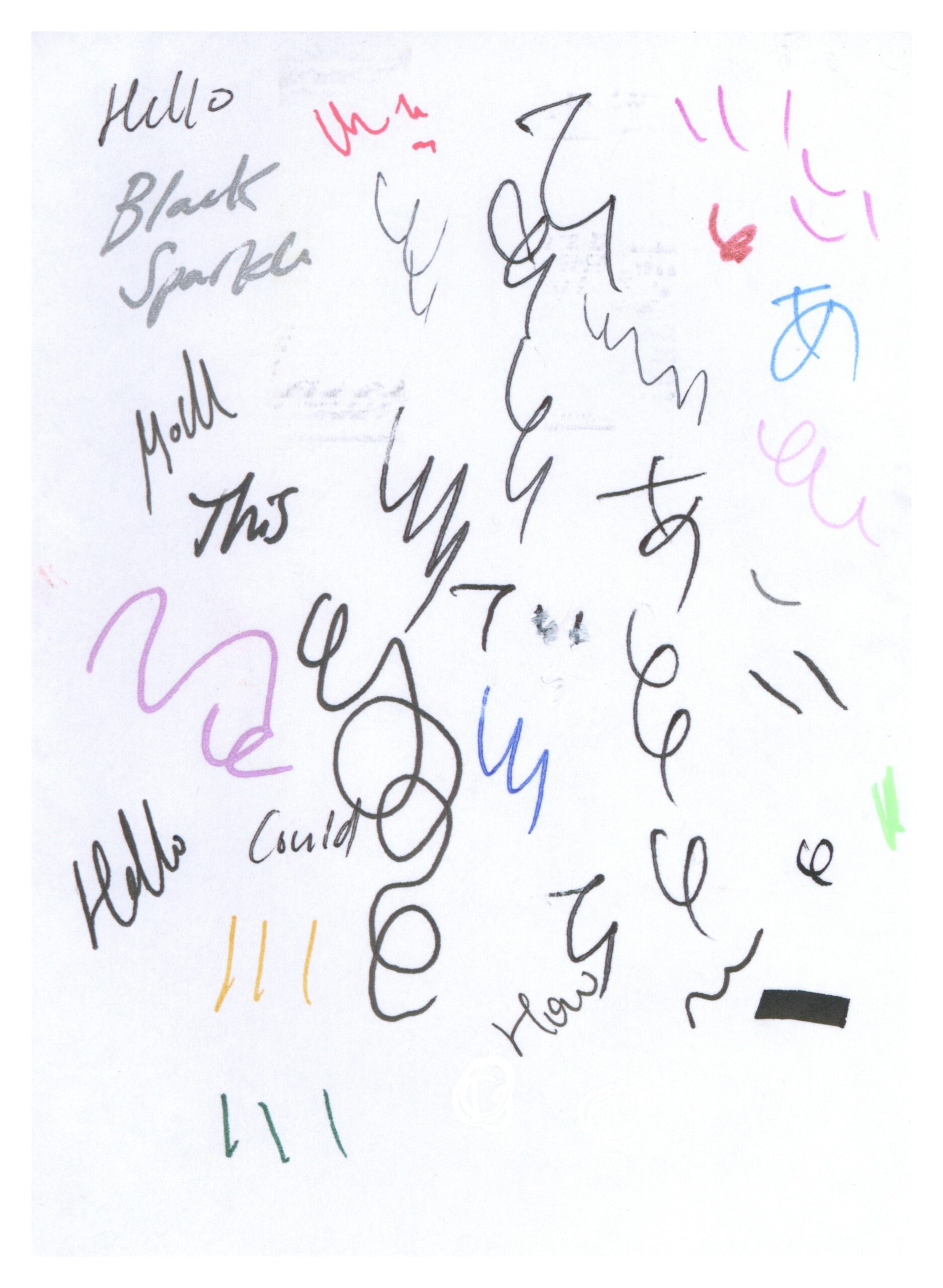
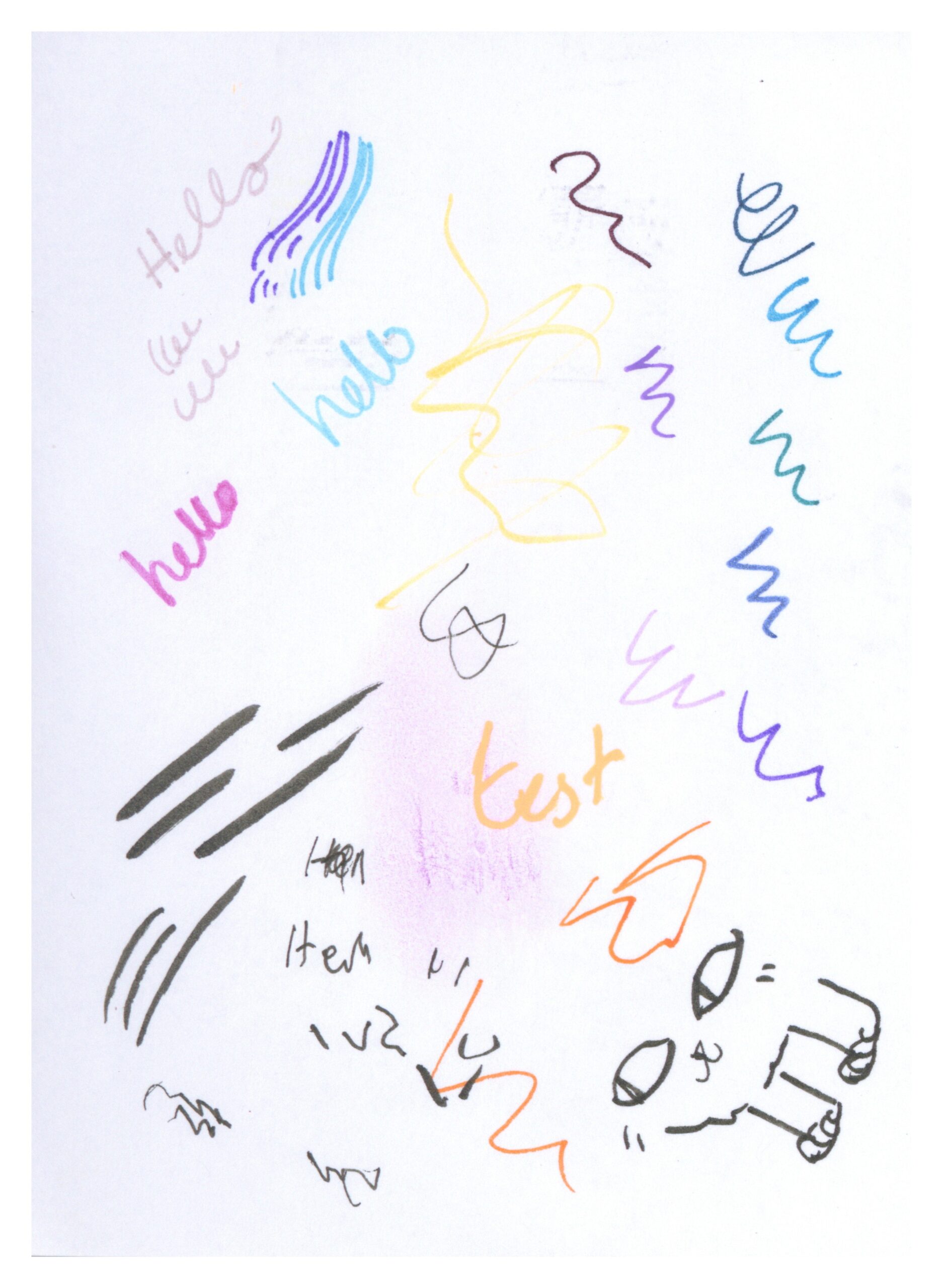
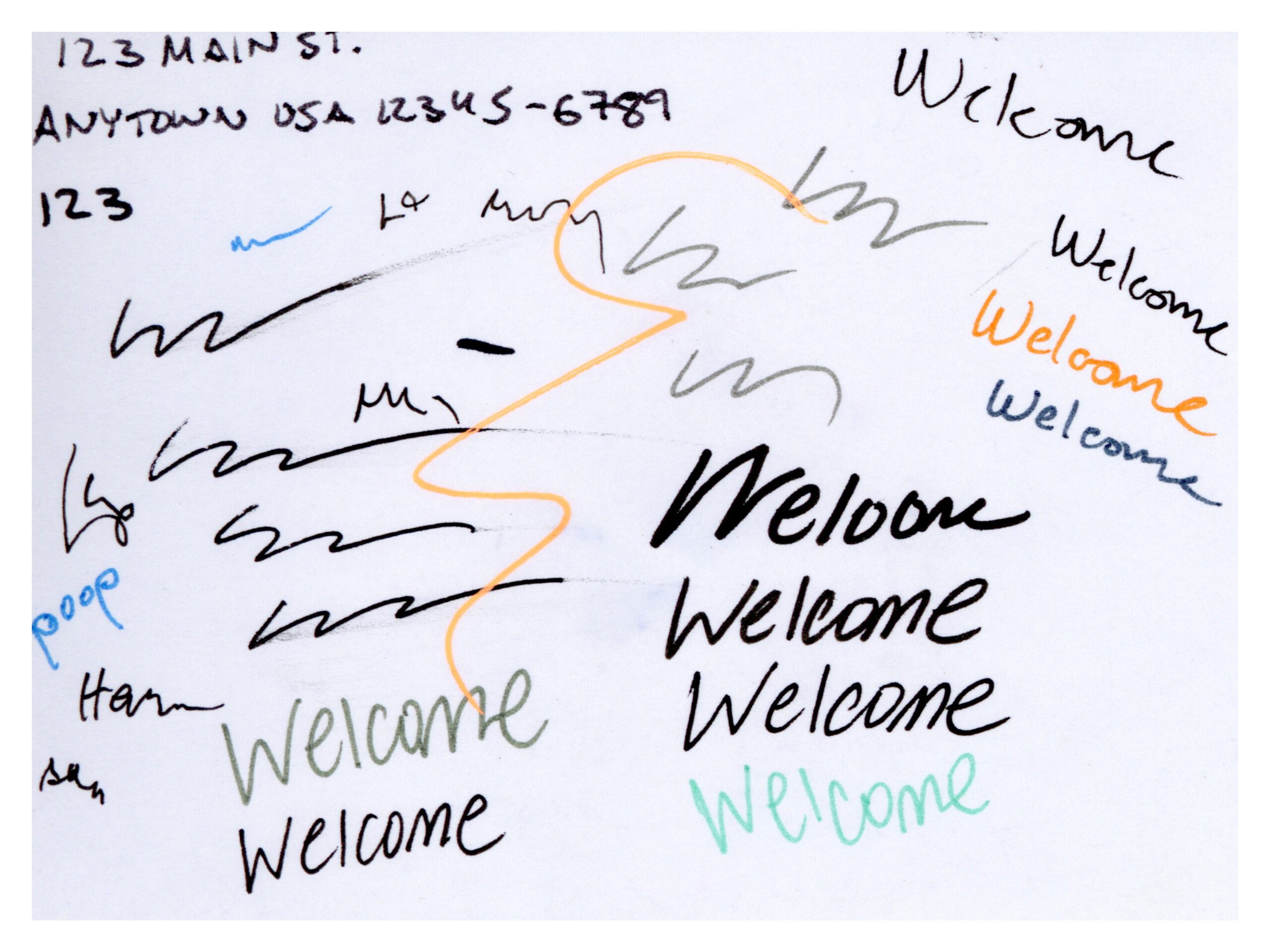
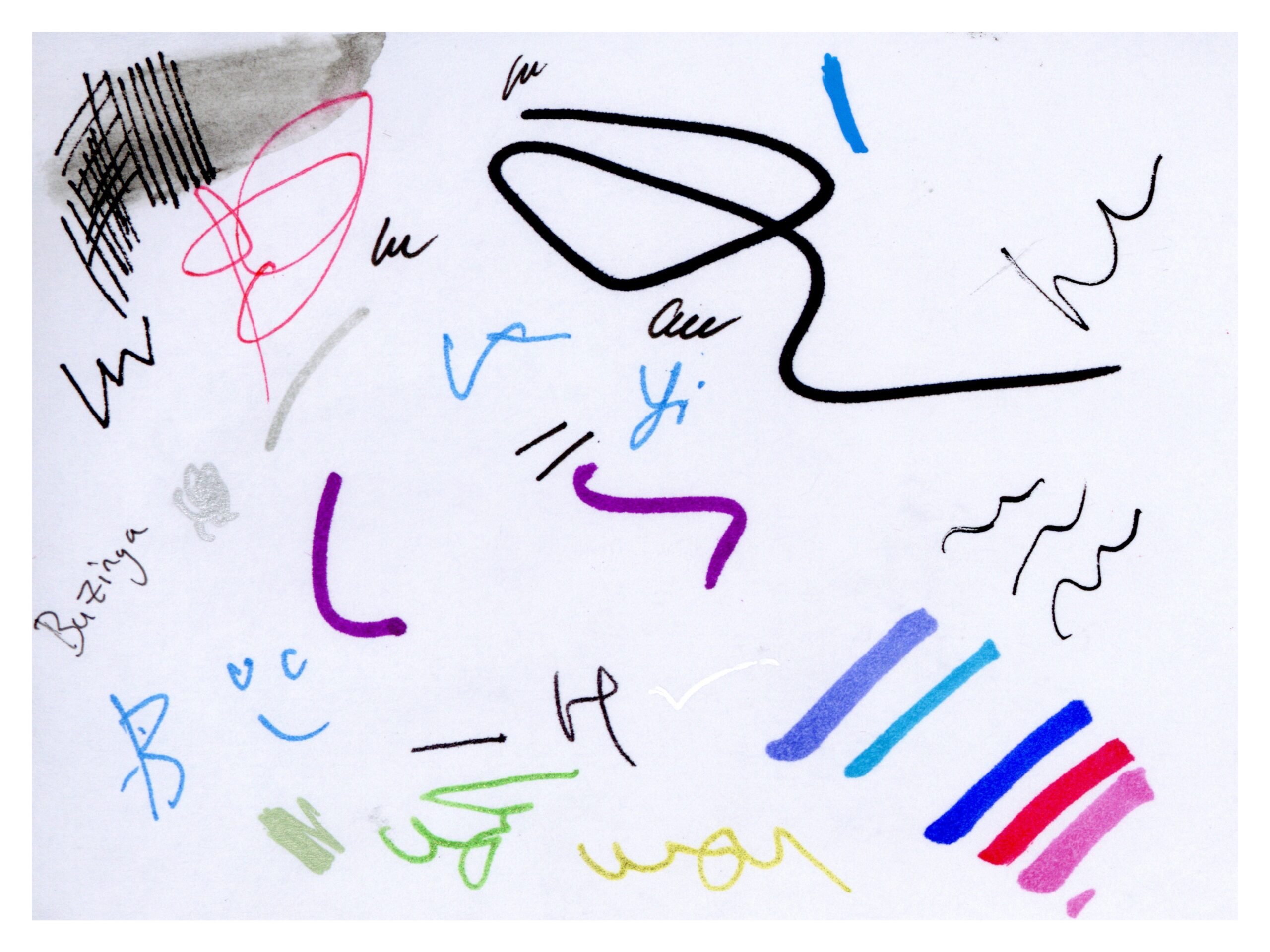
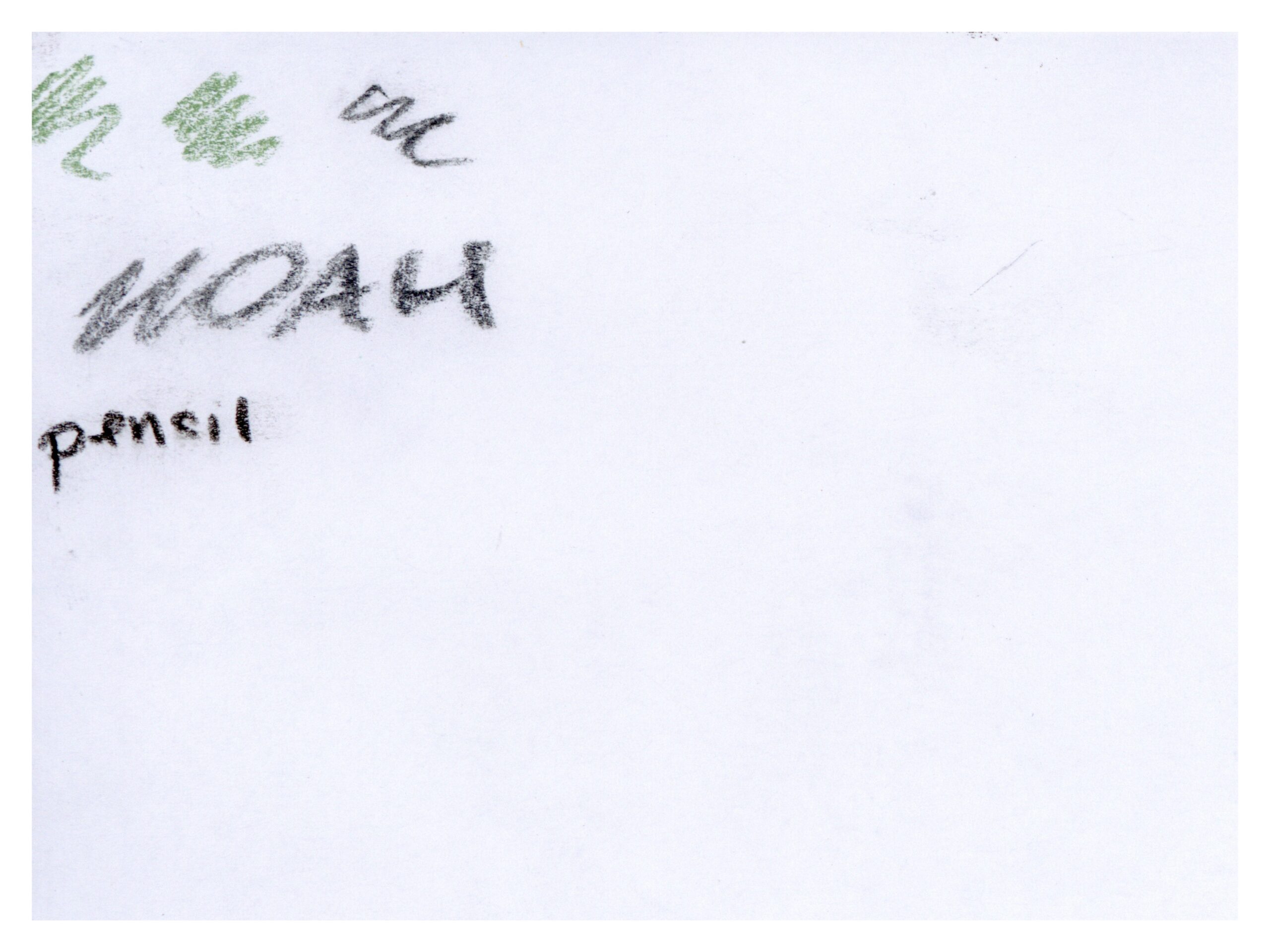
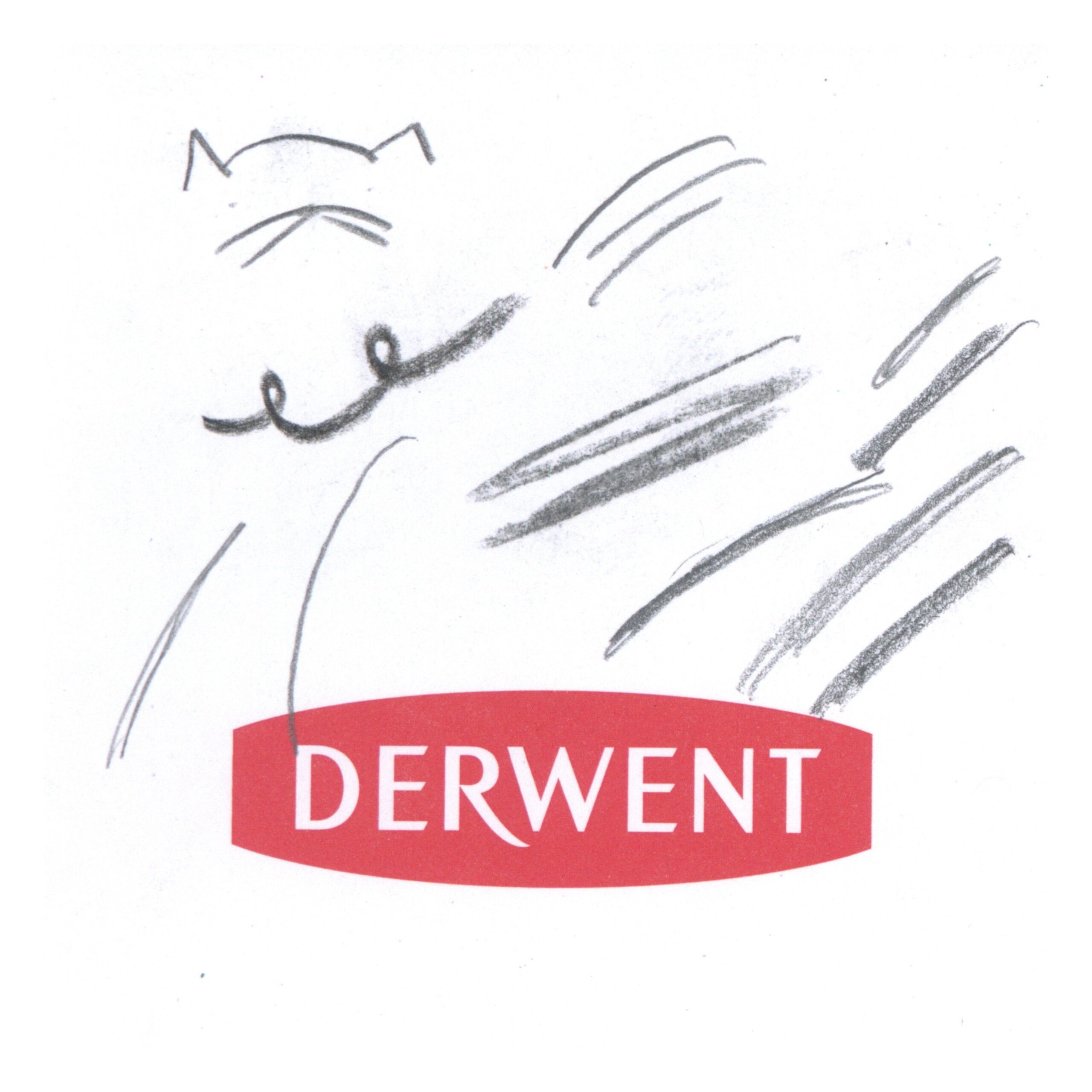
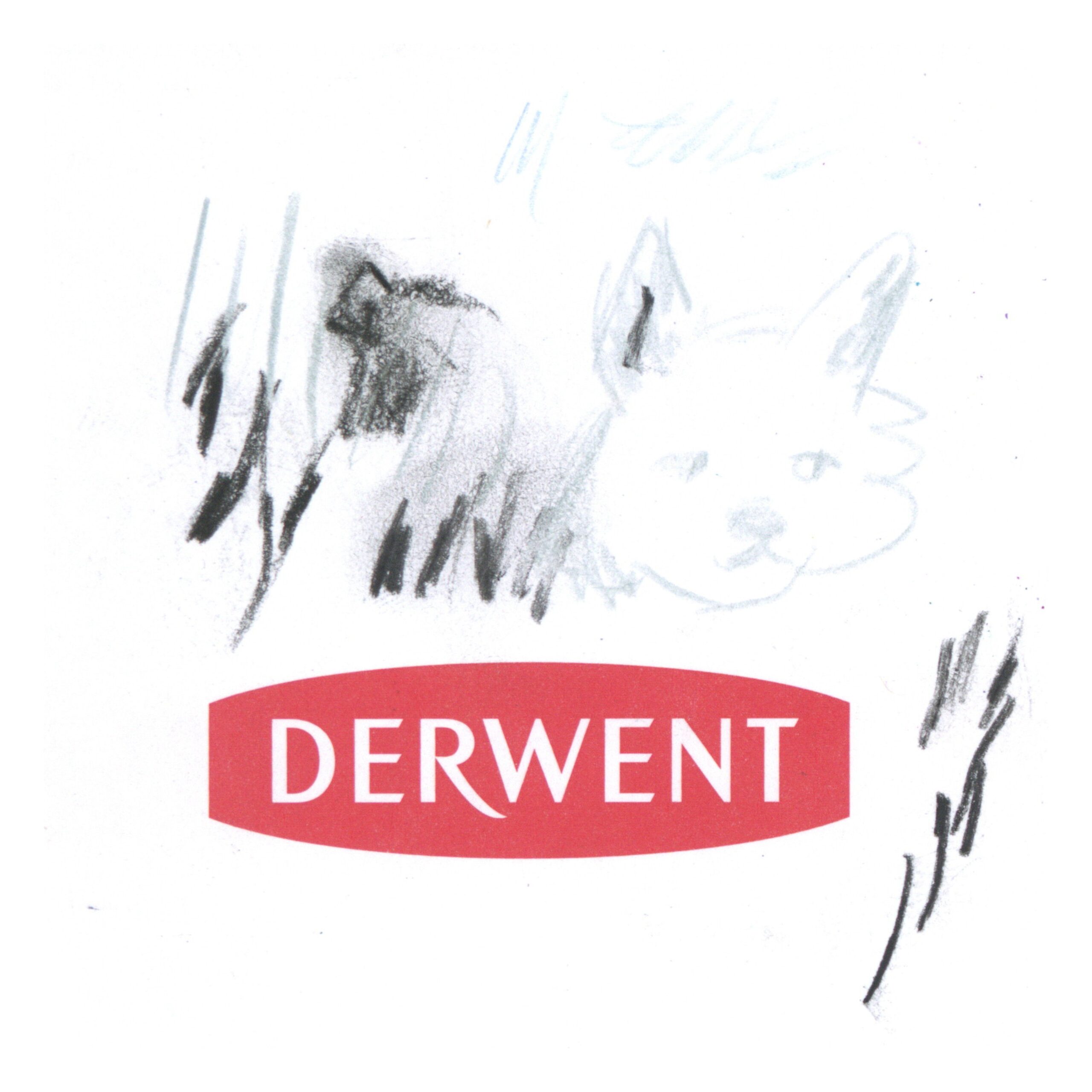
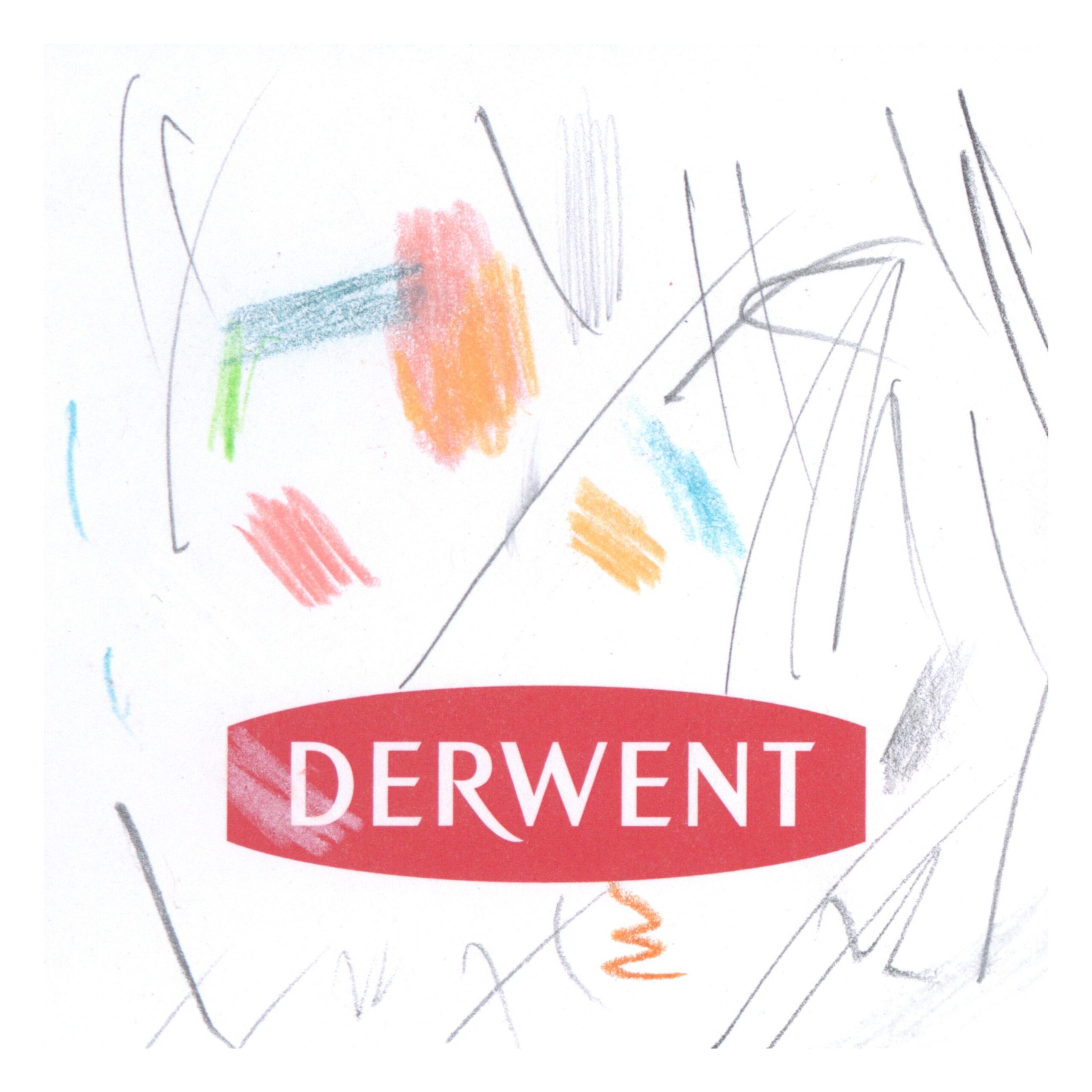
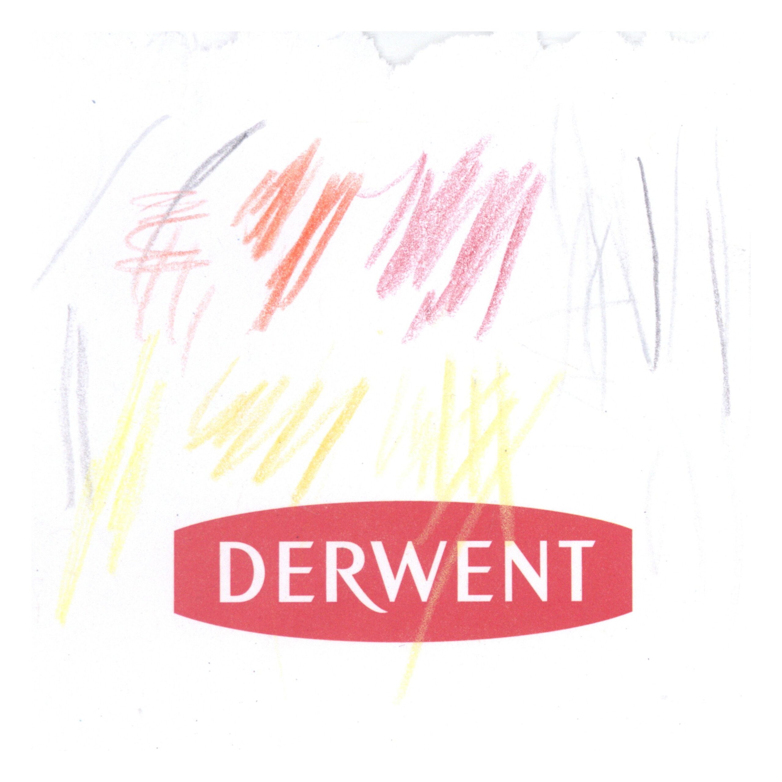
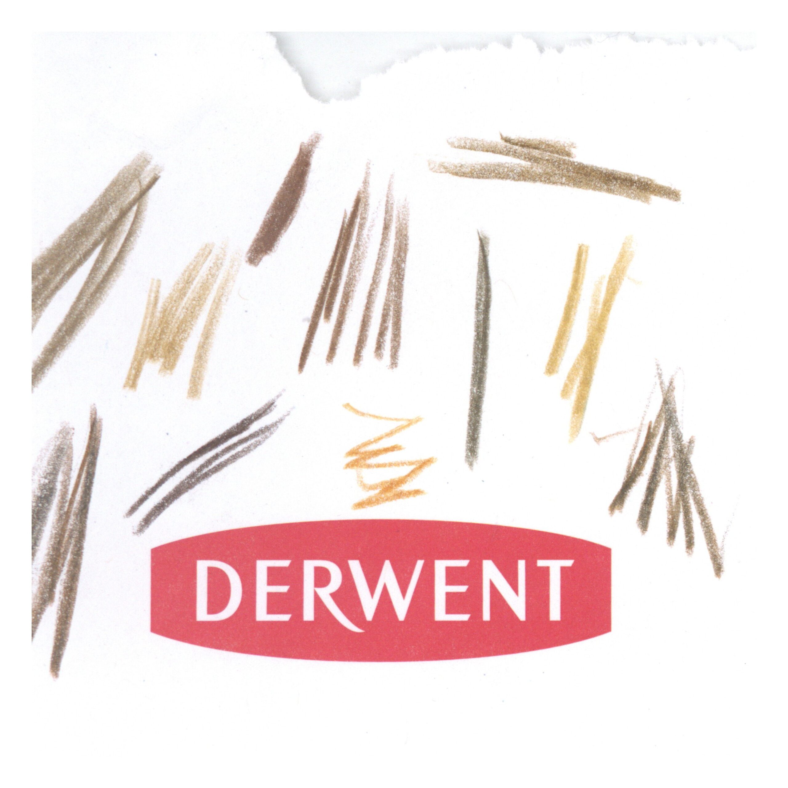
Each piece is unique, and yet as a whole they speak coherently to how we draw lines and express ourselves when given a blank canvas and no rules. We learn what people do when required to draw something, but given no direction at all in what that is. We see many scribbles, but we also see hearts, and smiley faces, greetings and names.
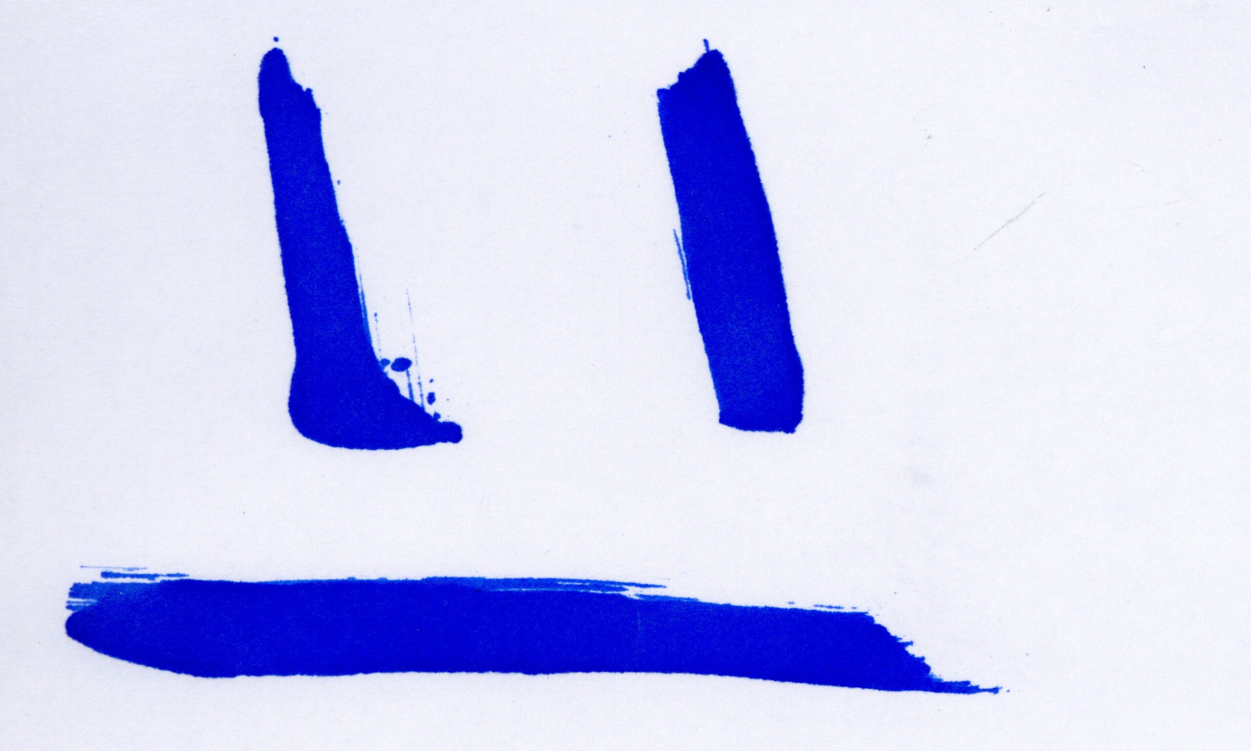
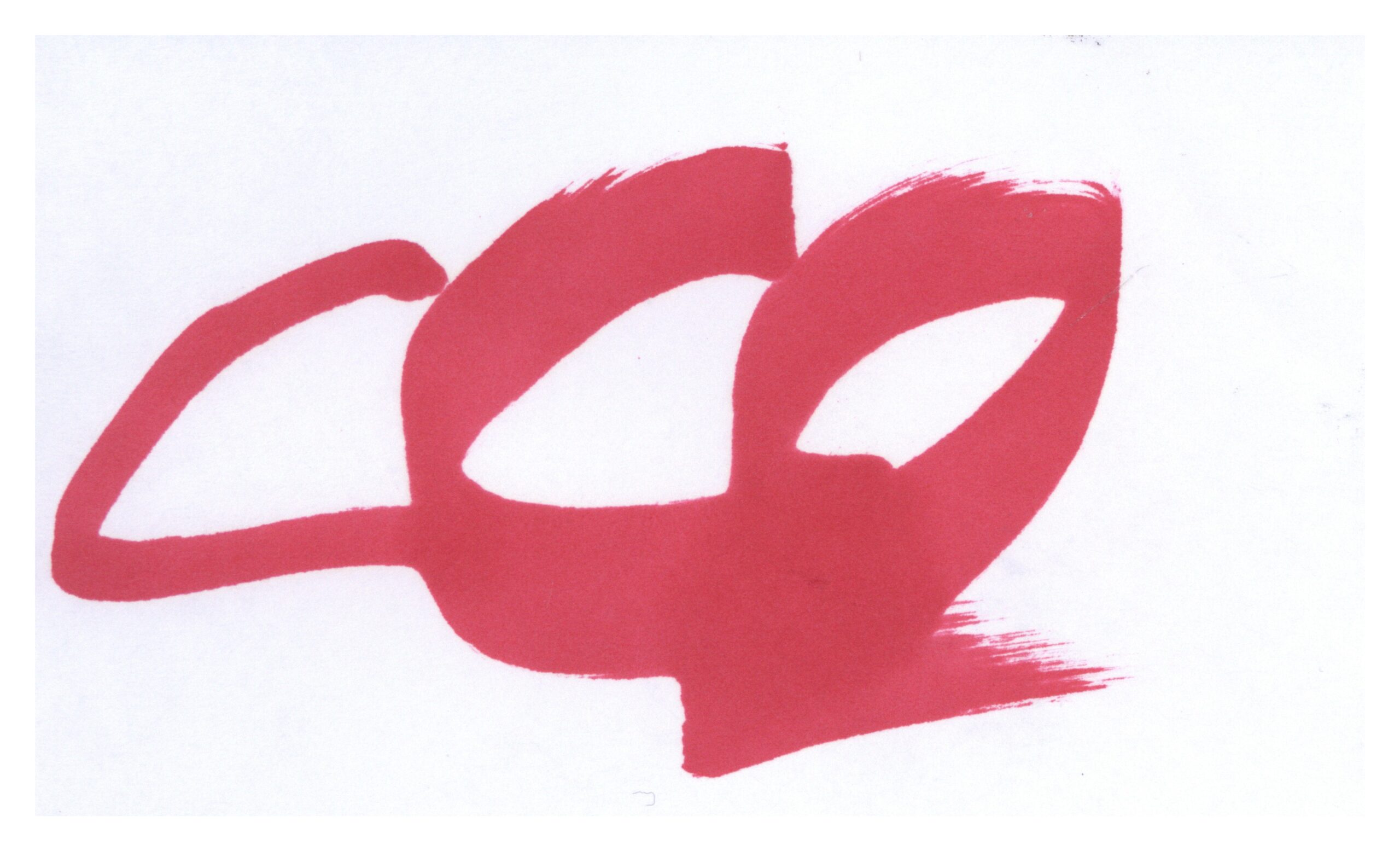
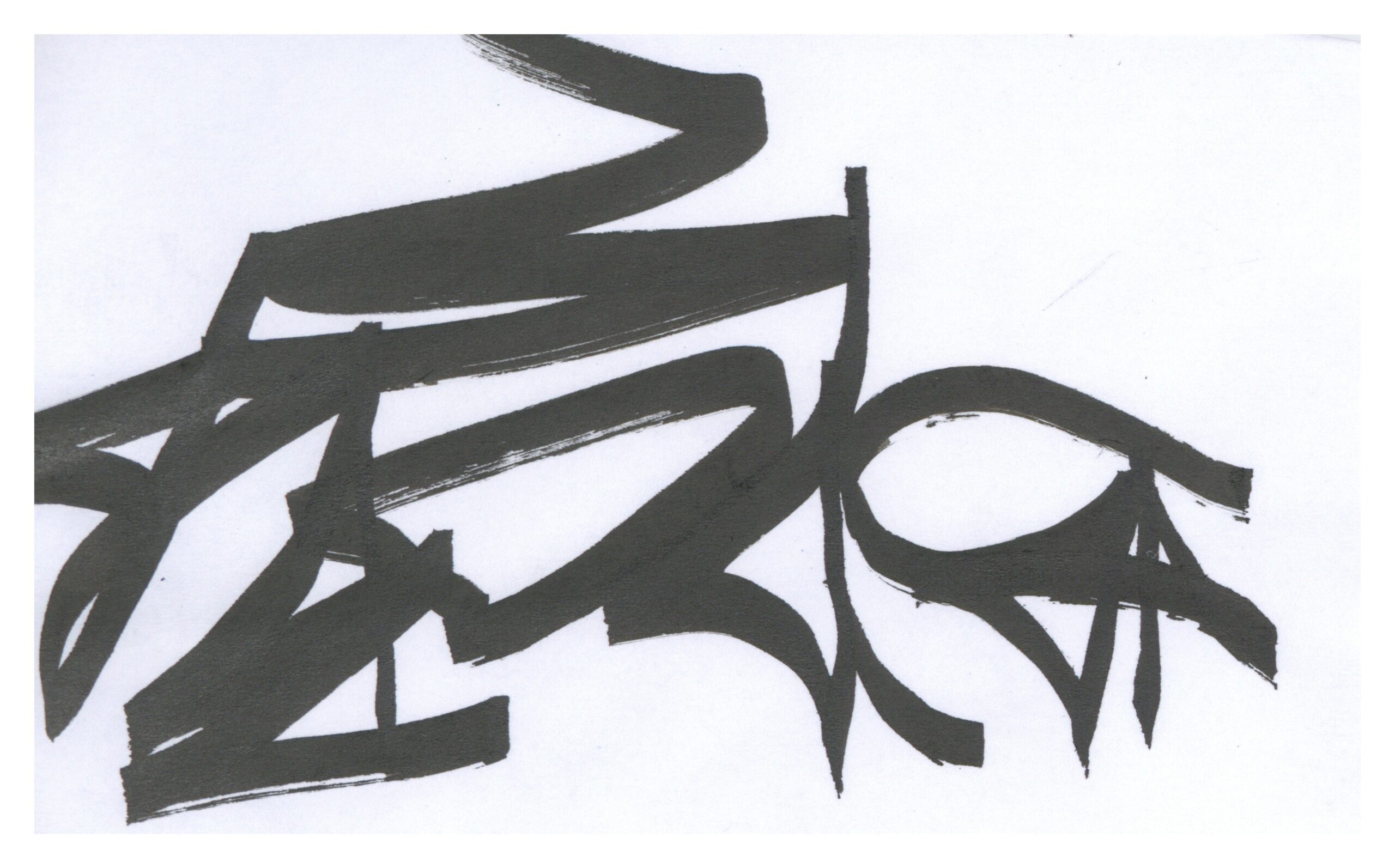
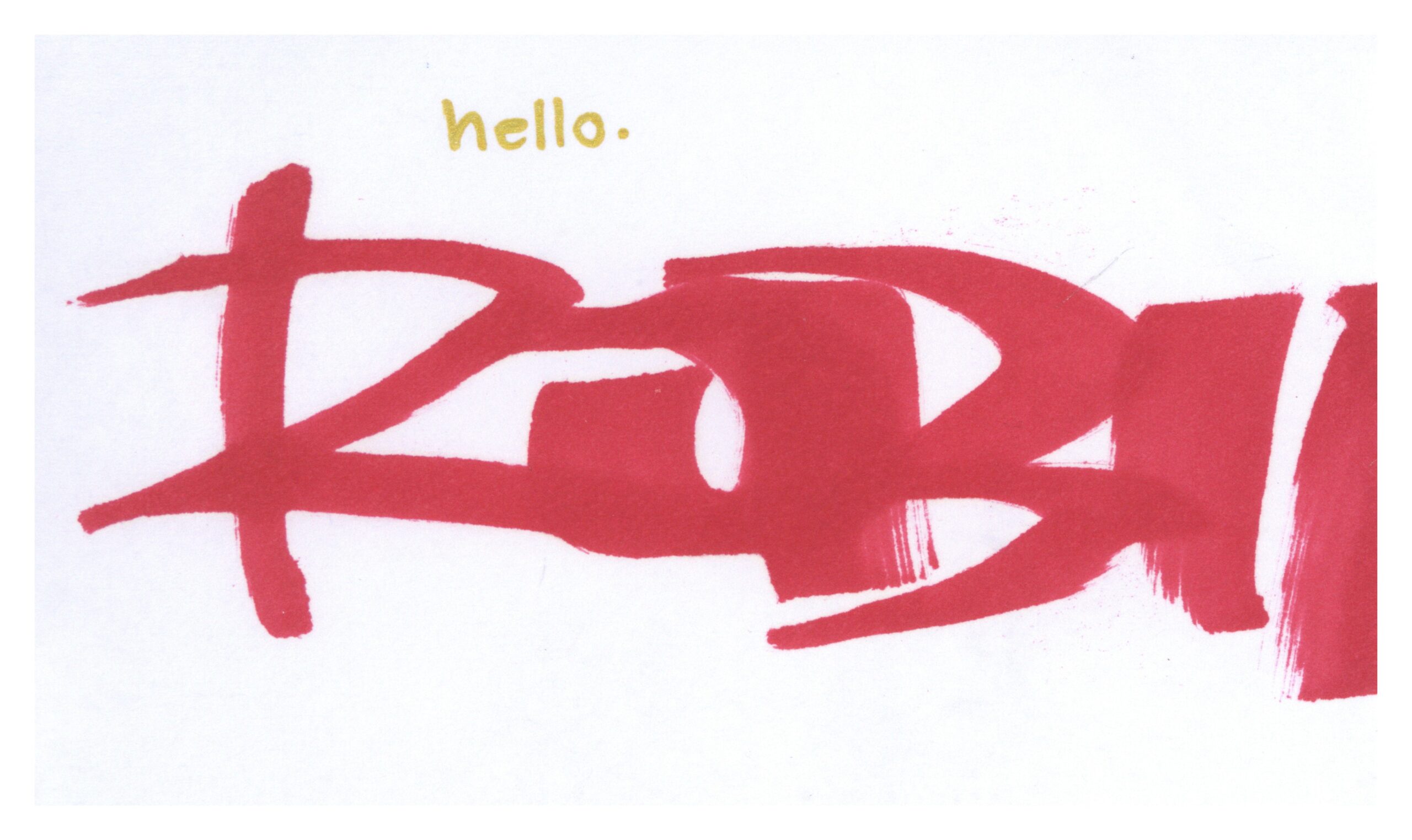
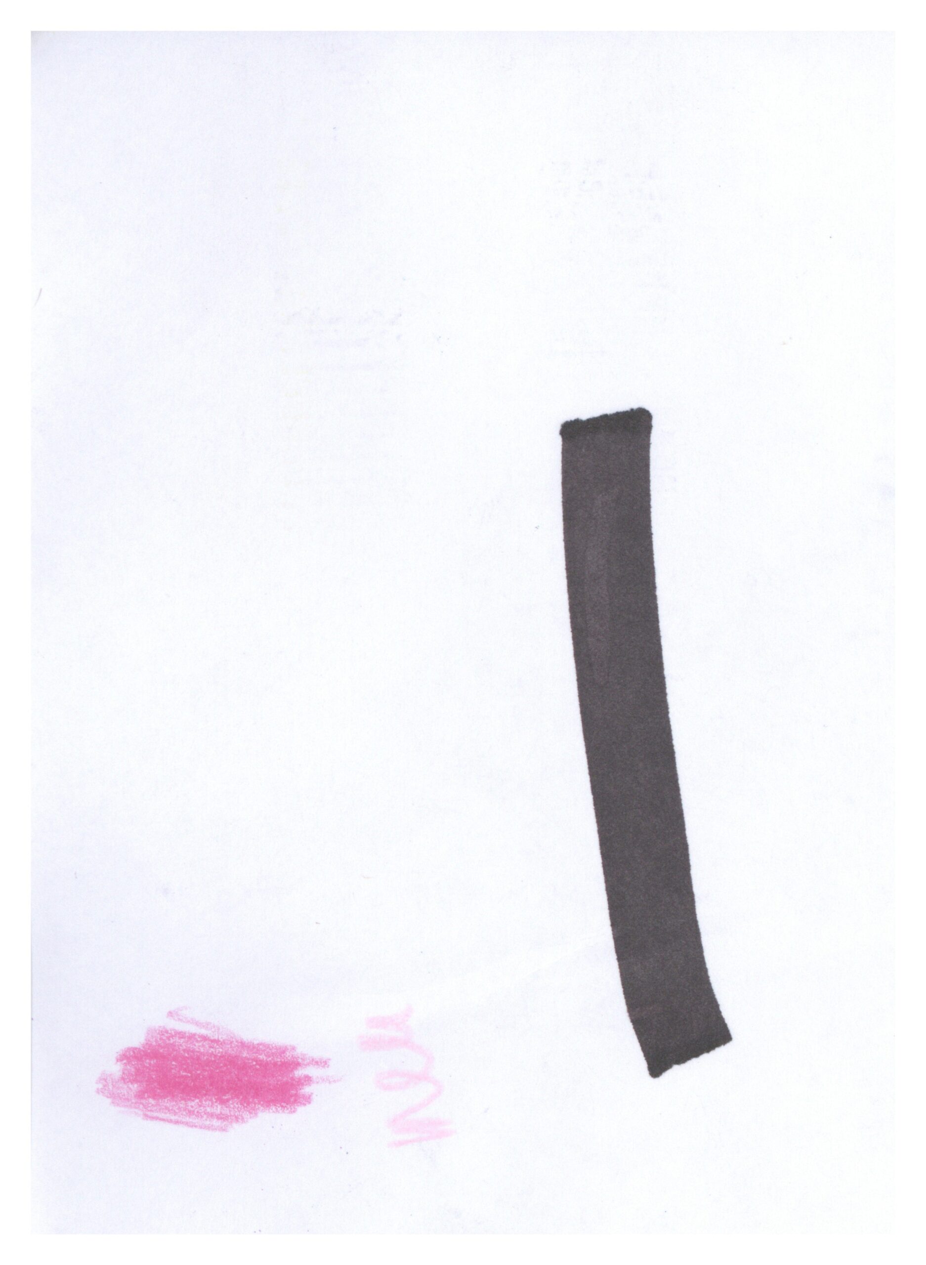
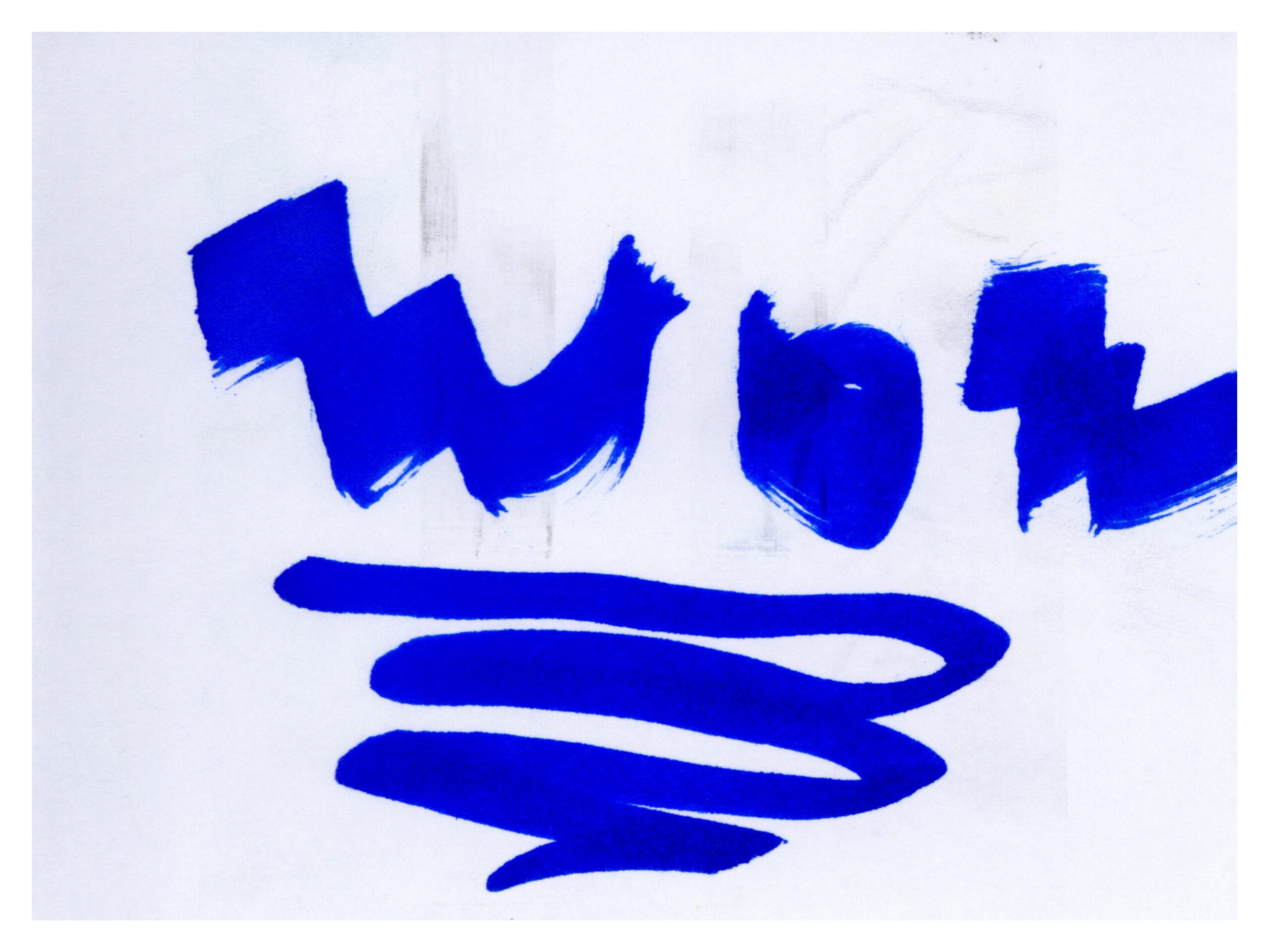
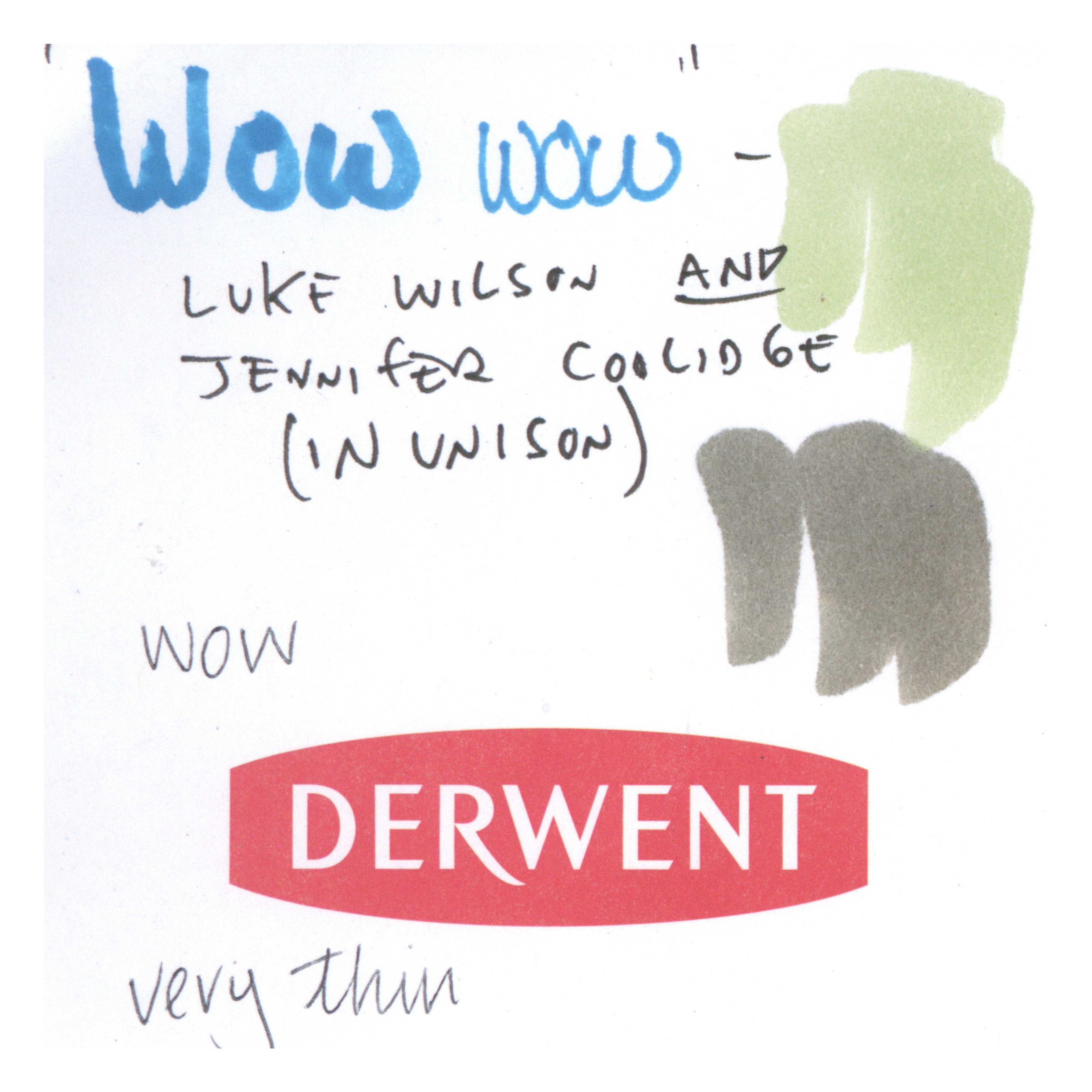
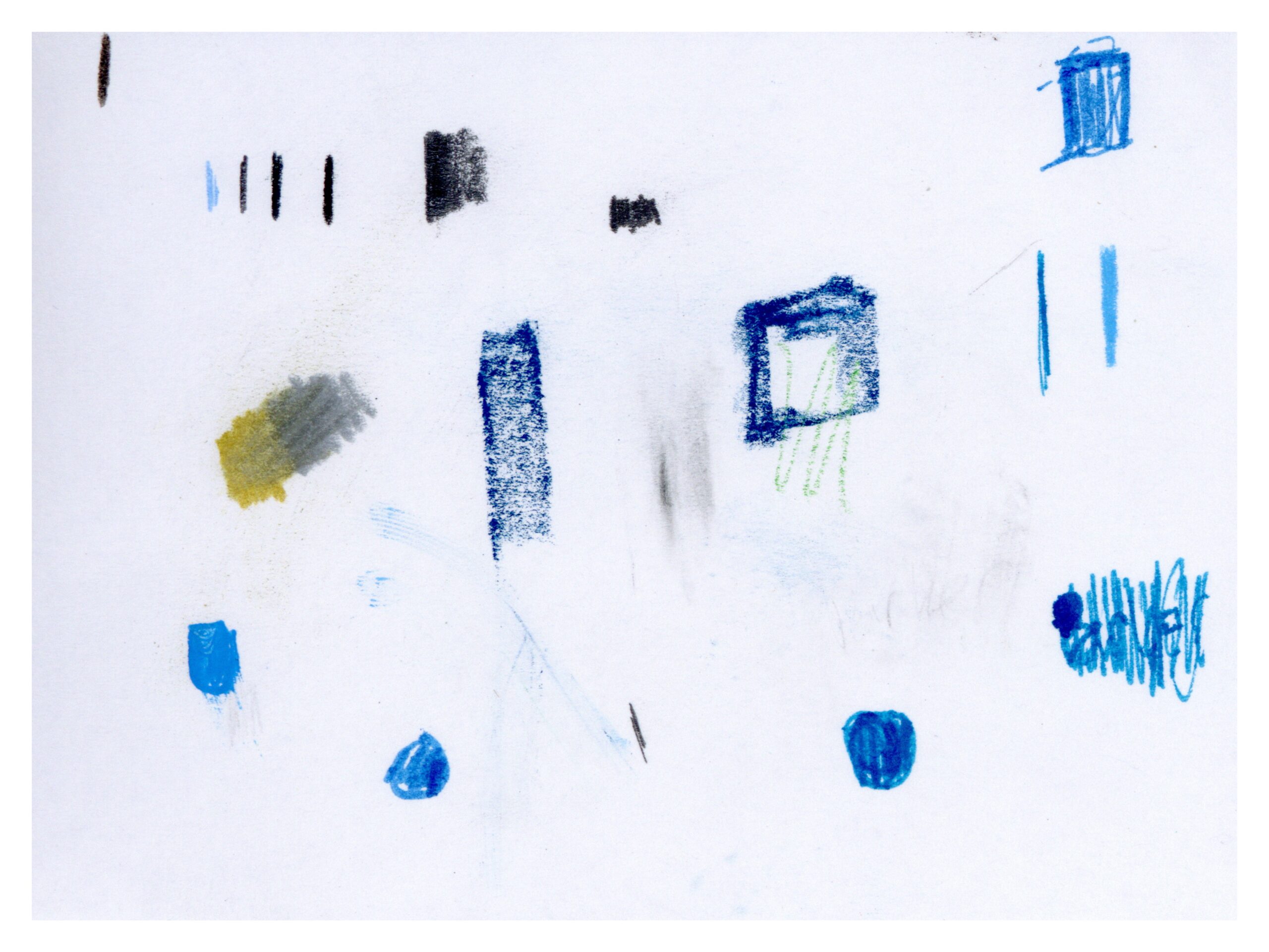
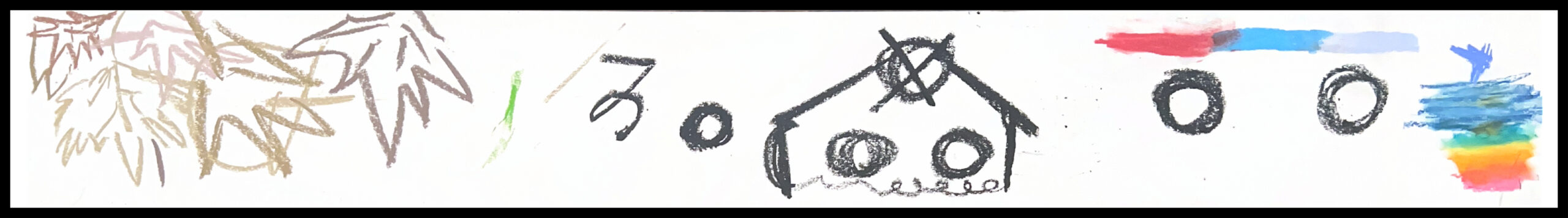
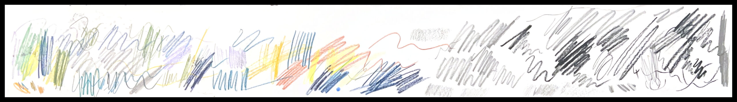
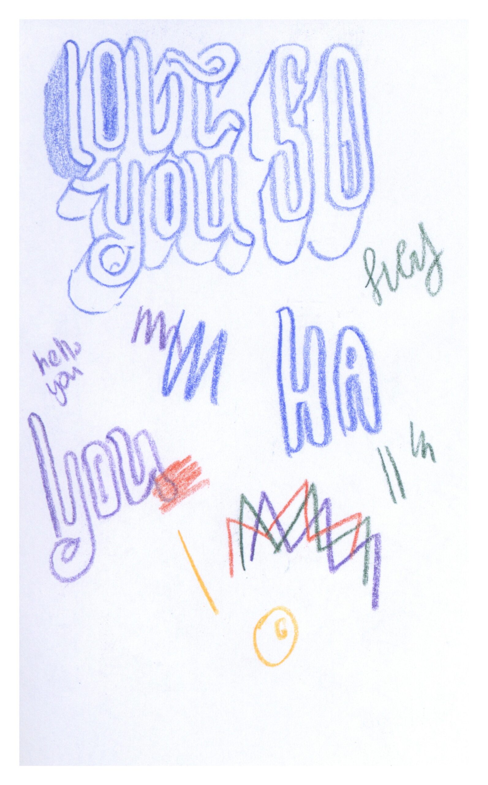
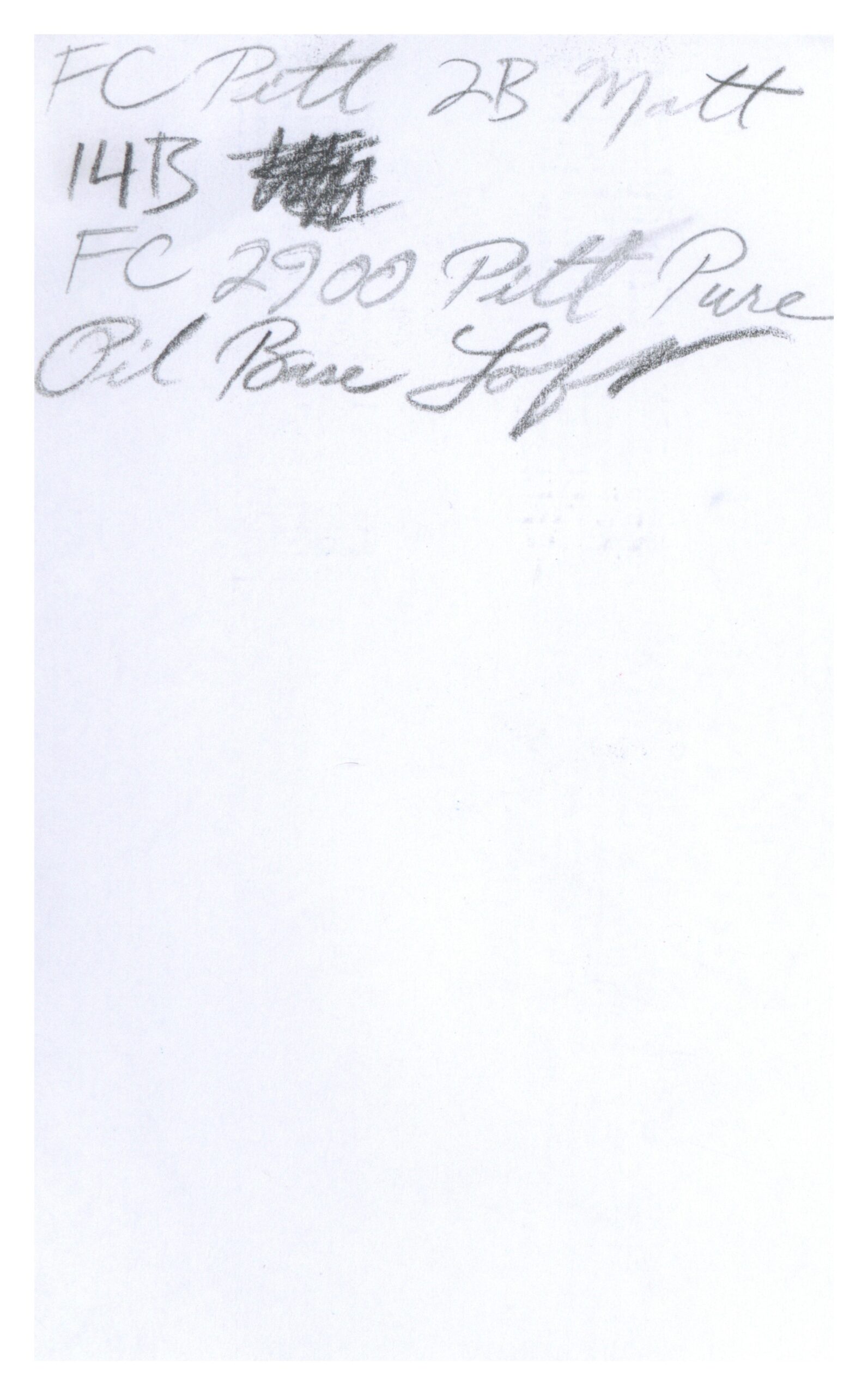
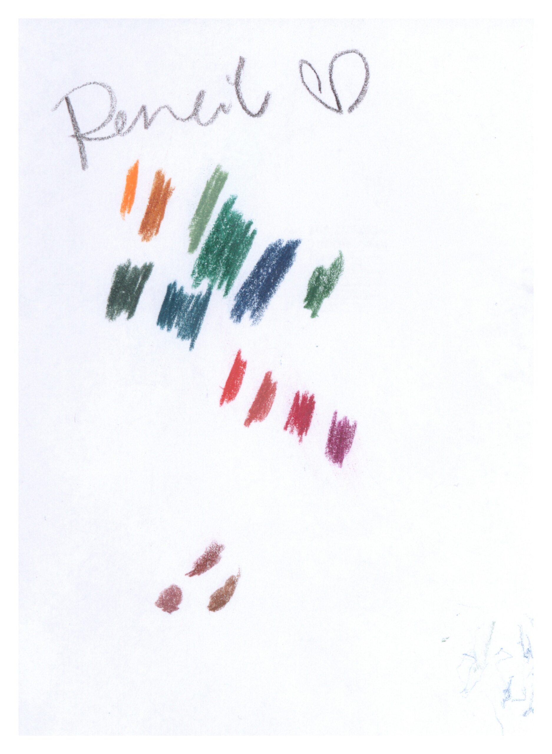
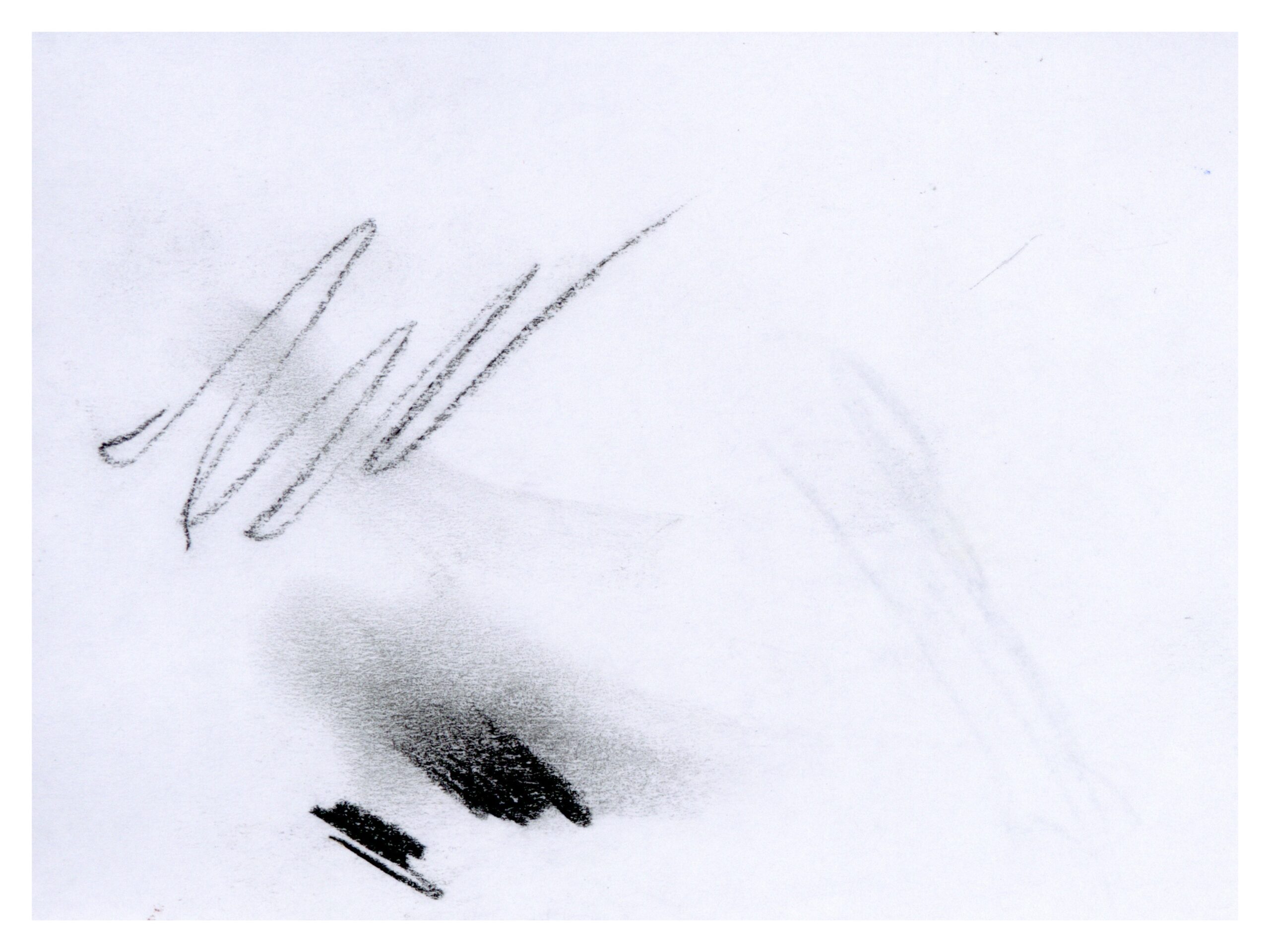
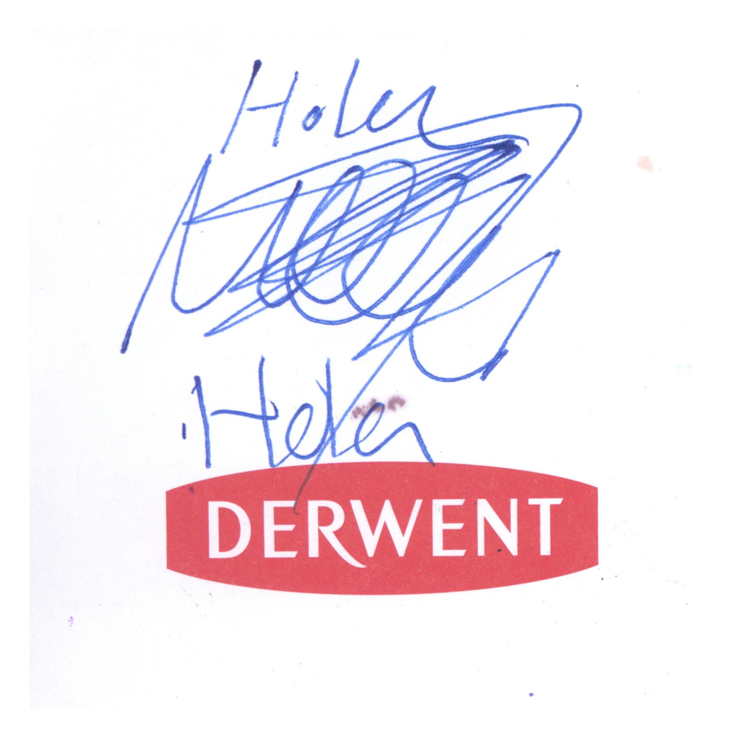
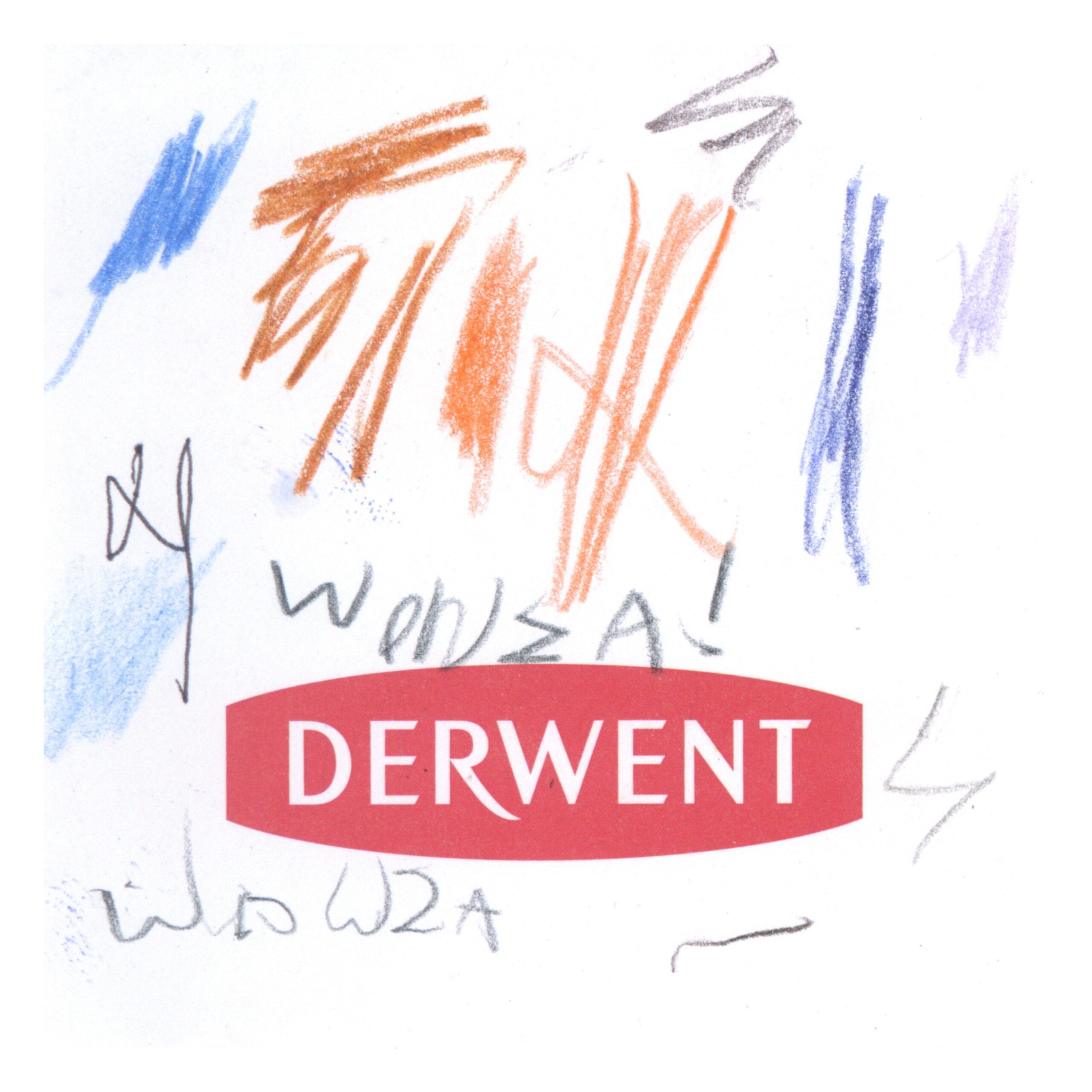
Perhaps the type that jumps out first are the big pens. Large, bold lines, often with a single icon taking up the whole page, almost intimidating other potential authors from that page. Whenever I saw one of these at Blick, I knew to check the scratch page below it, as other, less bold marks would take refuge there from these brash strokes.
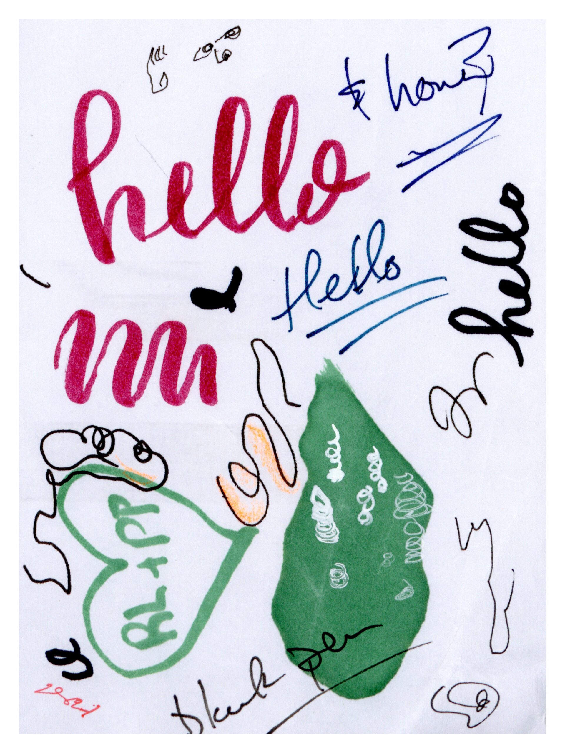
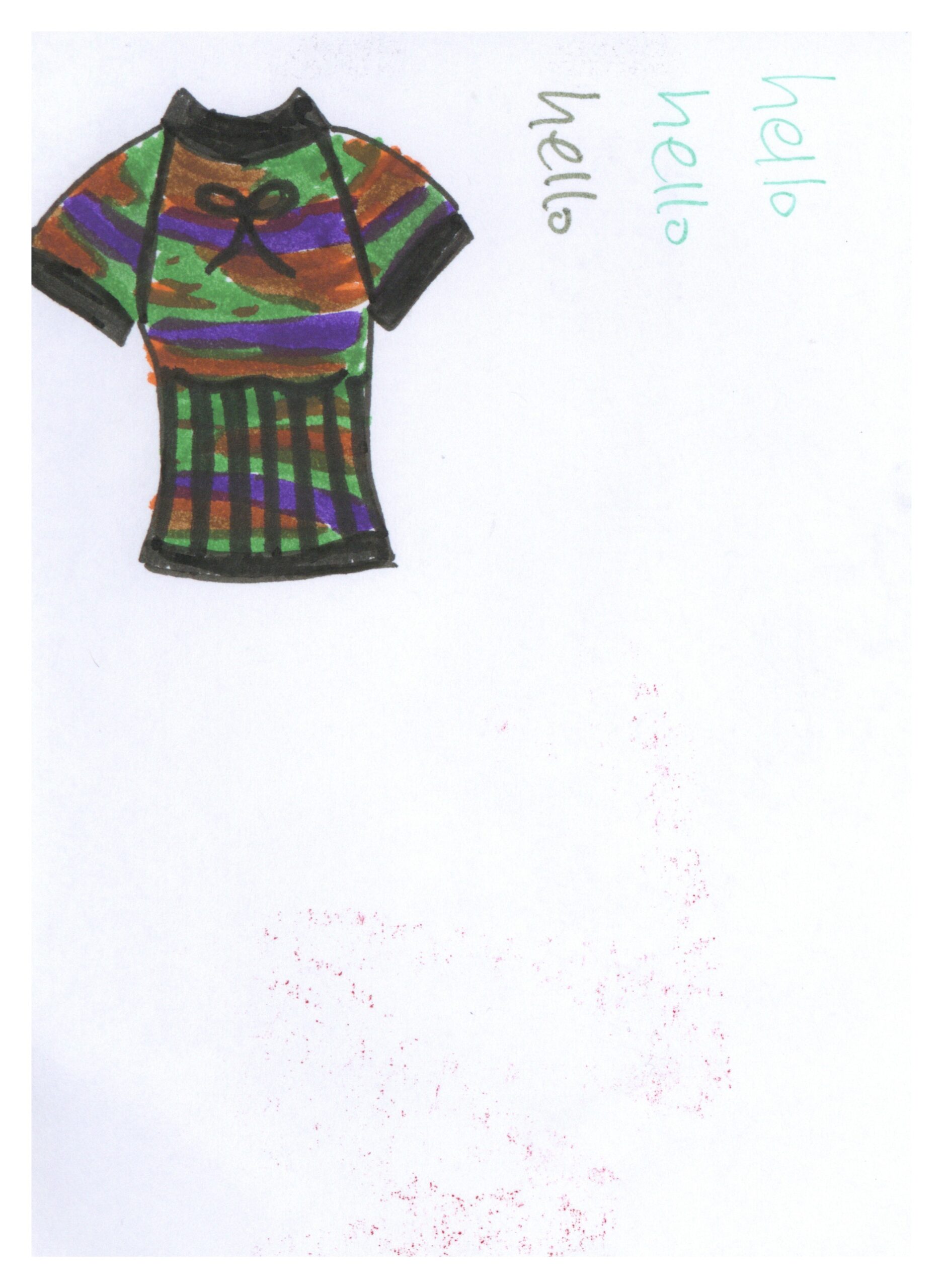
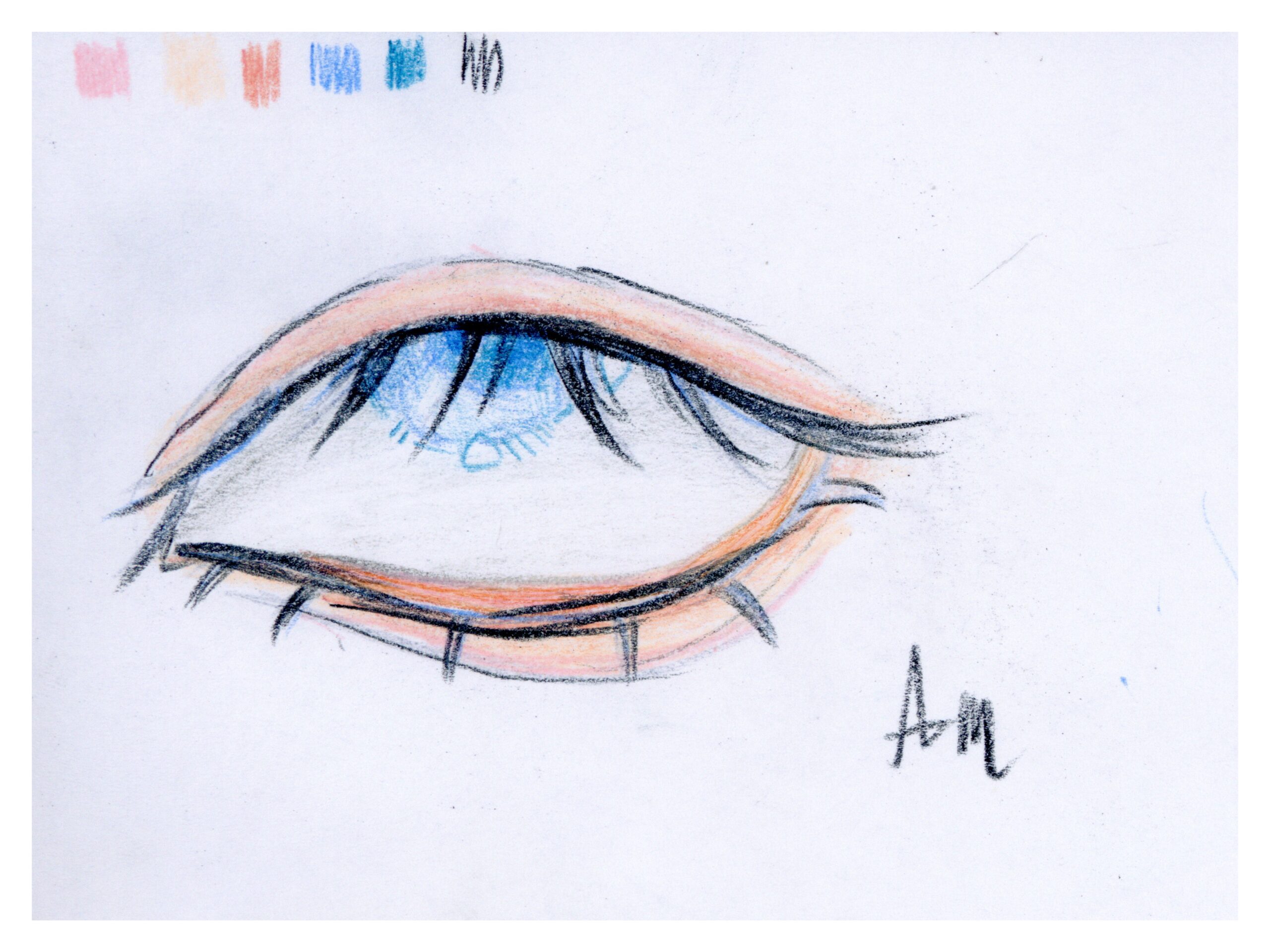
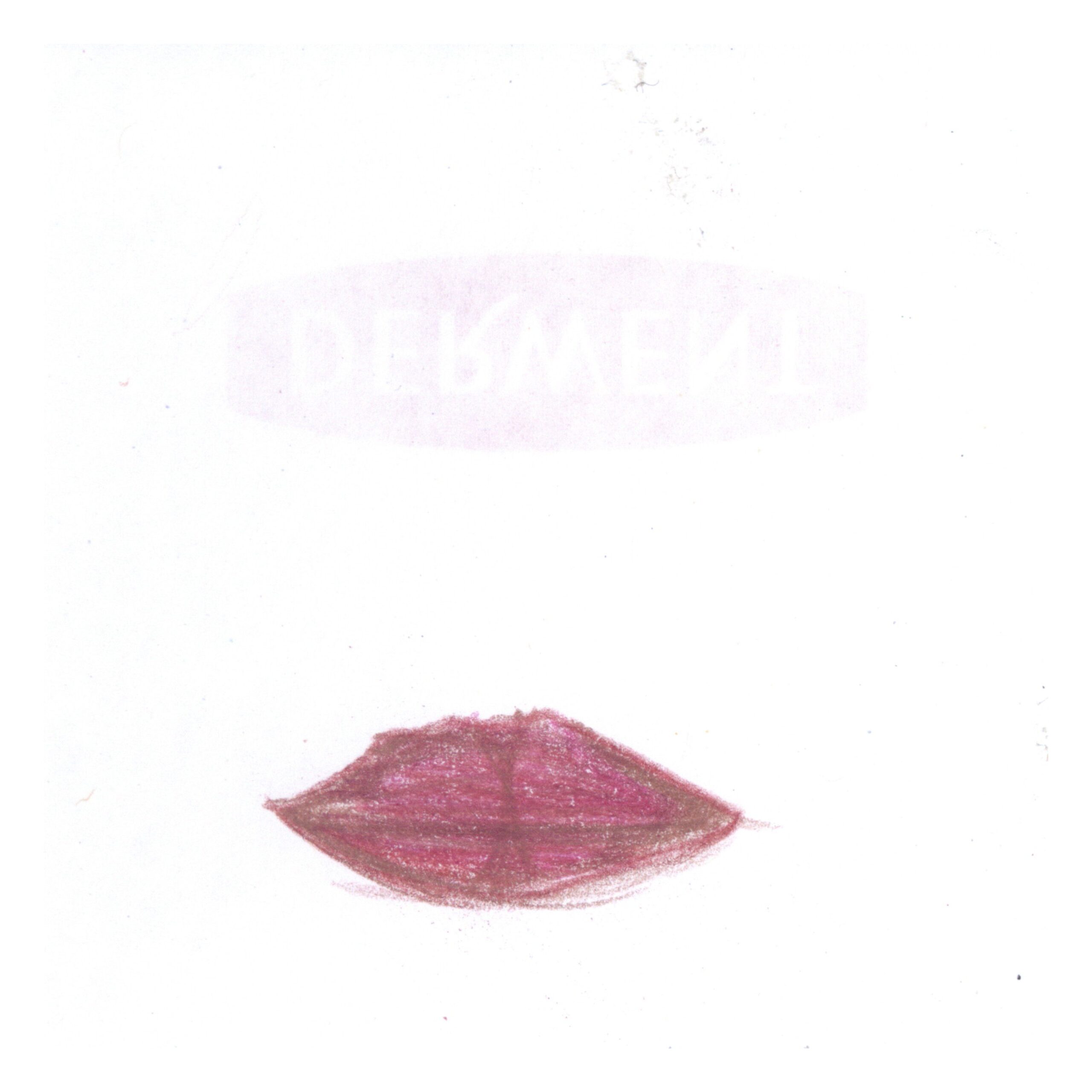
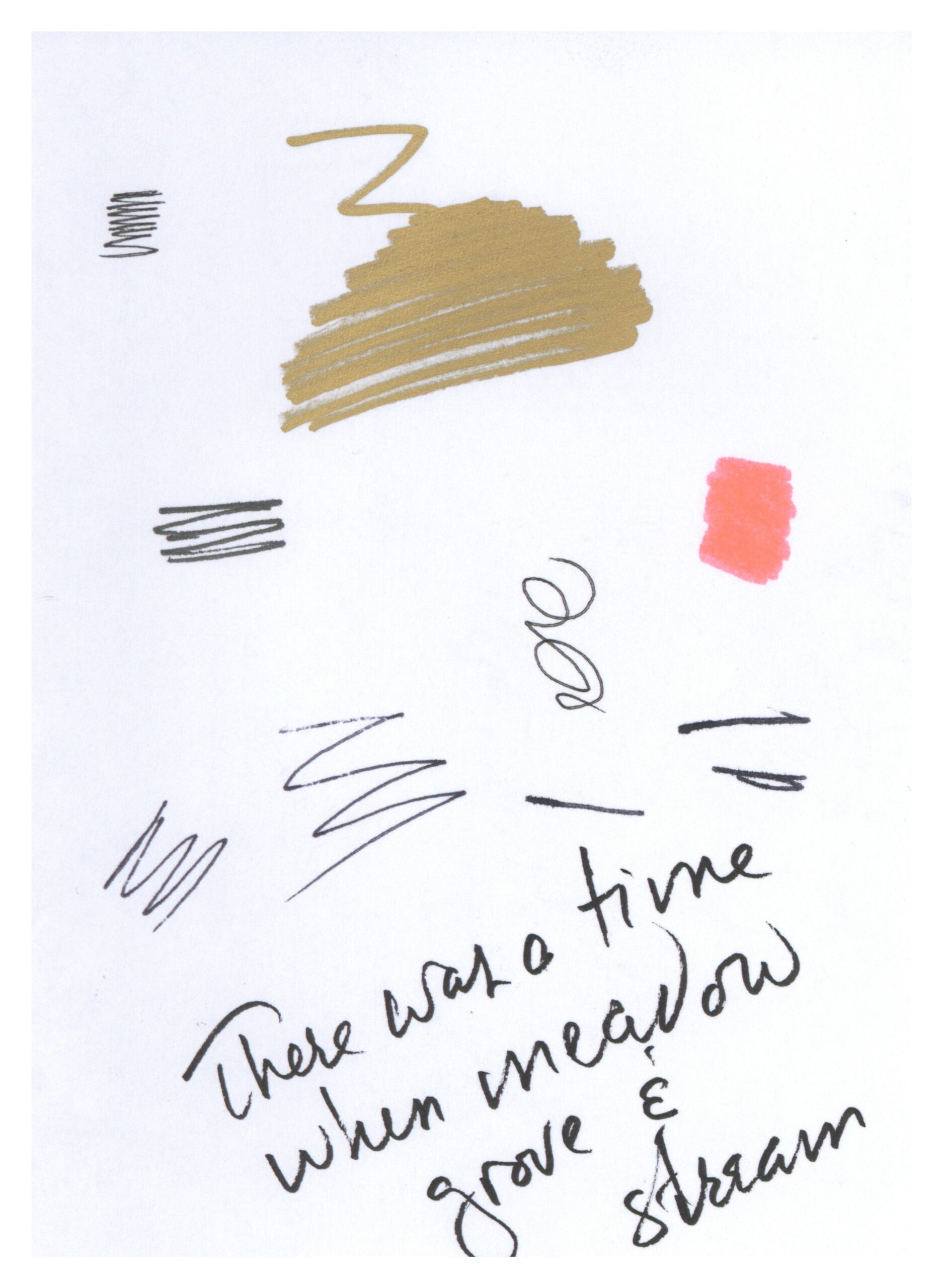
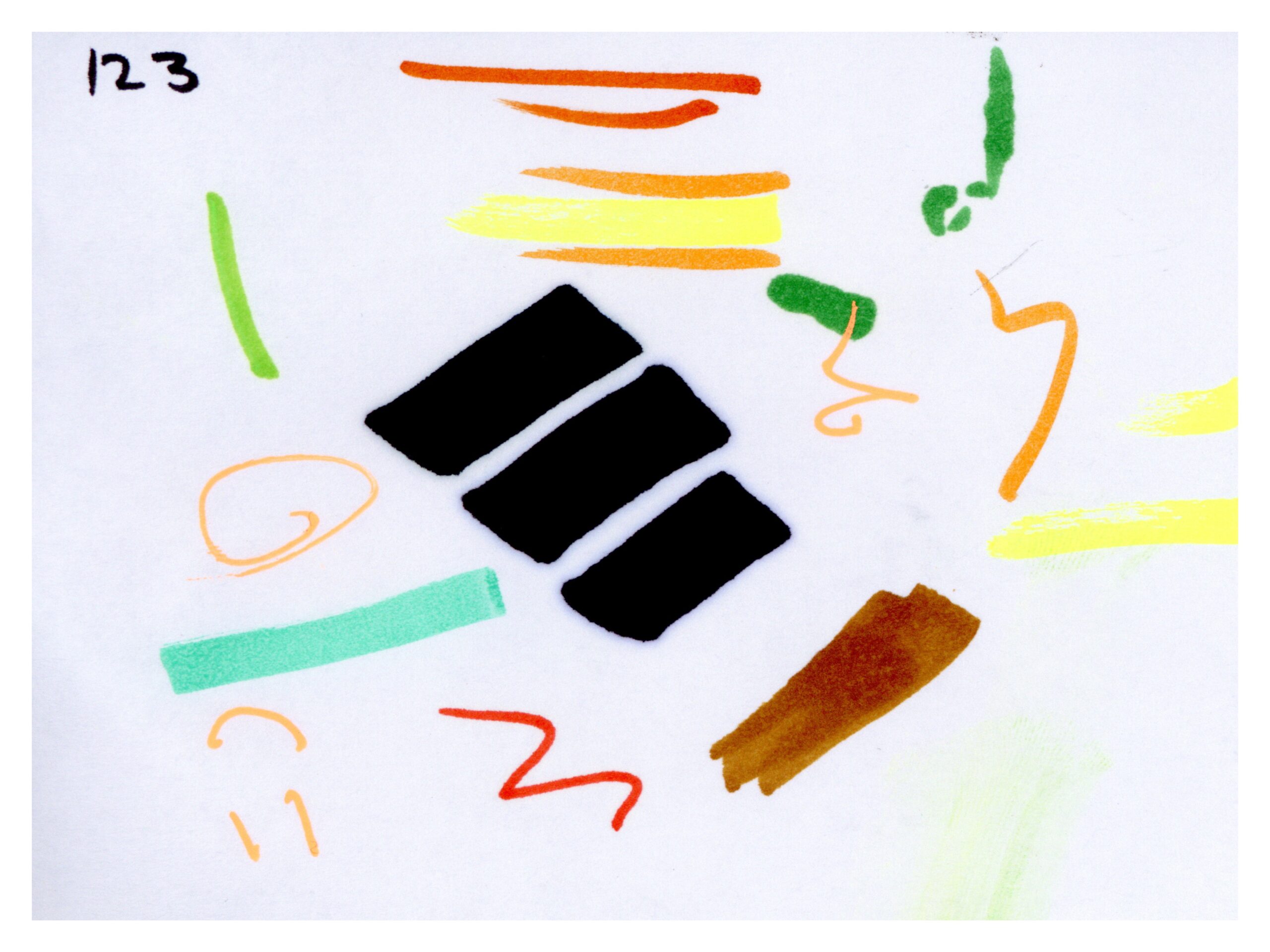
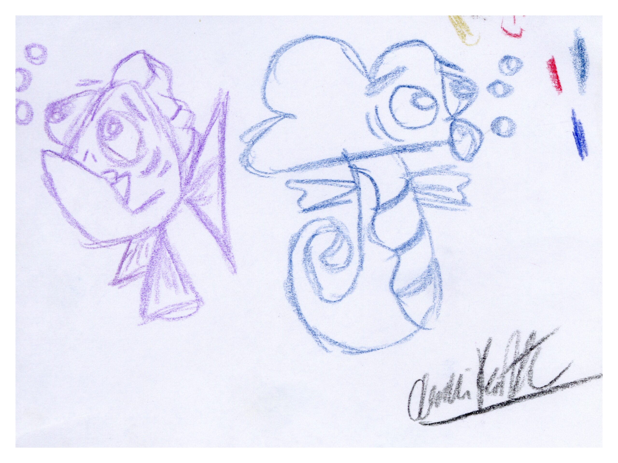
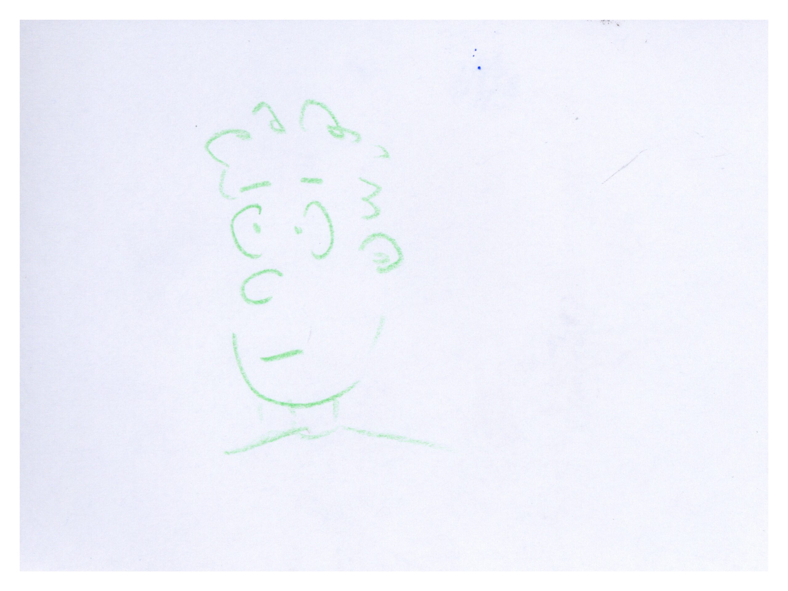
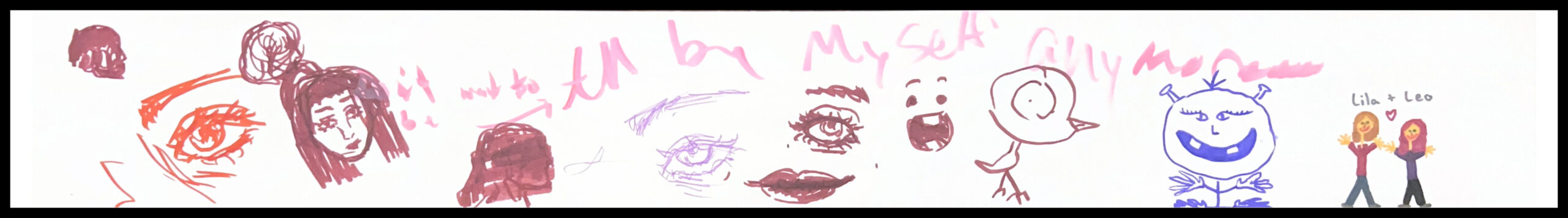
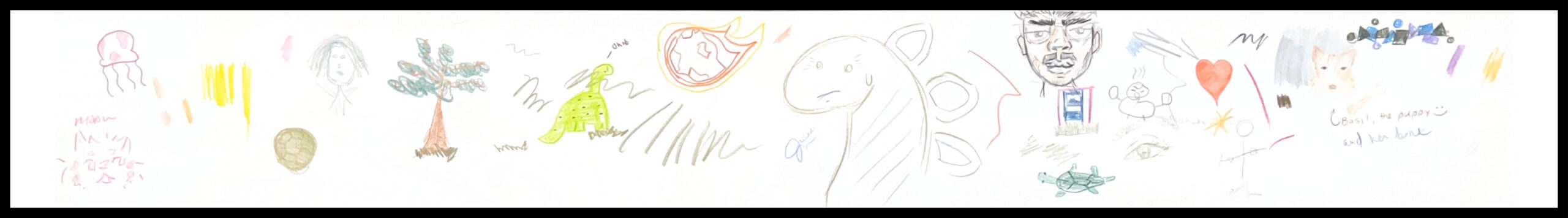
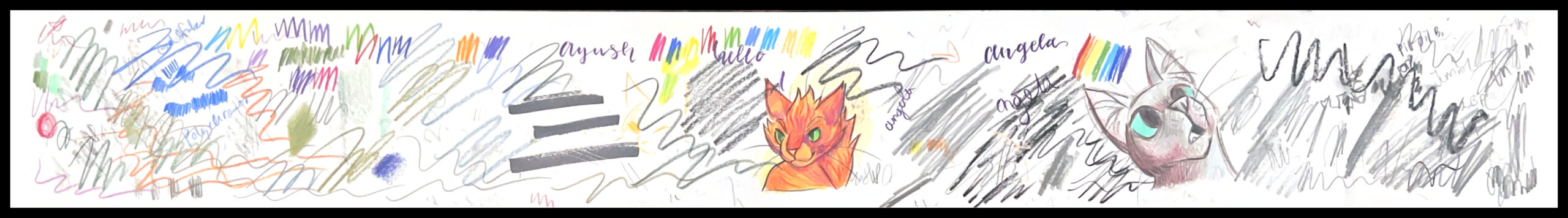
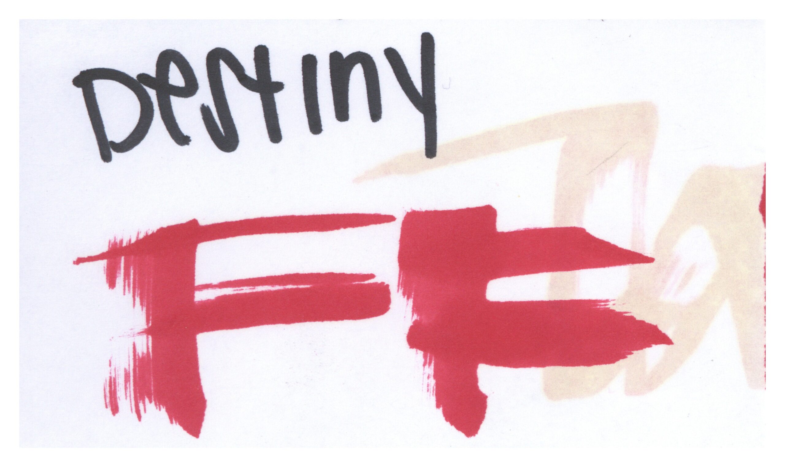
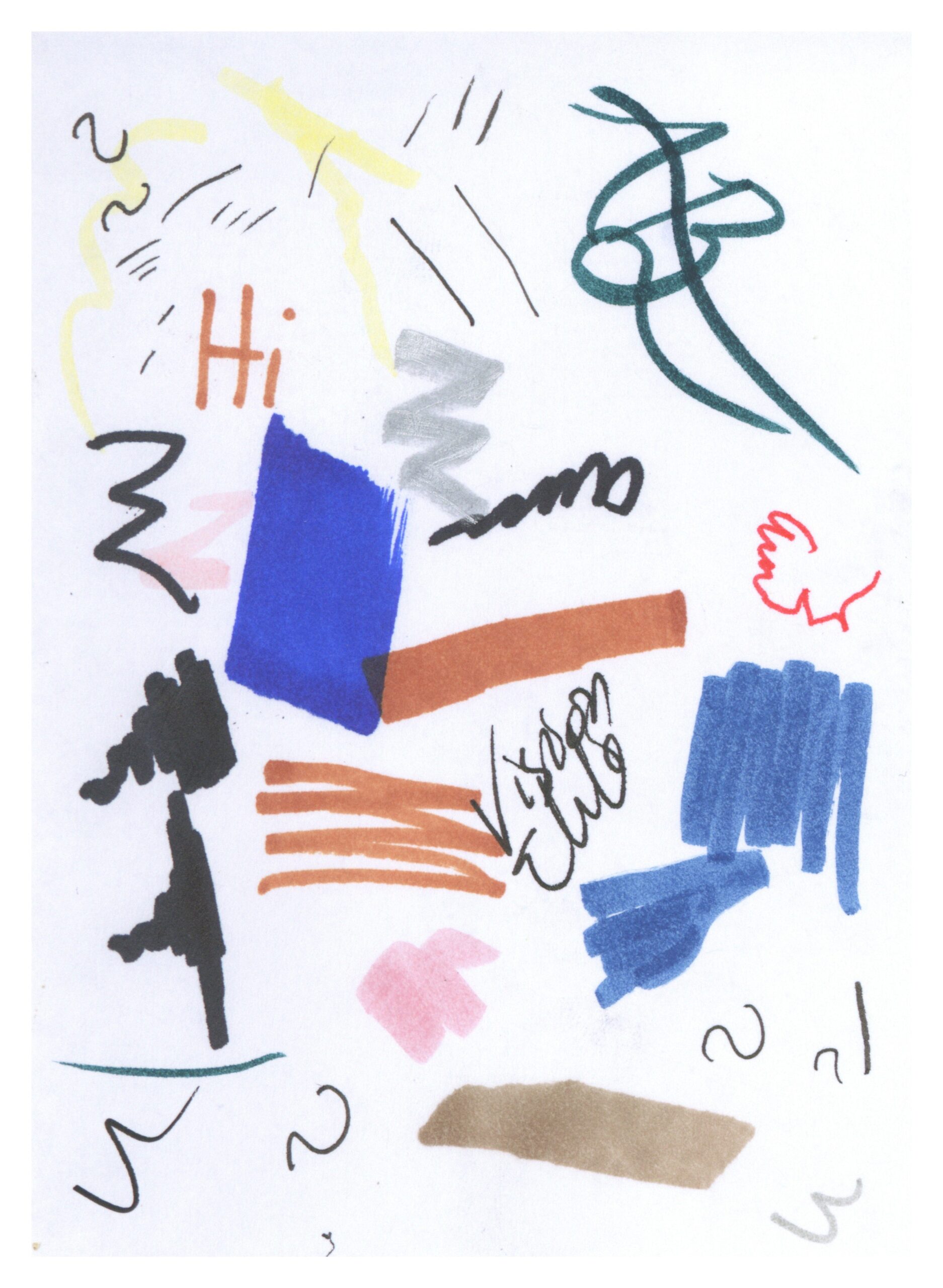
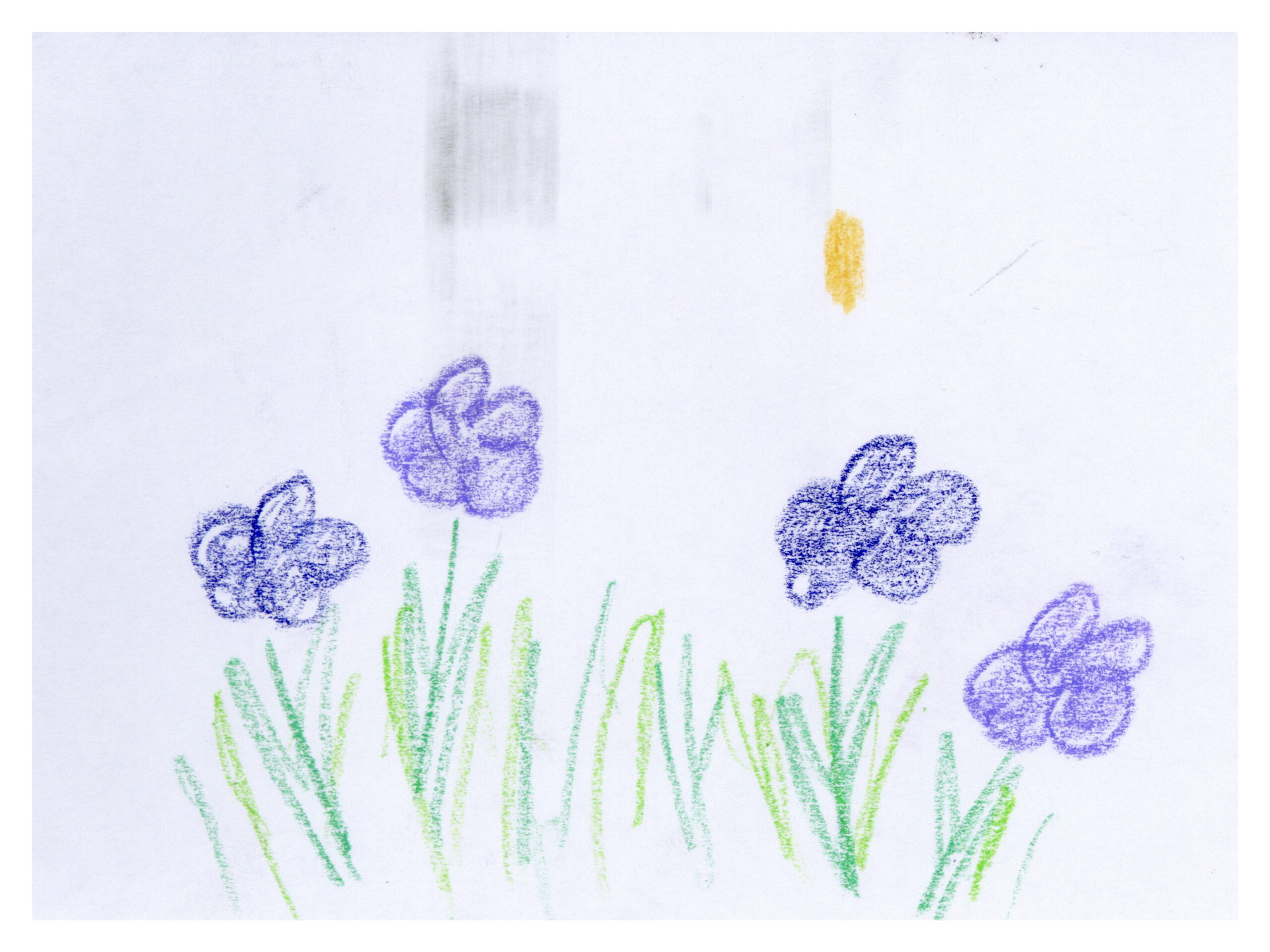
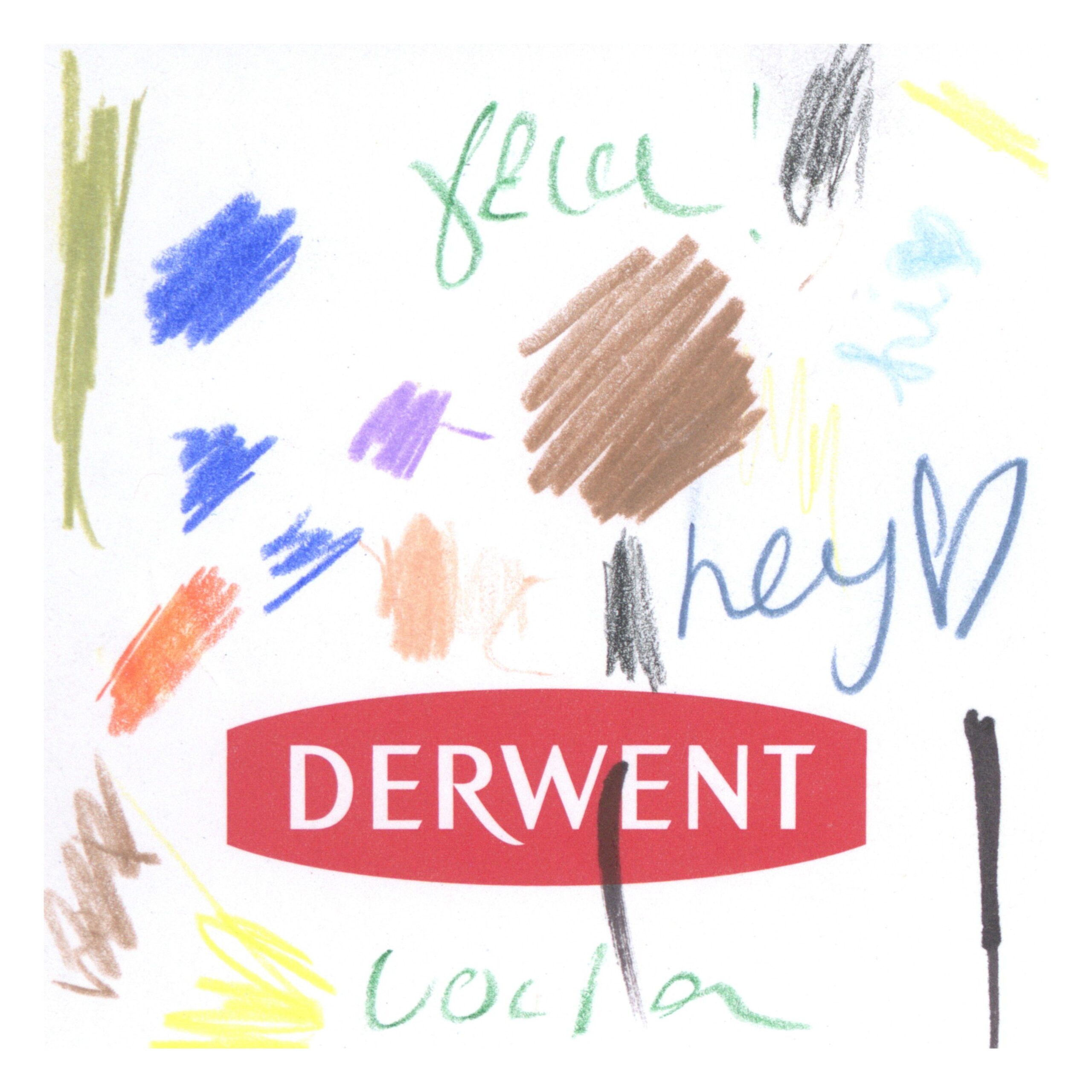
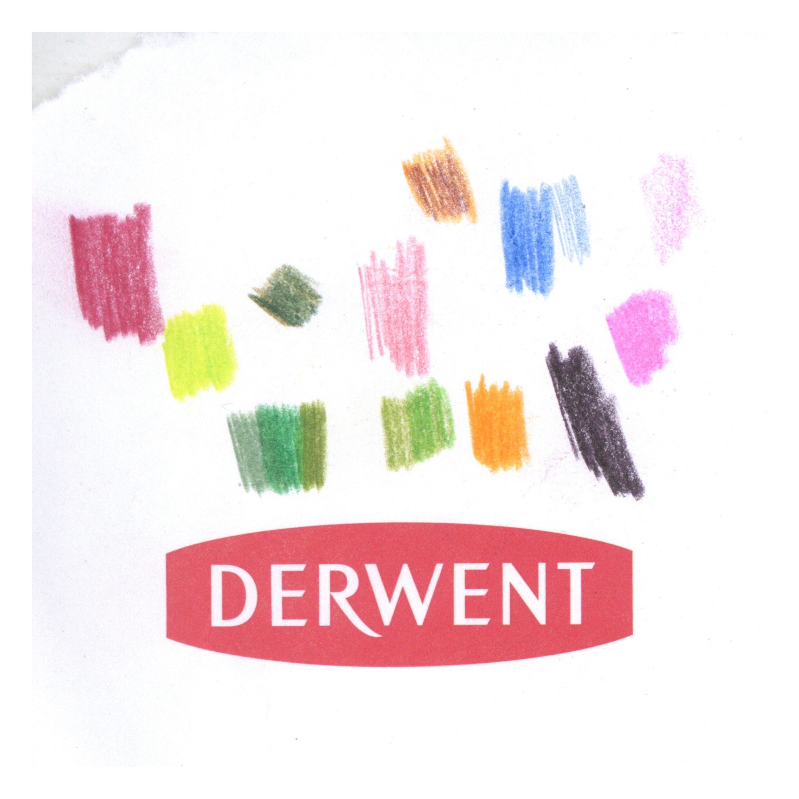
Another immediately visible type are the art projects. To me, these have a distinct intent from all other works in the typology. In theory, these pages are intended for scratch use, for people to try out a pen, and the marks created are a result of experimentation. The art projects flip this expectation on its head. The artists here have a clear, finished doodle in mind and they choose pens to achieve this predefined vision. In essence, the finished doodle informs the choice of pen while in nearly all other doodles, the choice of pen informs the finished doodle.
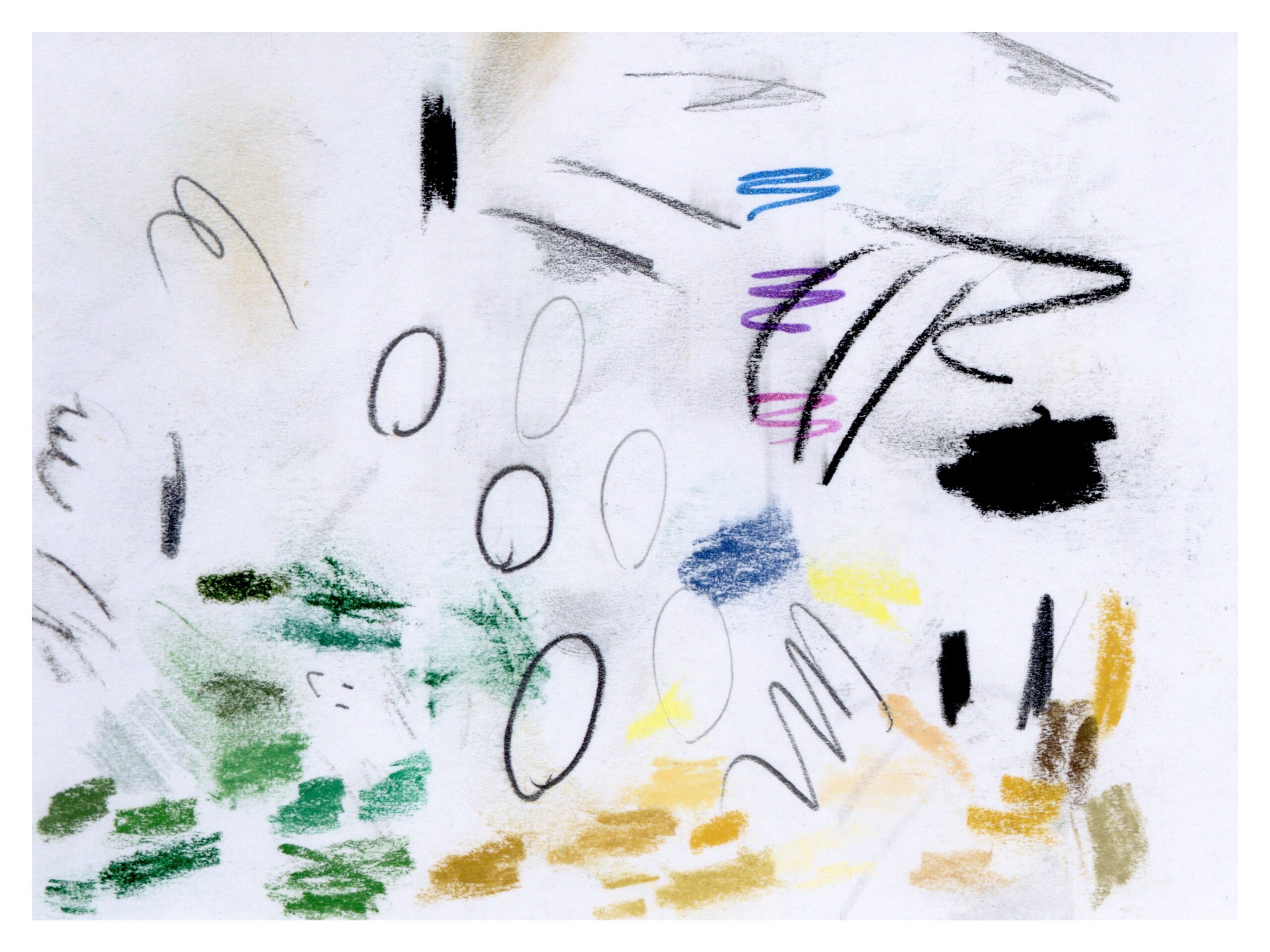
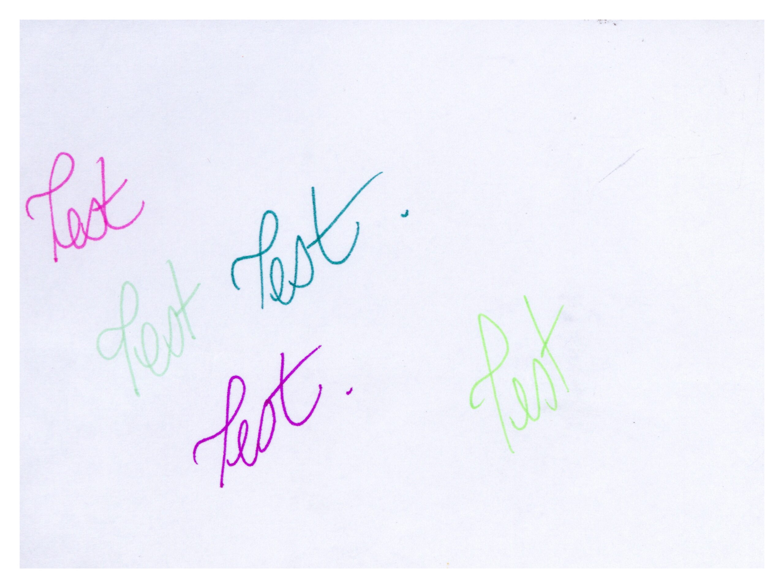
A telltale sign that a piece is an art project is the use of multiple colors to create a single, coherent doodle. This means that the pens have likely been chosen with the intent of making that final doodle, not as unplanned experiments.
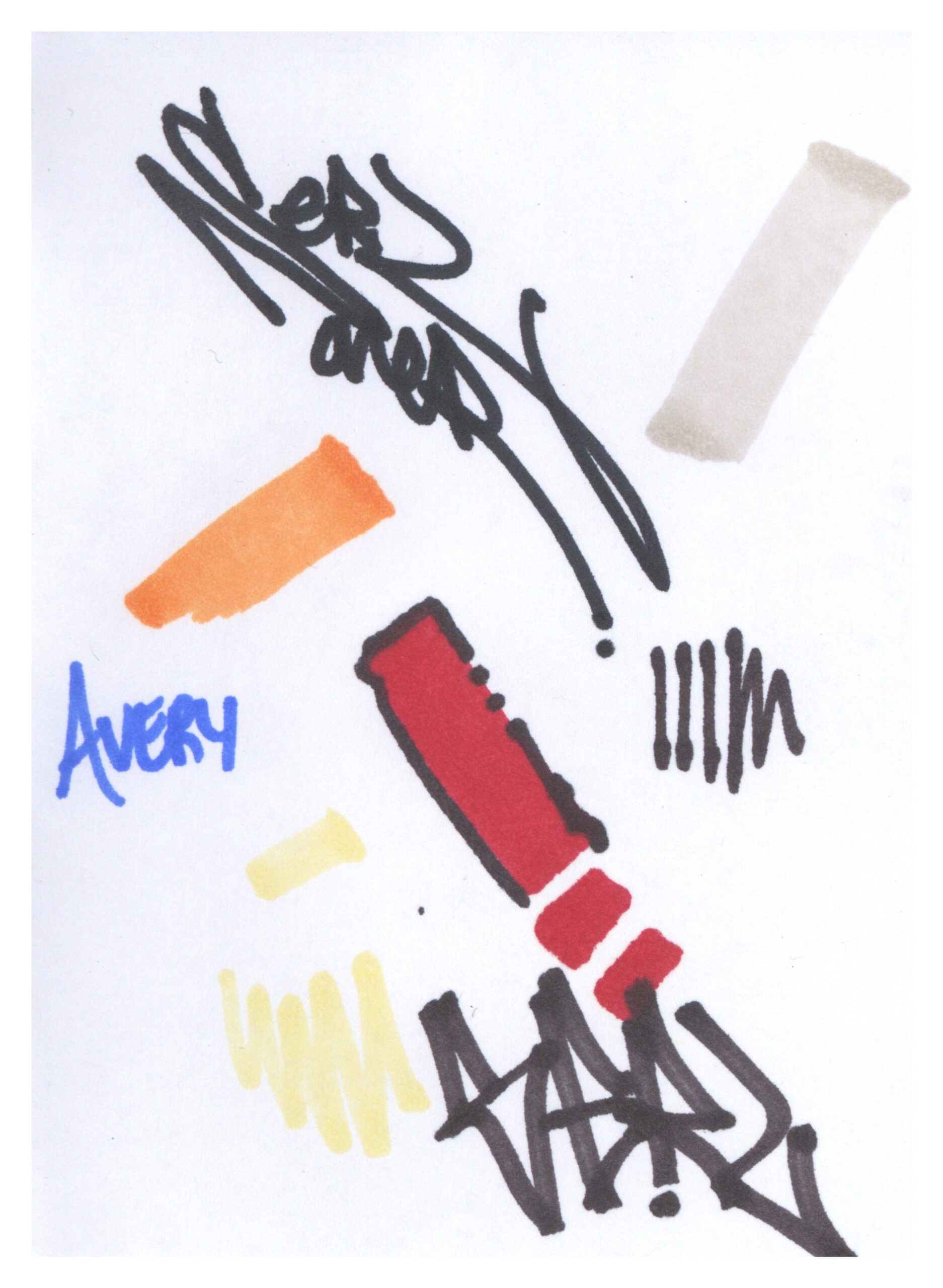
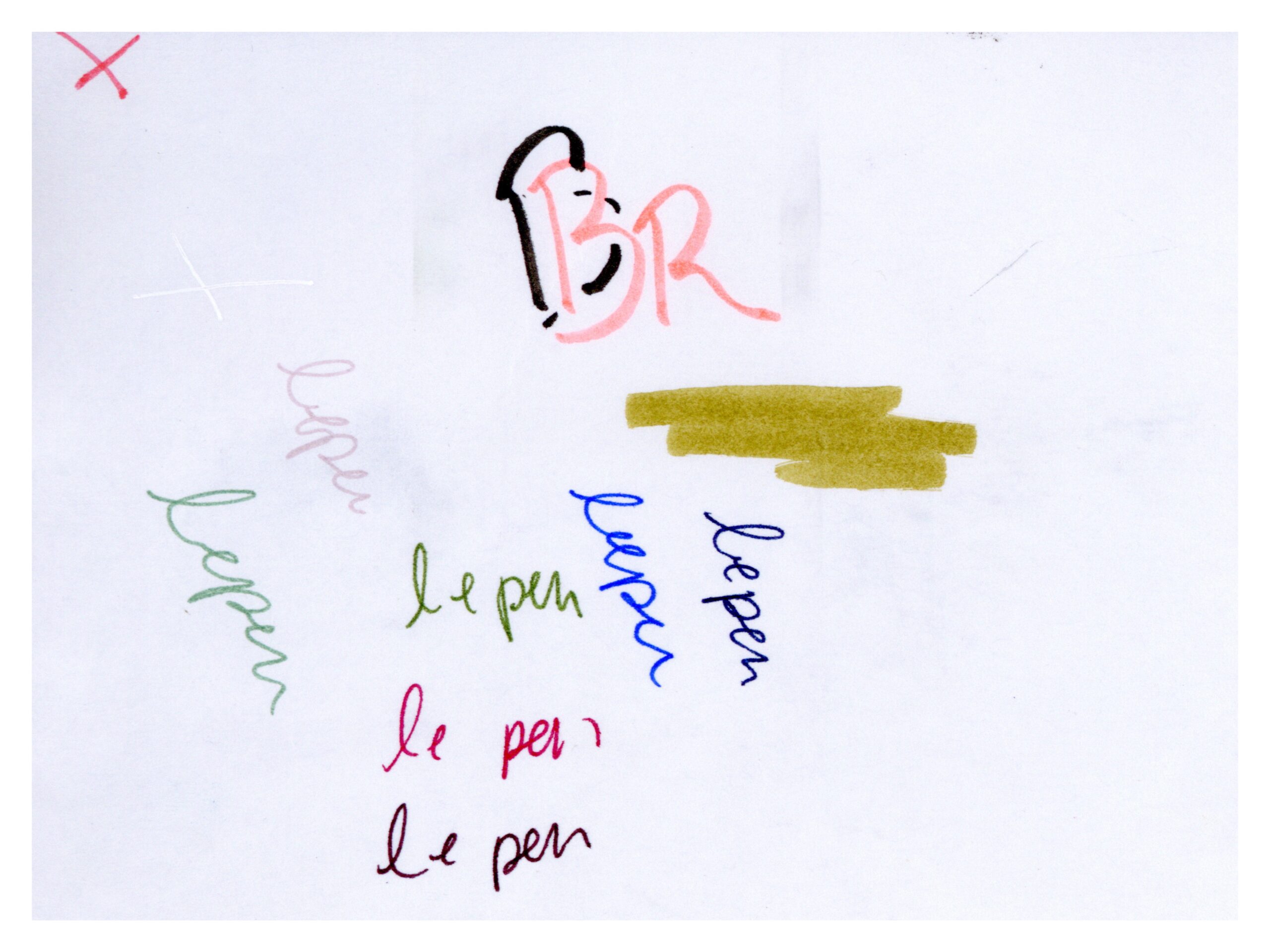
The stories told across pages or across authors are one of my favorite parts of this project. These can be traced through common themes, common pens, and common handwritings.
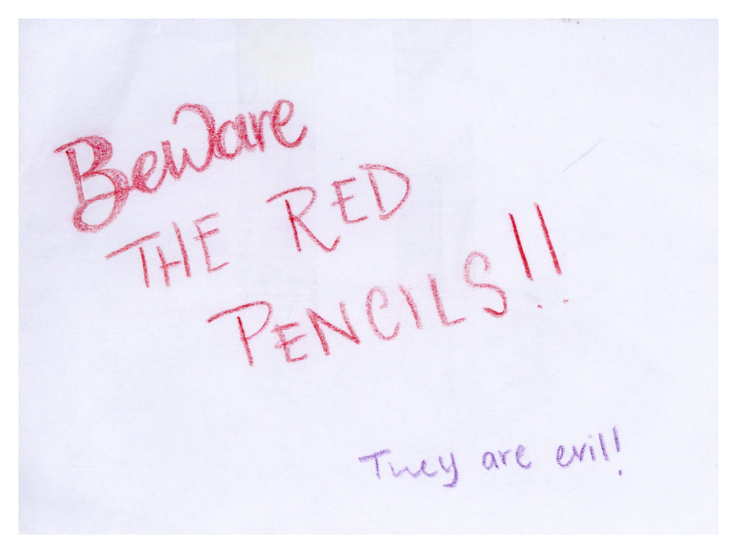
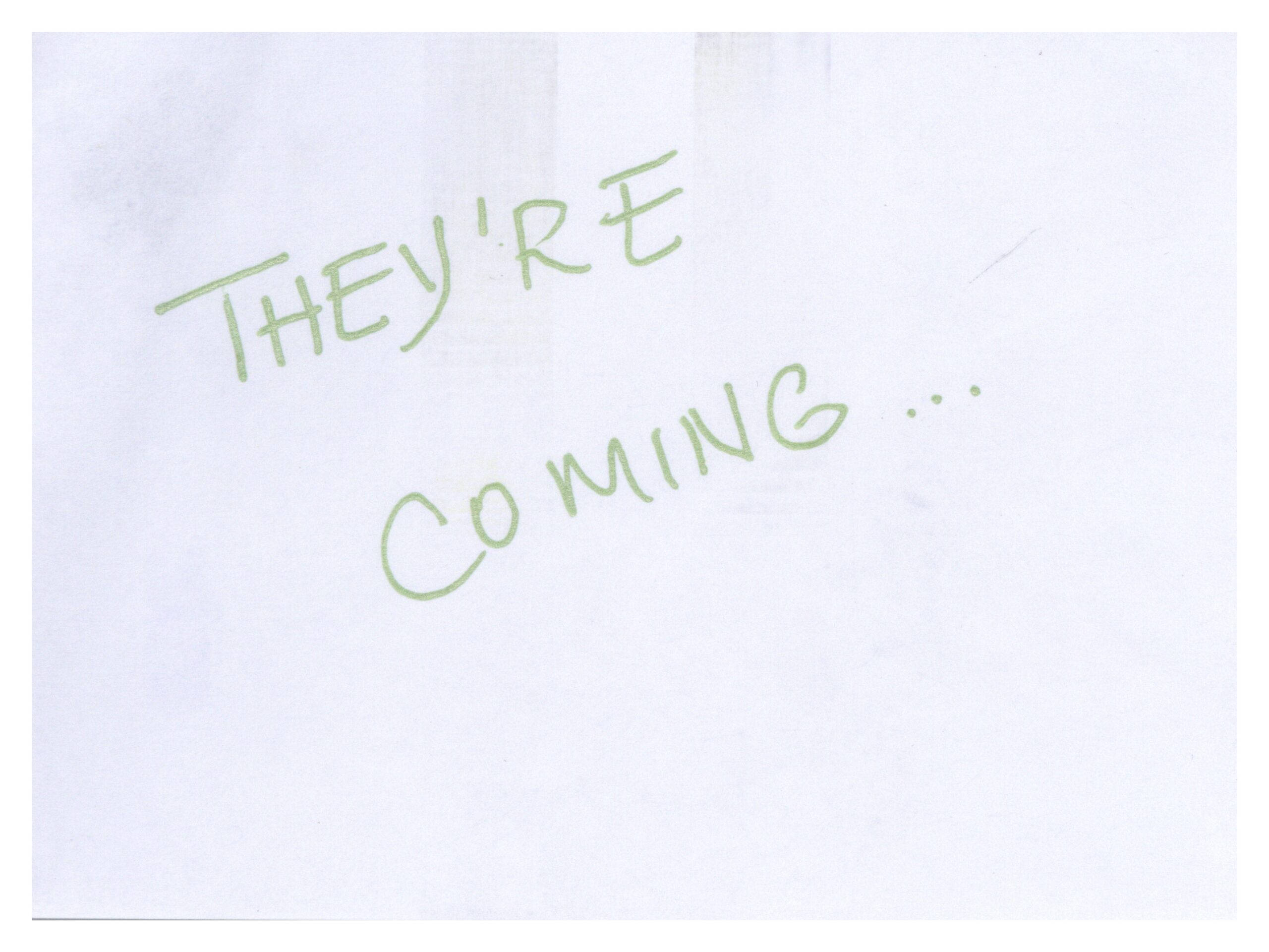
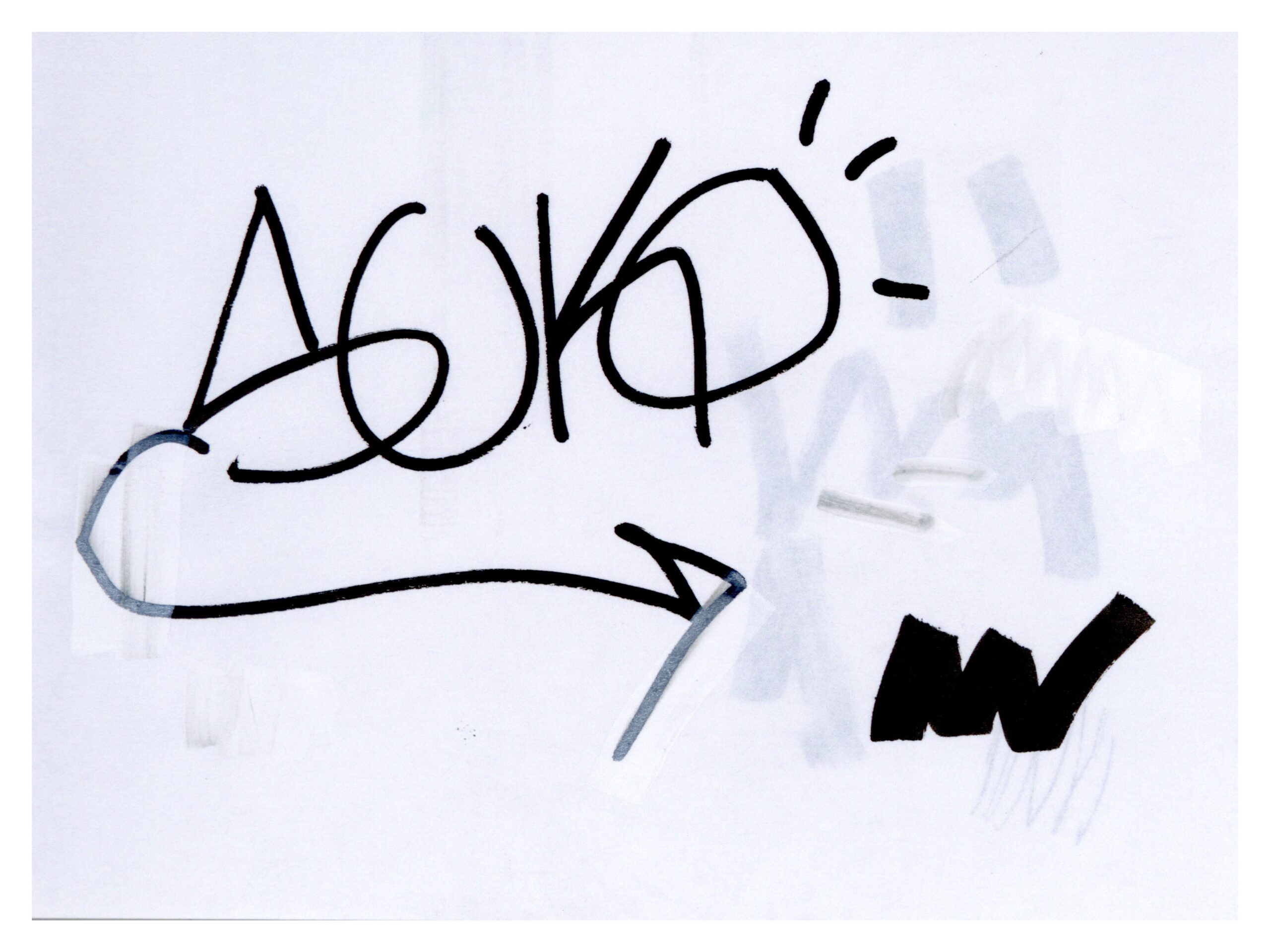
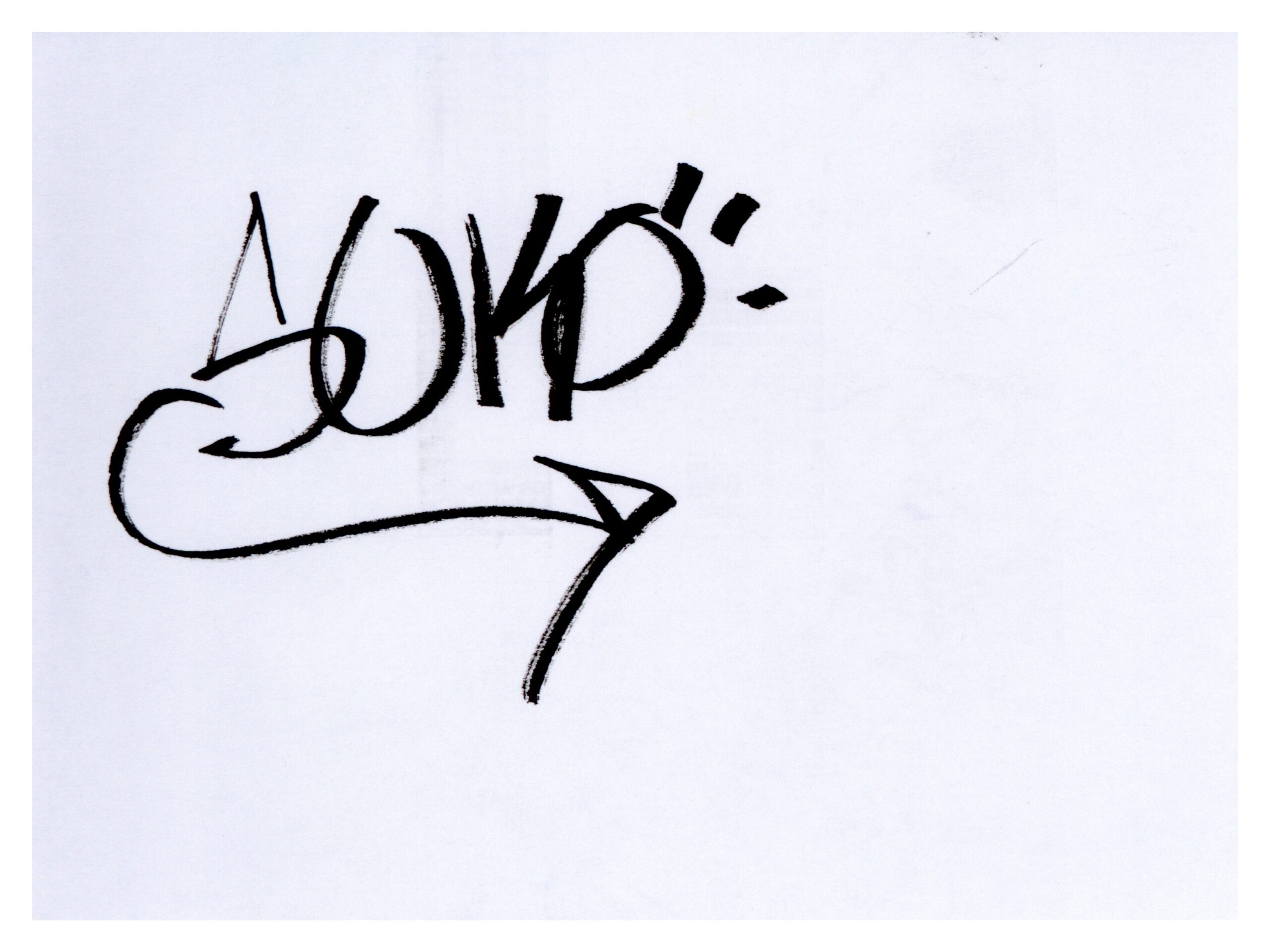
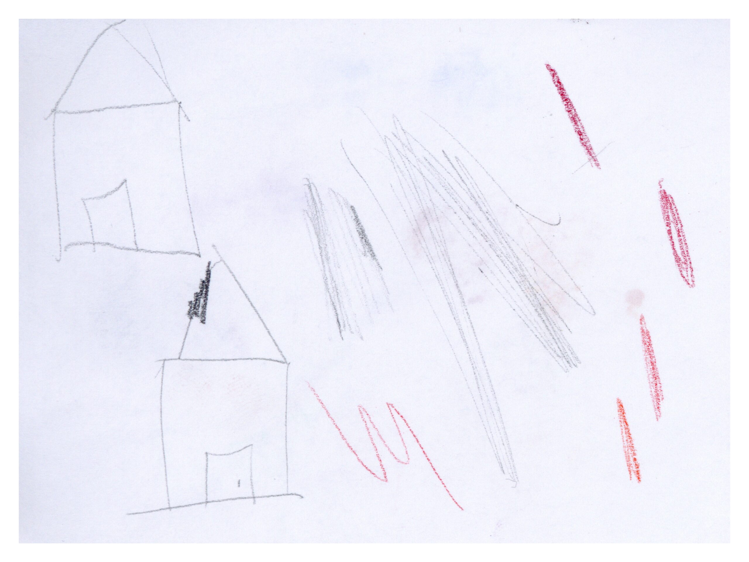
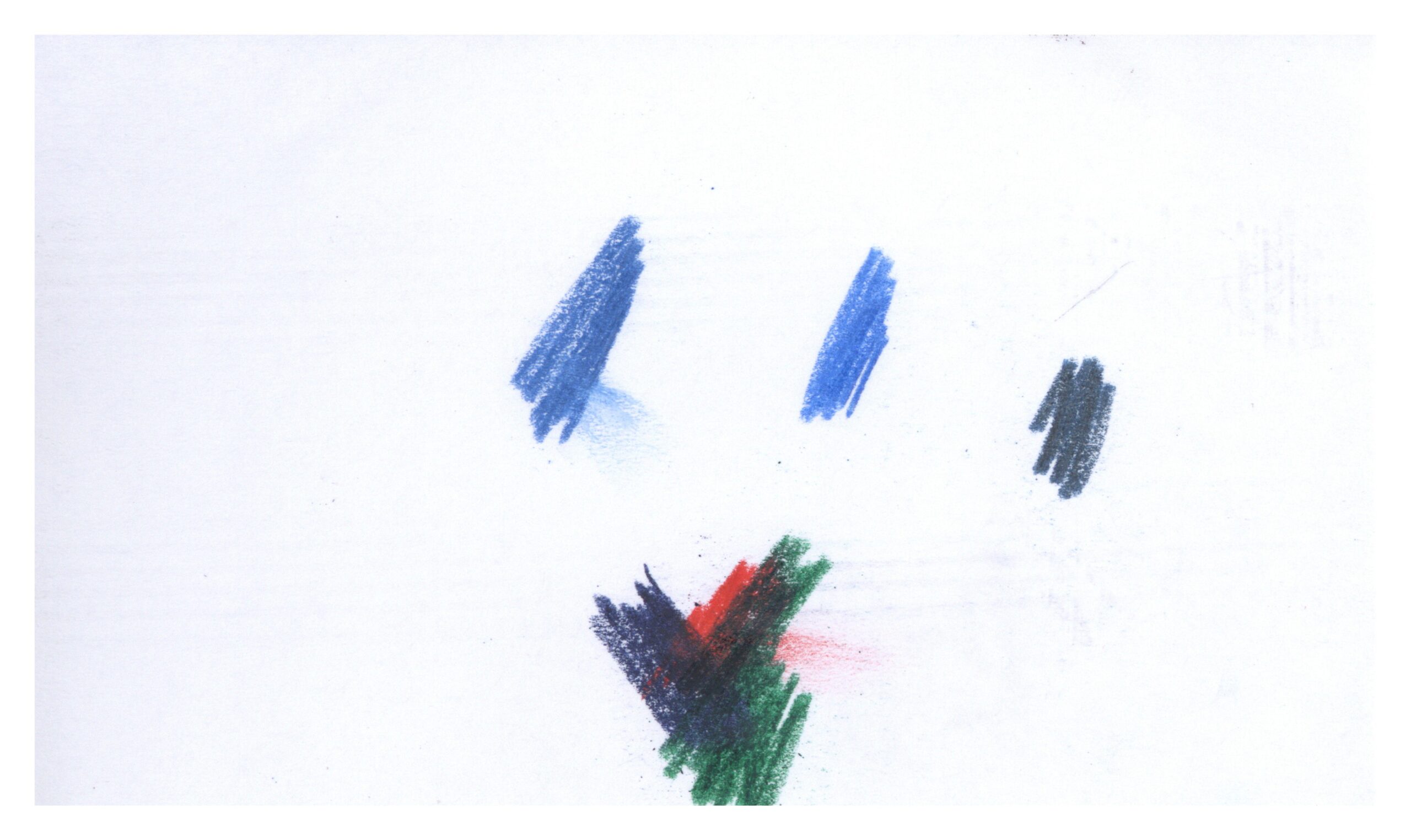
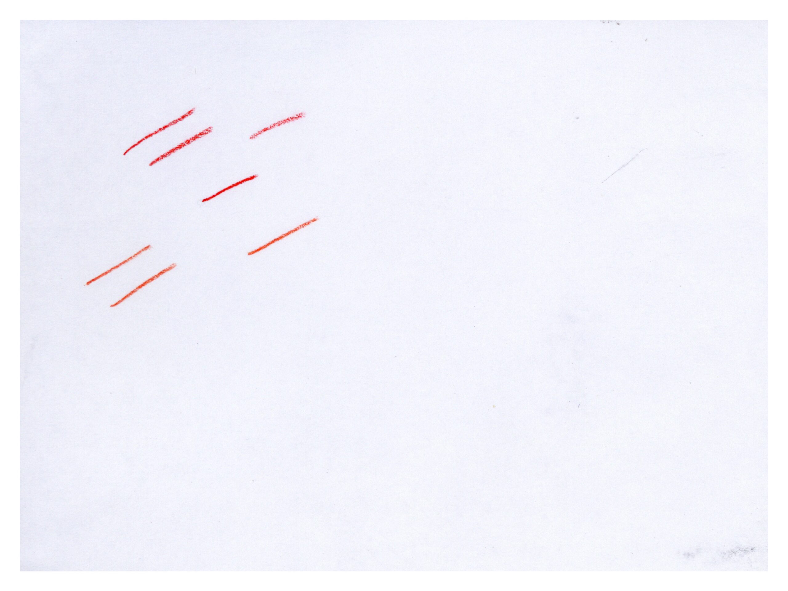
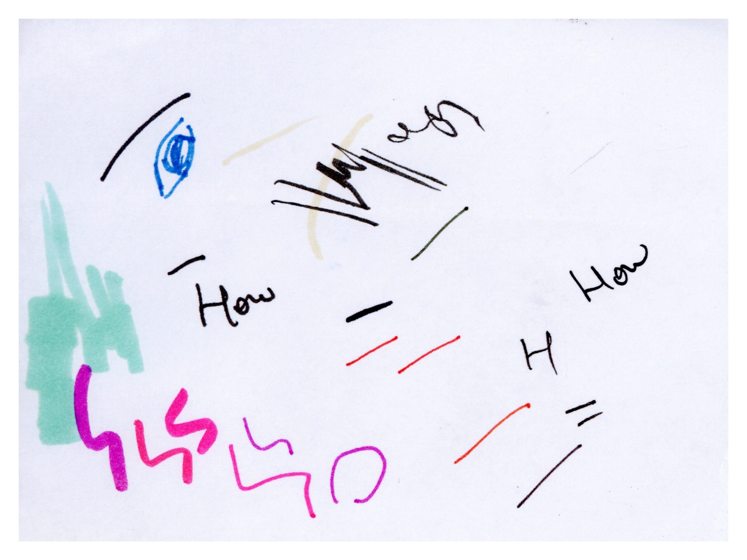
The story can be as simple as the development of an artist’s doodle over time.
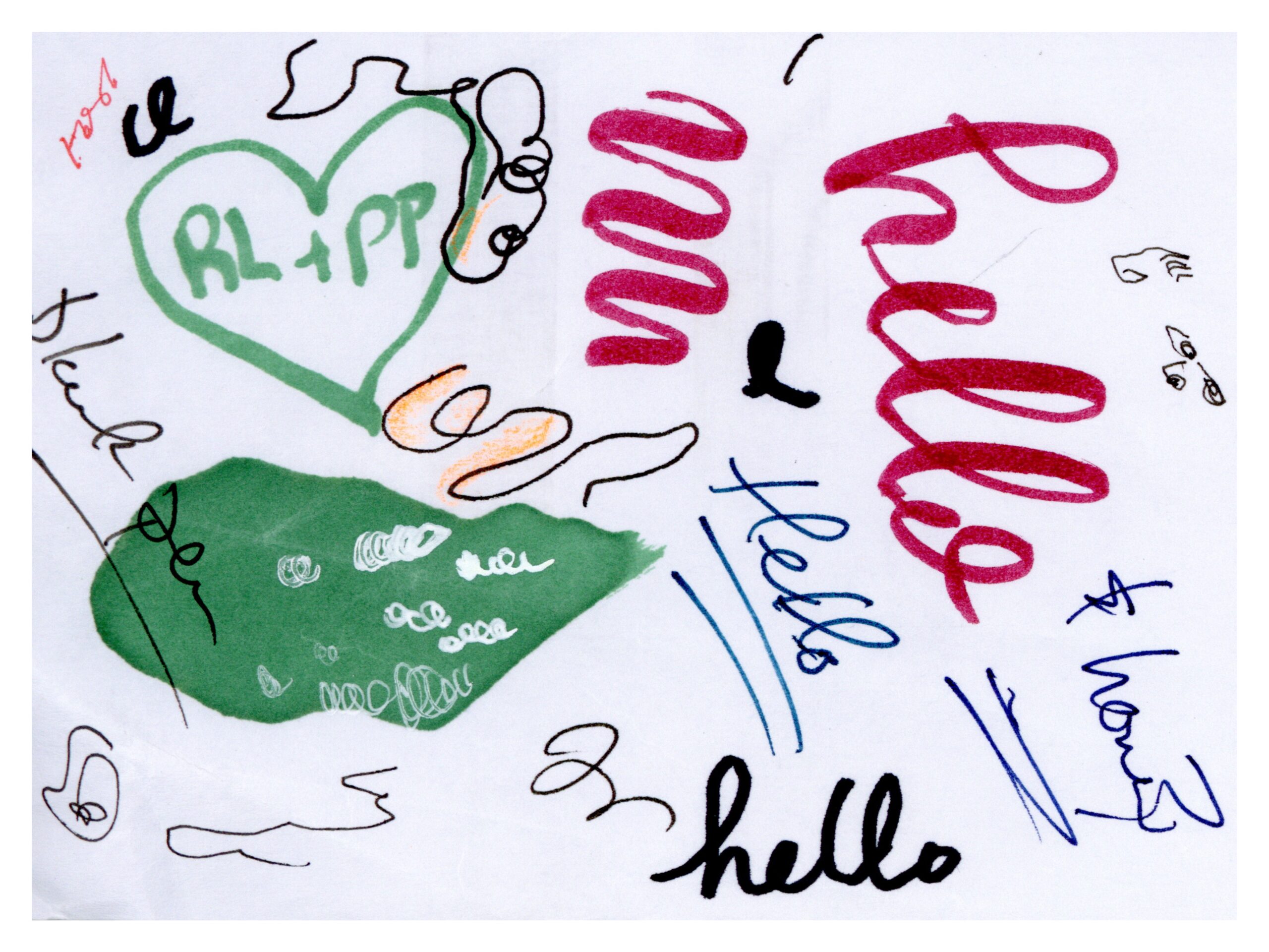
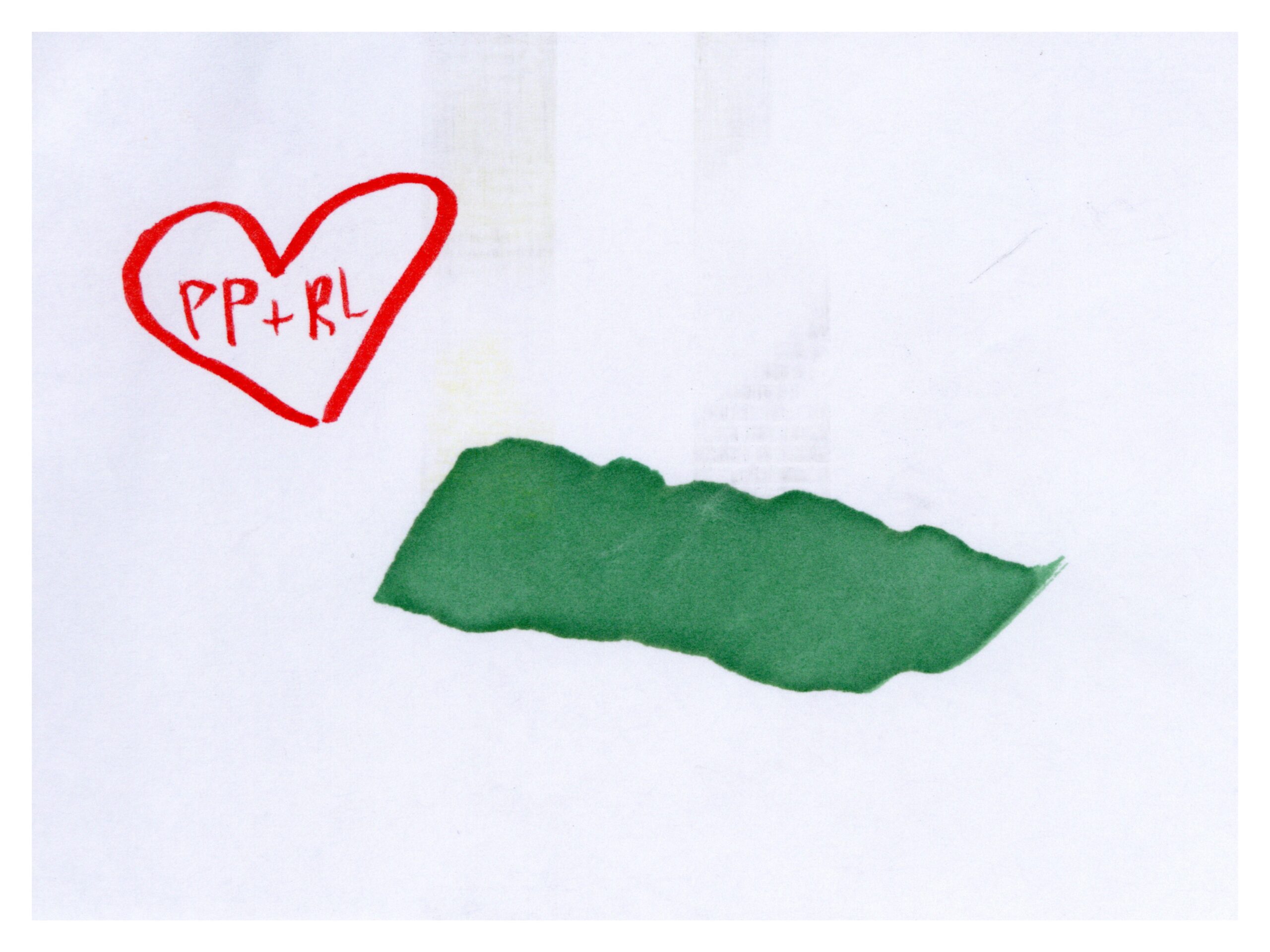
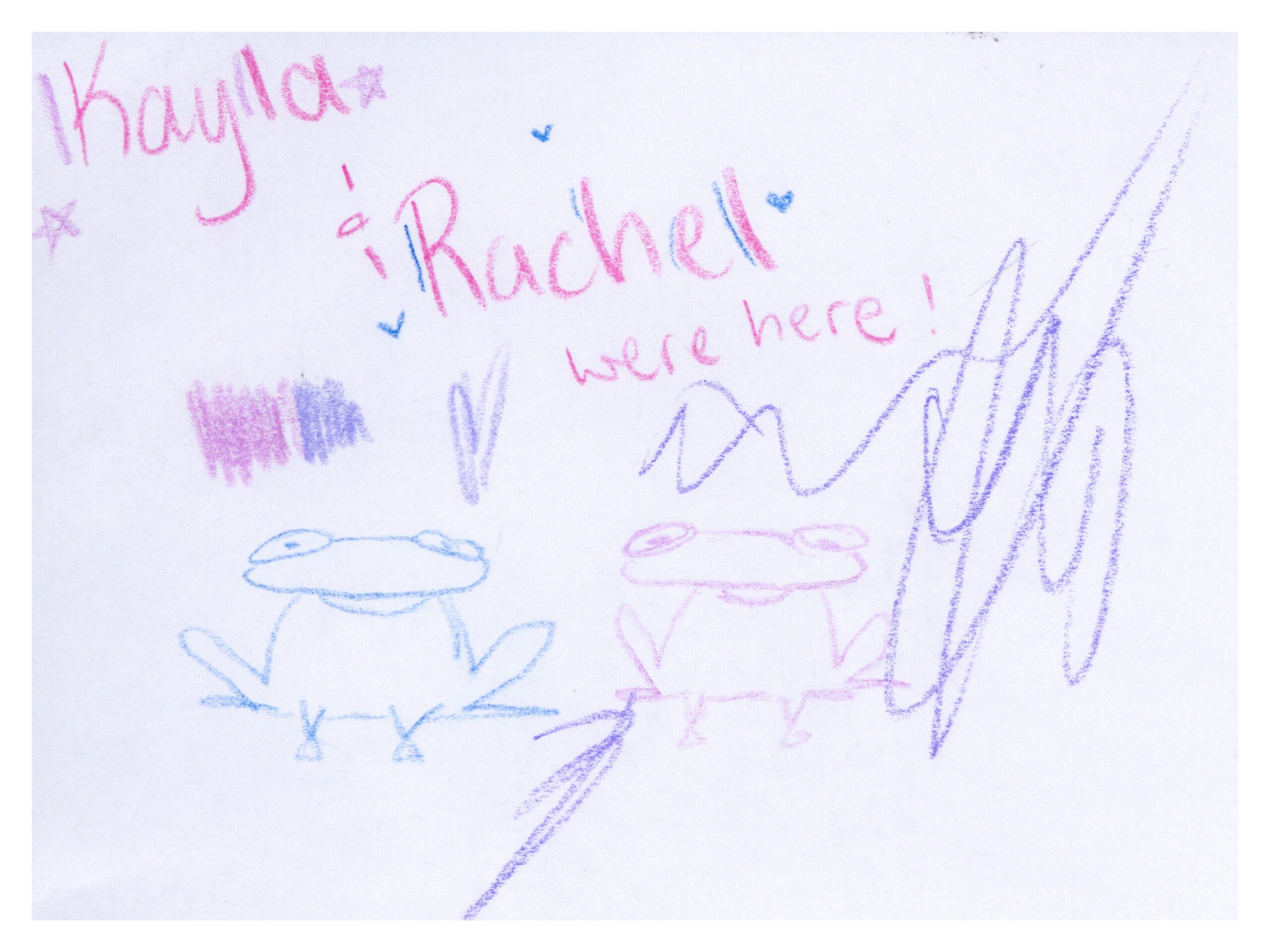
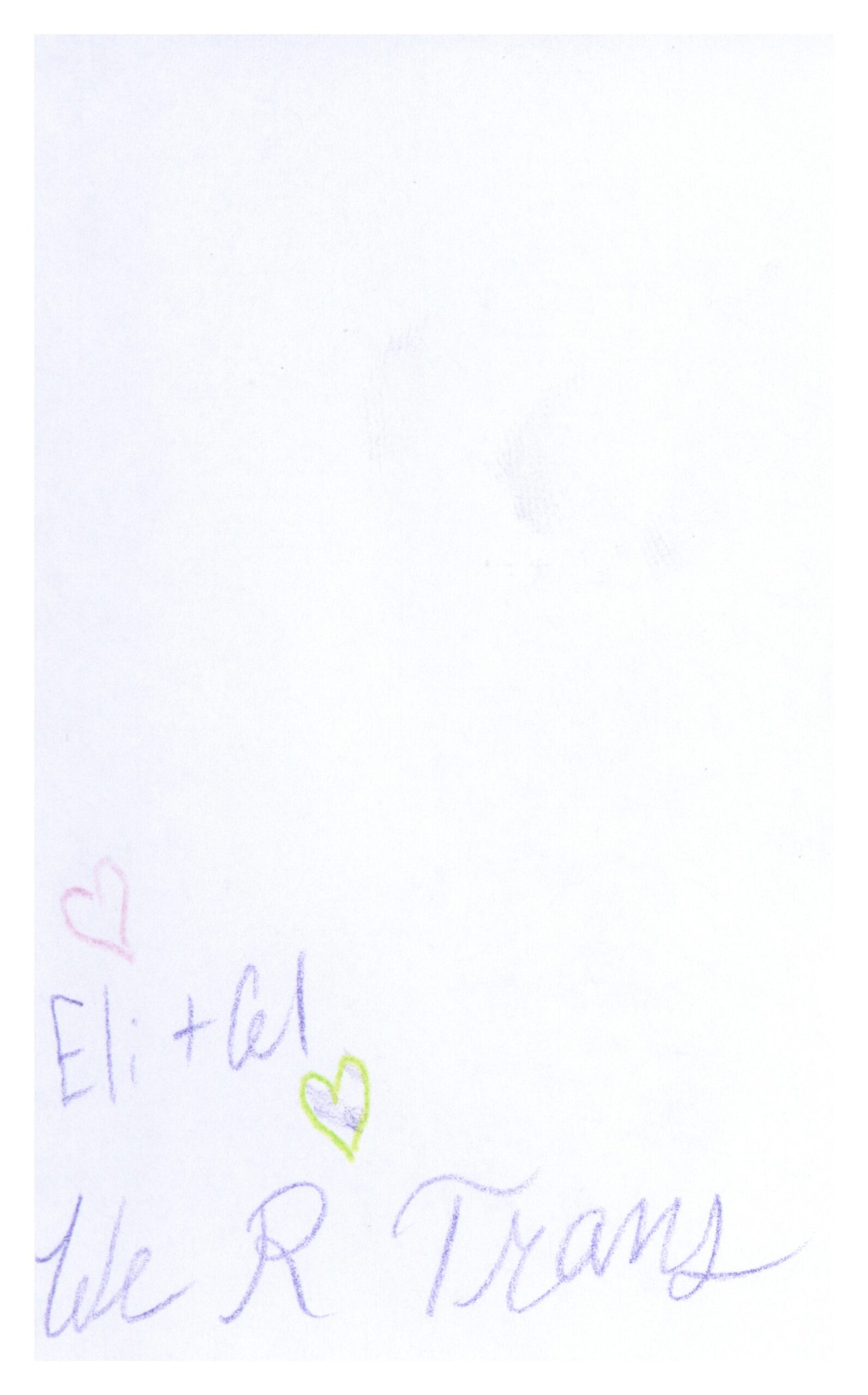
Or these two, who love each other both ways.
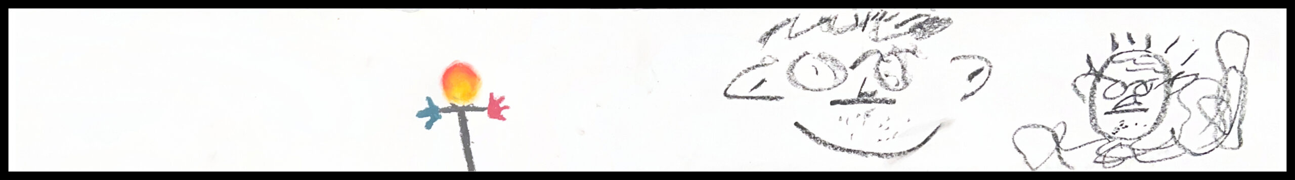
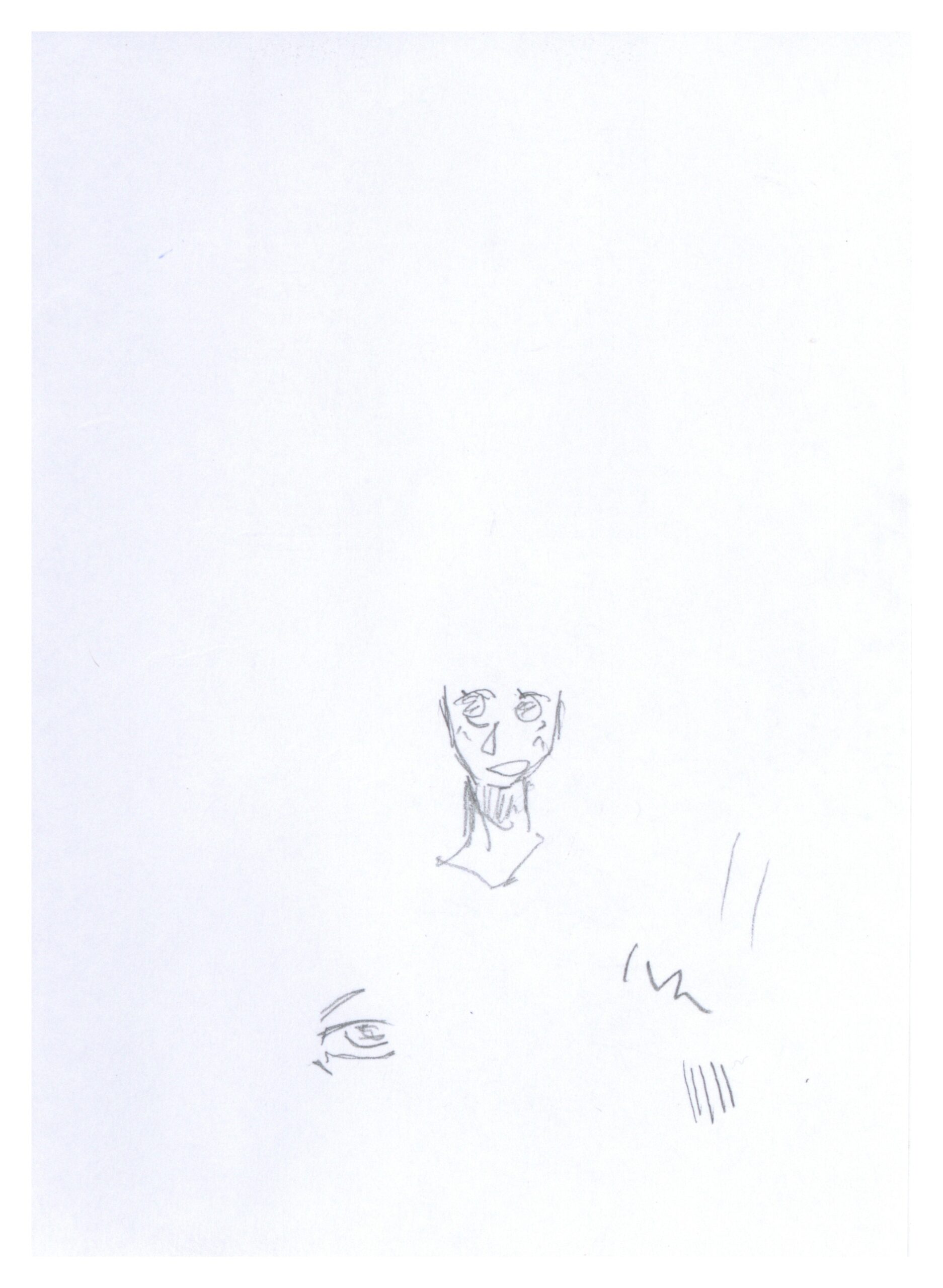
Some feel like a glimpse into a world I don’t know.
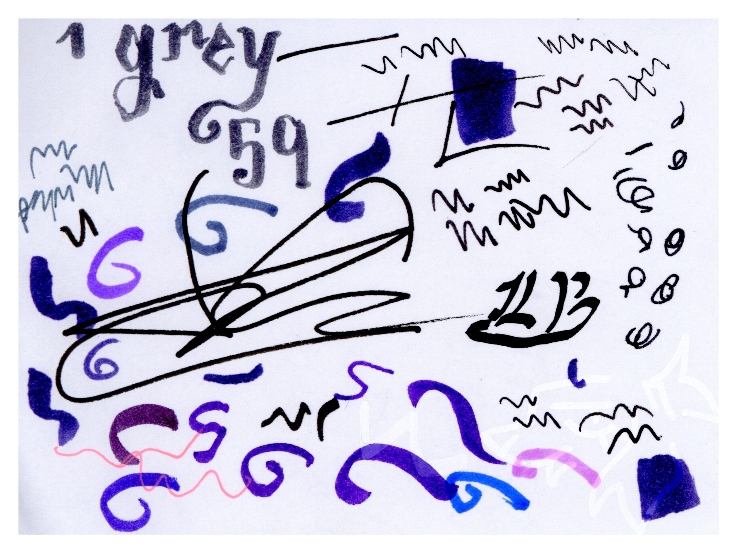
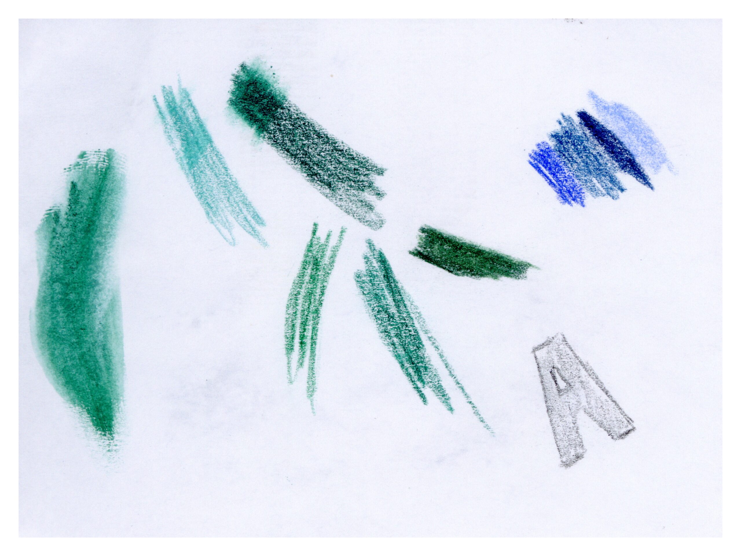
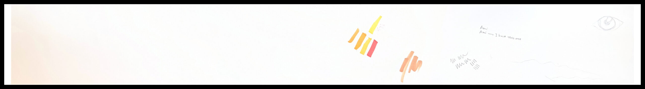
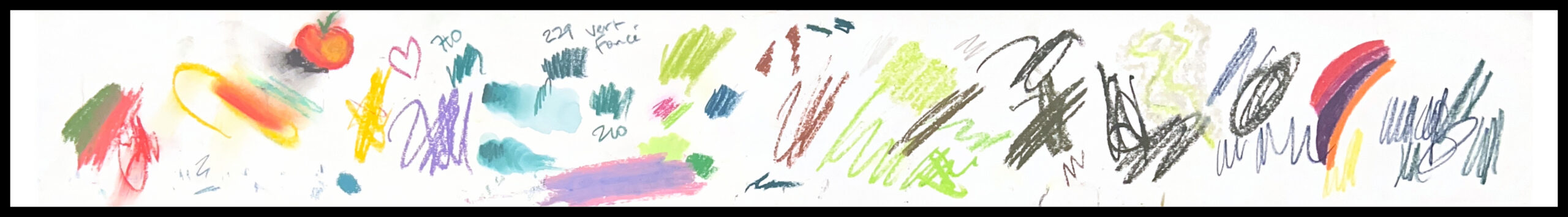
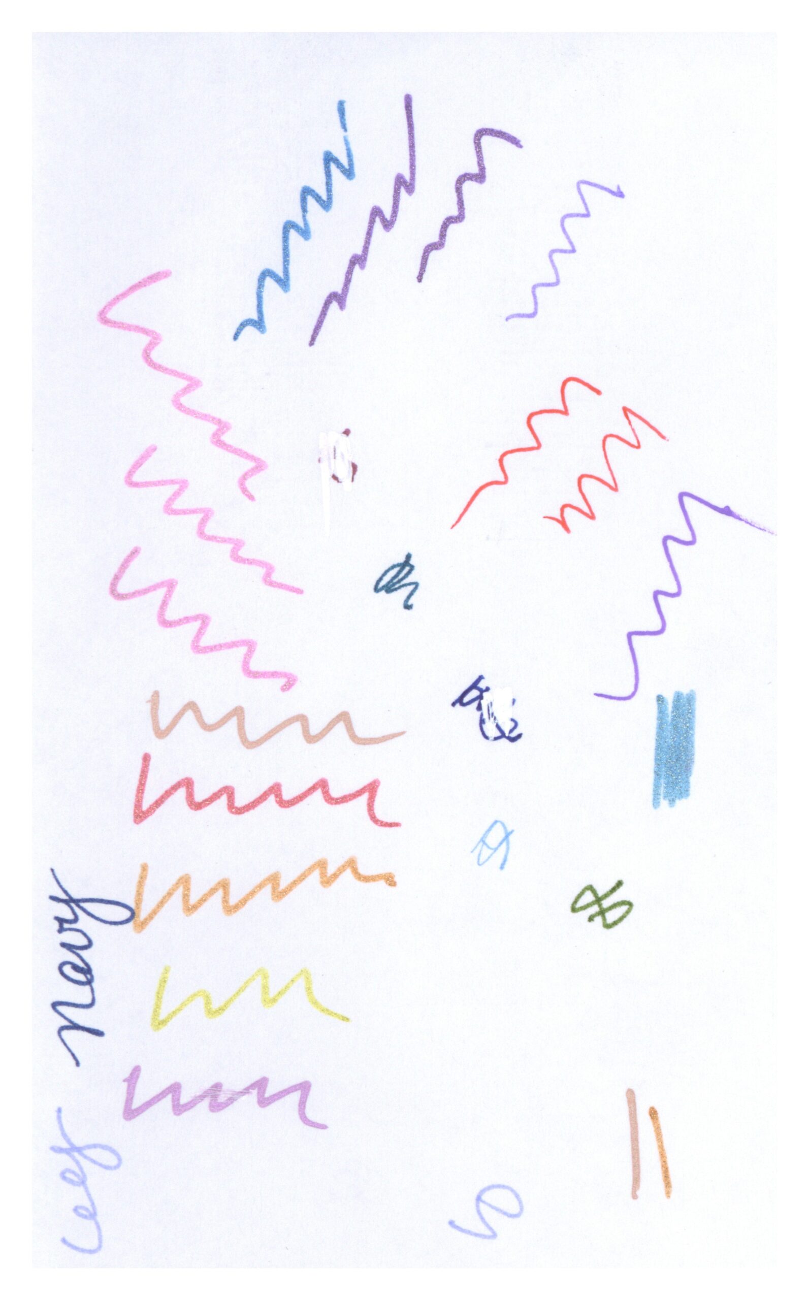
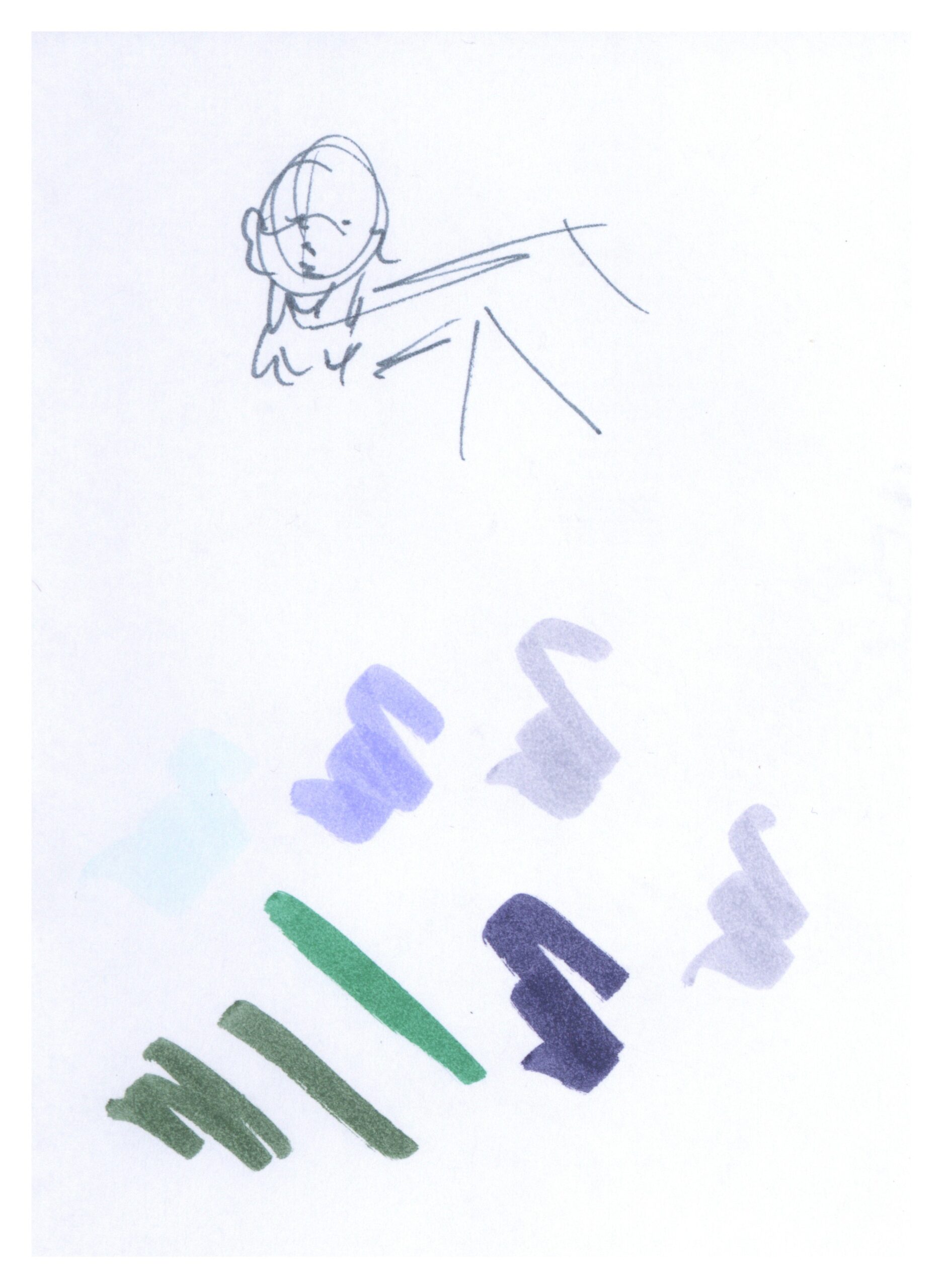
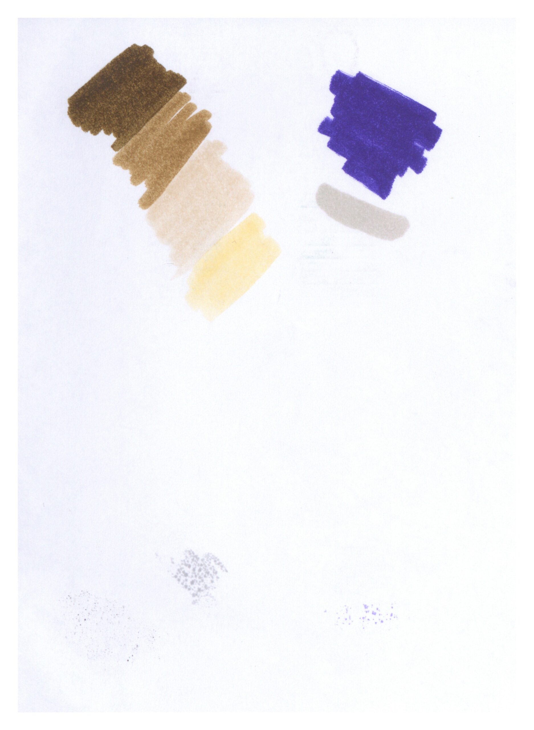
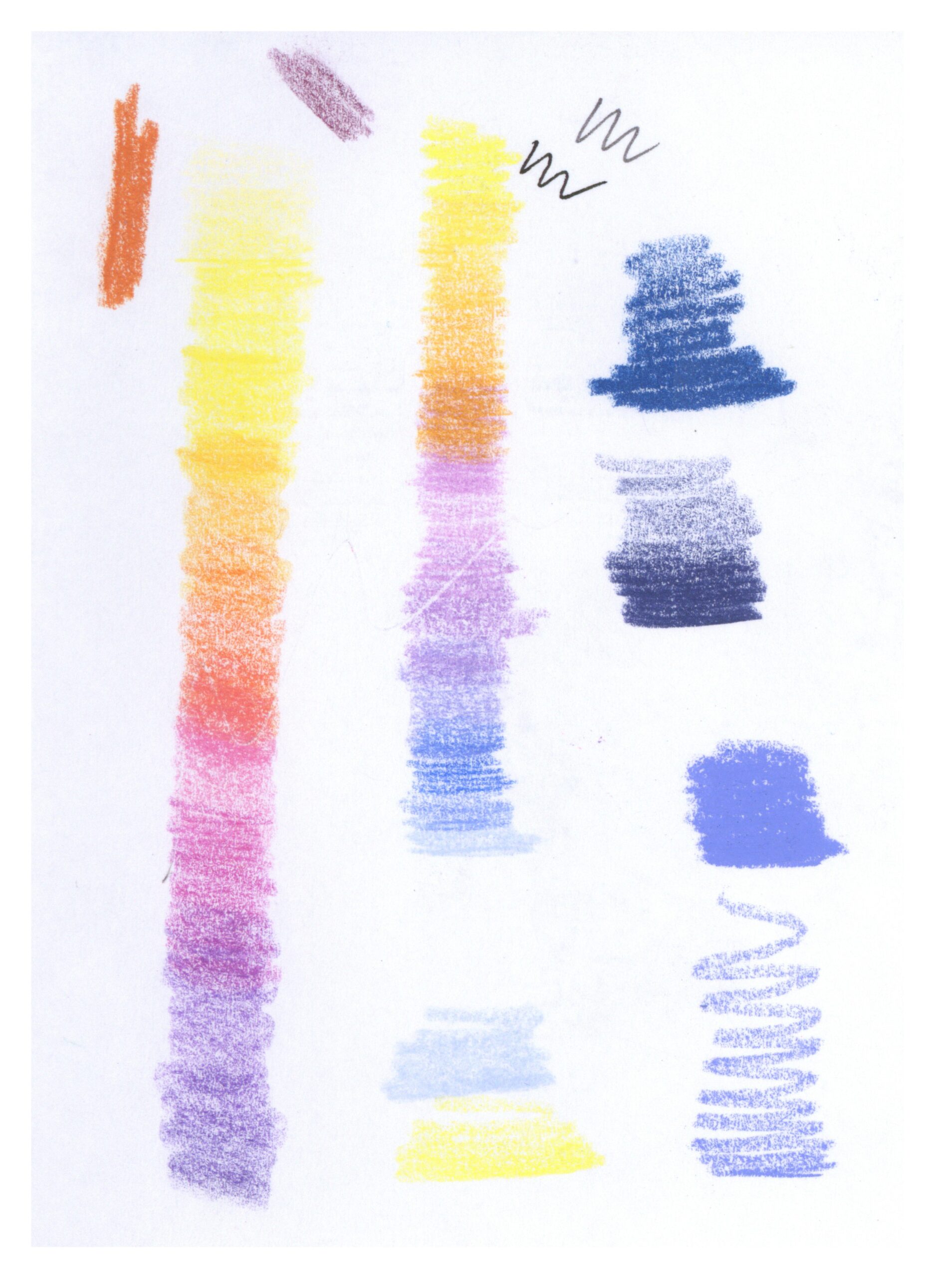
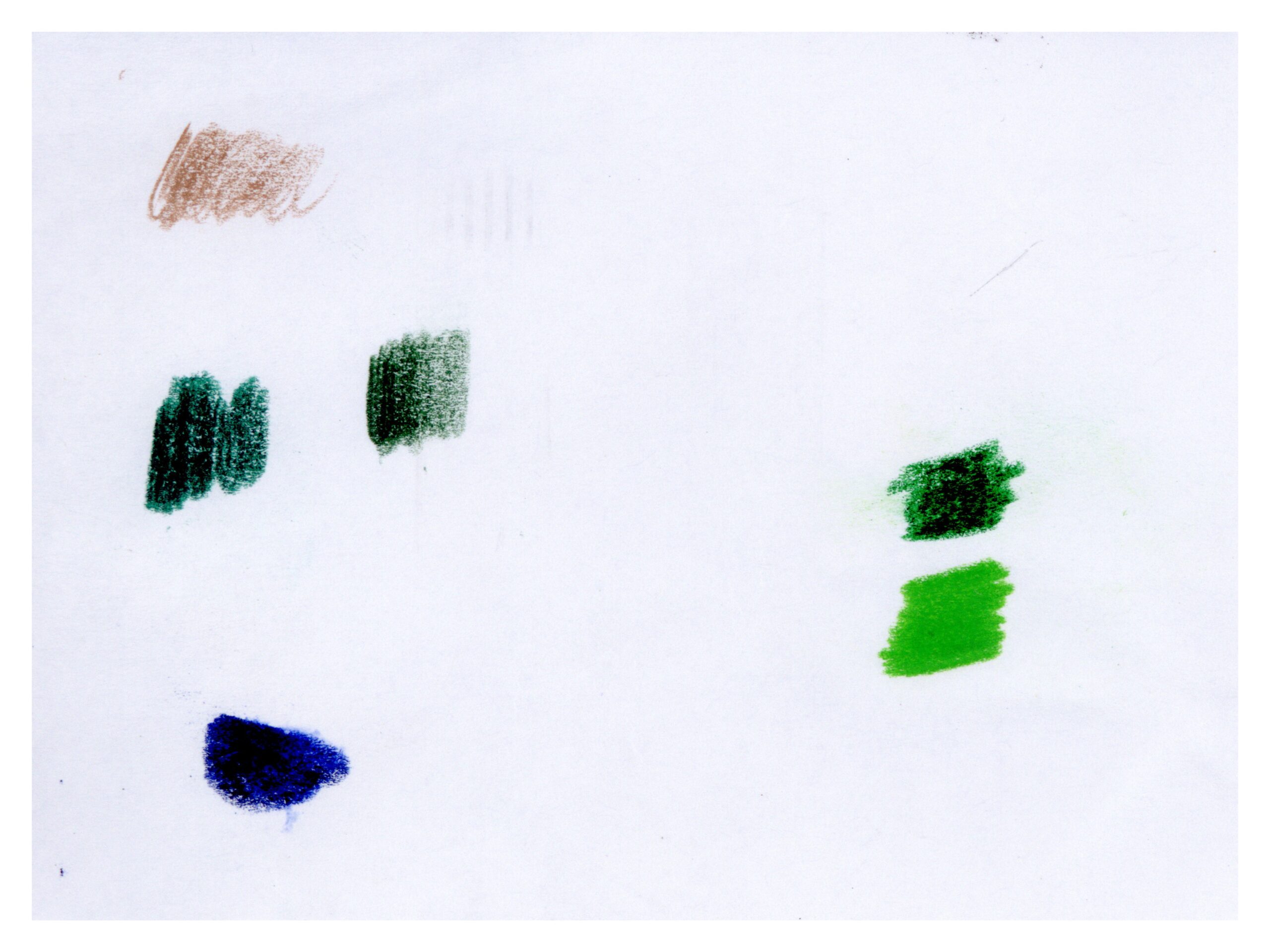
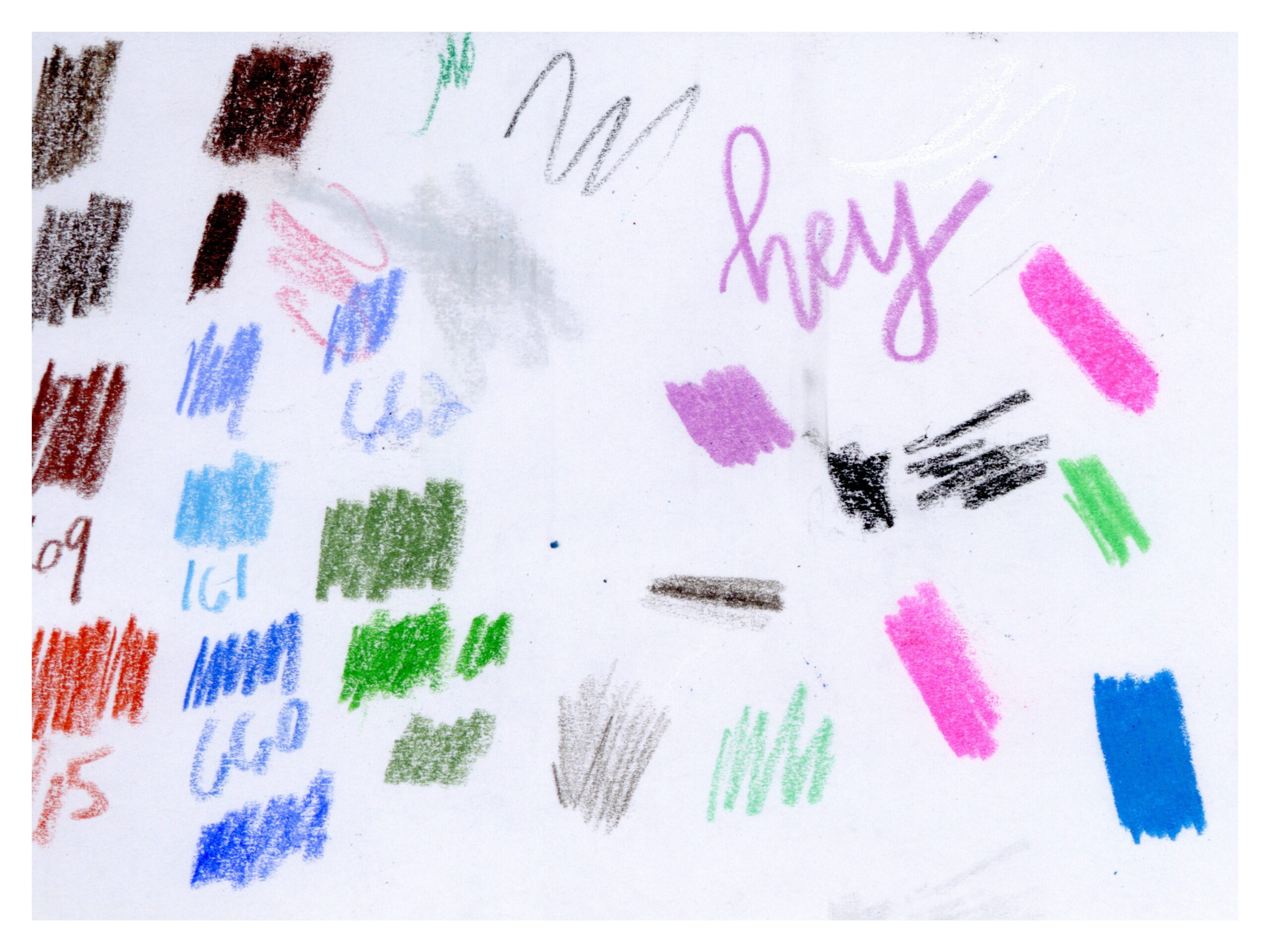
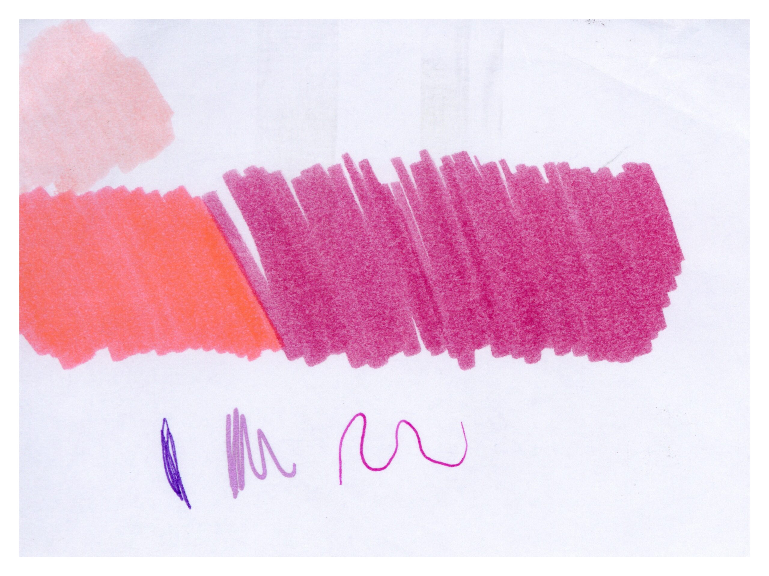
And many had beautiful color schemes.
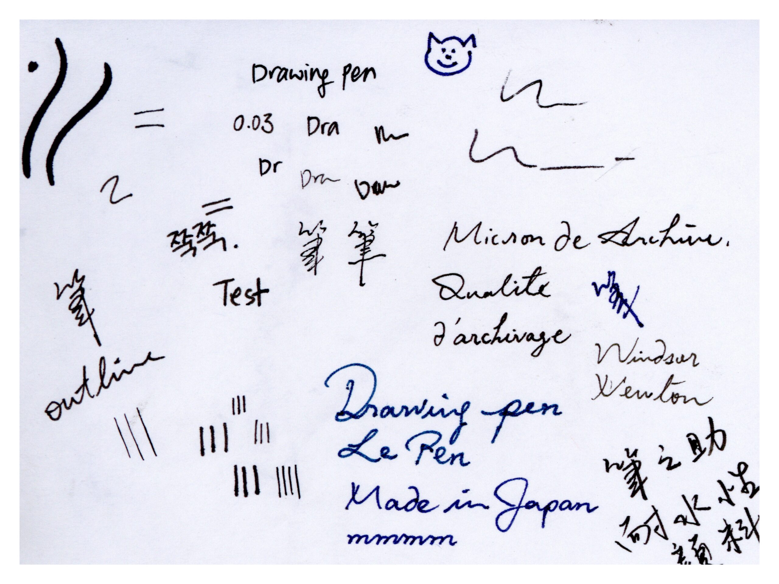
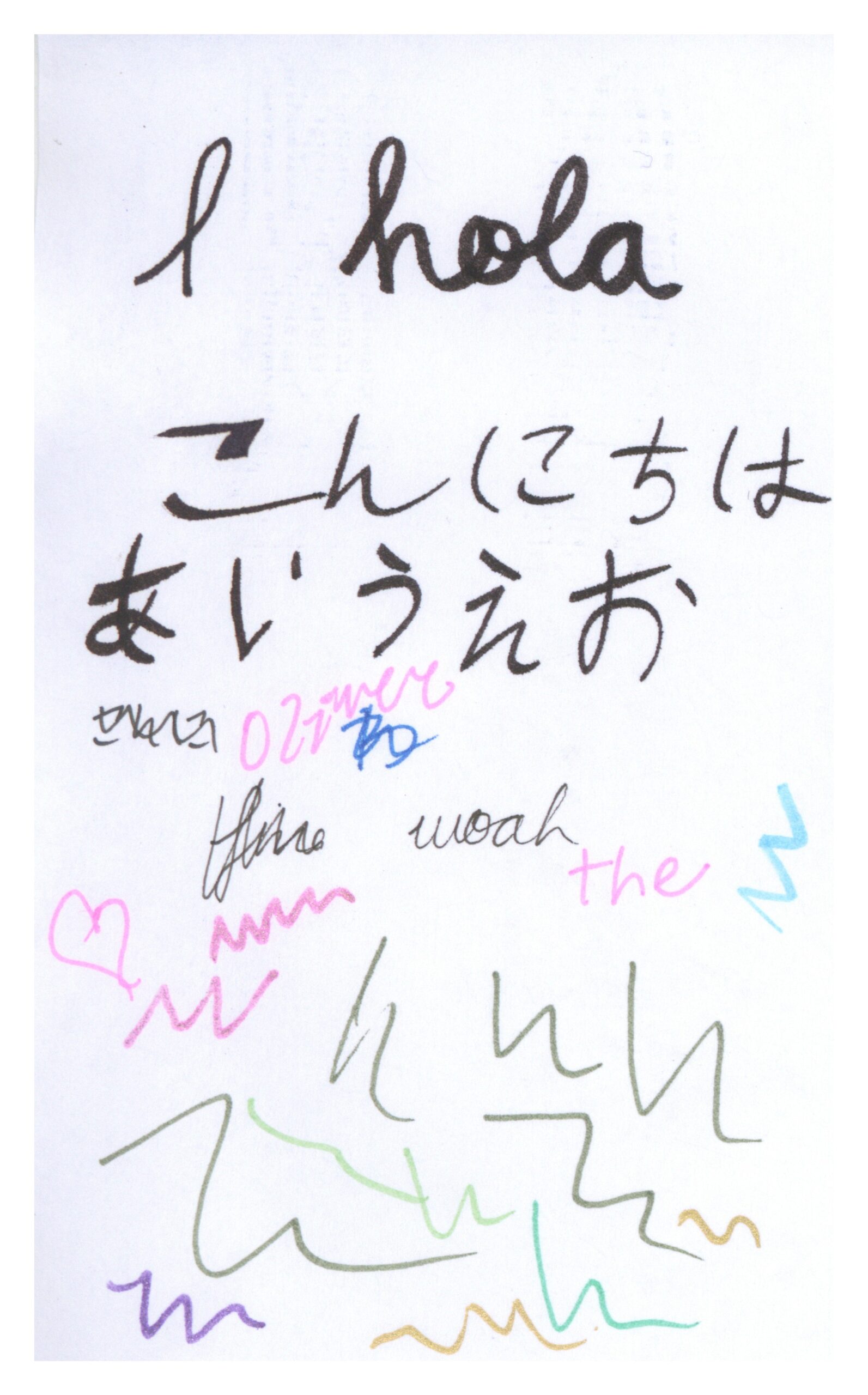
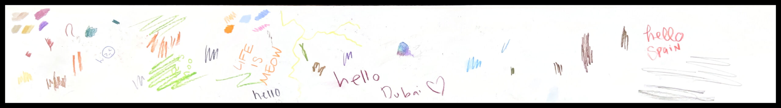
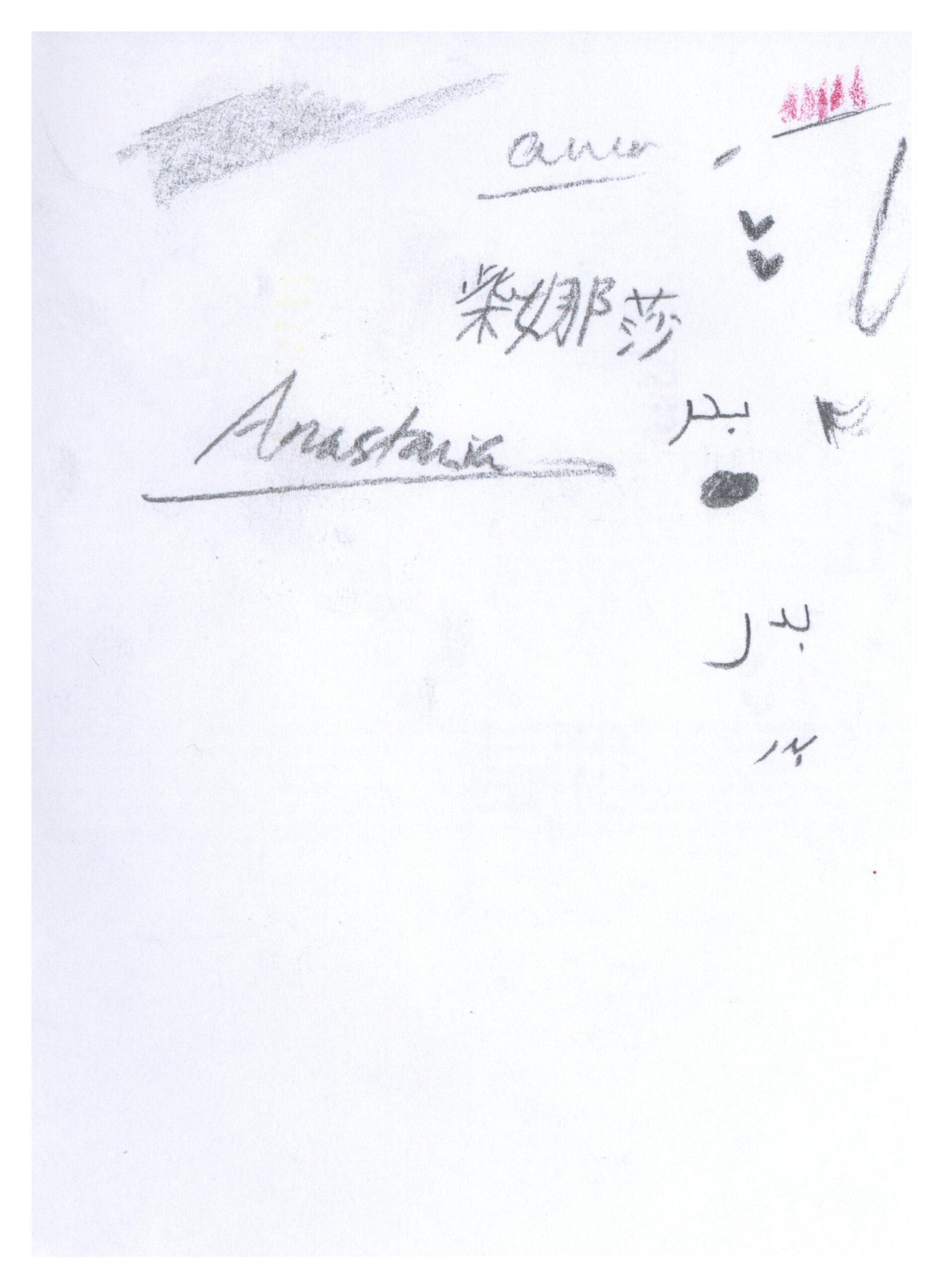
The number of languages represented was astounding.
We have Korean, Traditional Chinese, French, and English represented here.
And Spanish, Japanese, and English here.
Love letters were common.
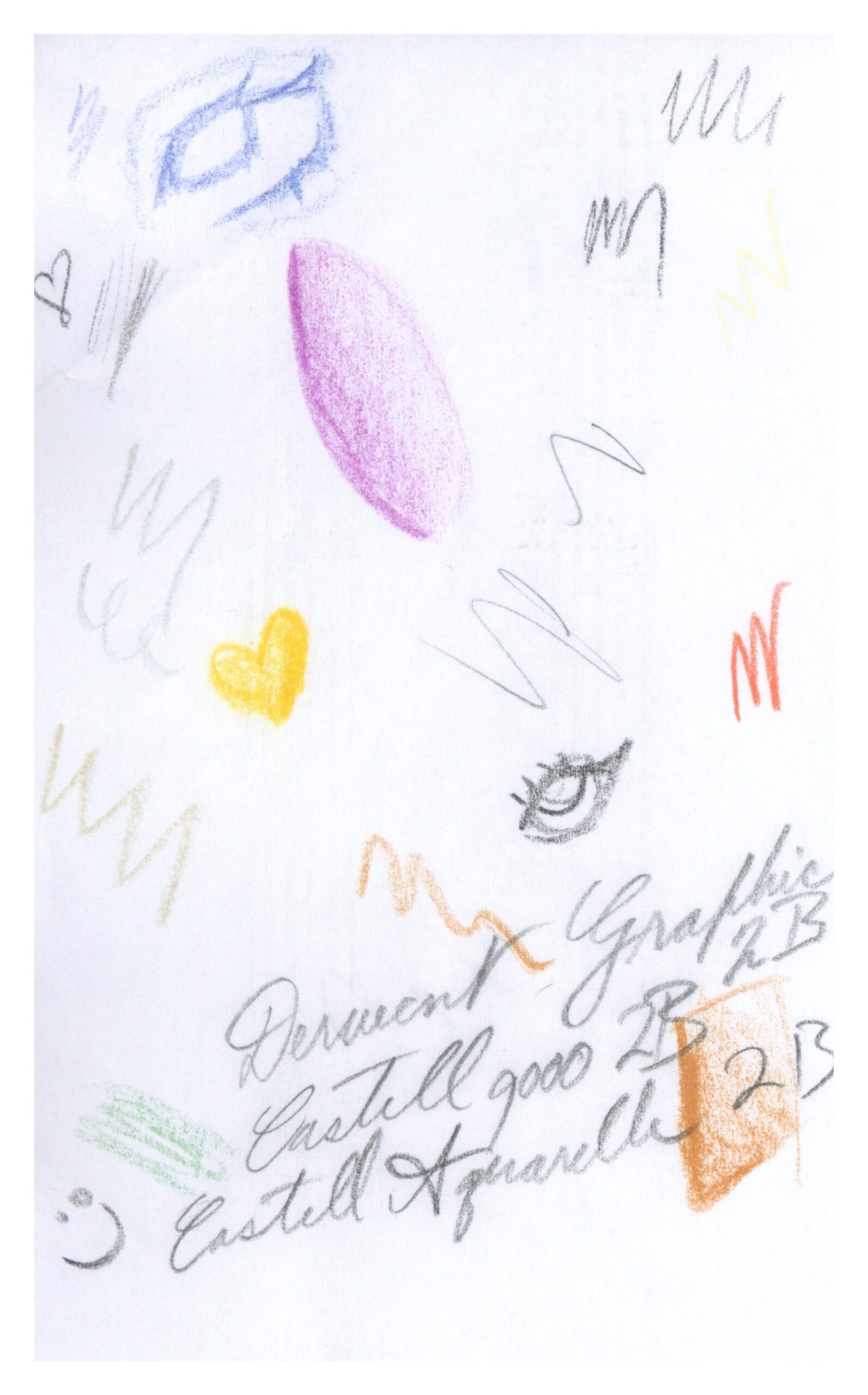
And so were strange little characters.
I could write almost forever about all the tiny little secrets I’ve found in this typology, but I believe that much of the joy of this piece lives in the individual experiencing and interpretation of the doodles. You may have found the groupings and discoveries I shared not to appeal to you, or to be flat out wrong, and that is wonderful. I invite you to explore the full typology for yourself and discover in it something entirely your own.
